The network for creativity
Join 1.25M professional creatives like you
Connect with clients, get discovered, and run your business 100% commission-free
Creatives on Contra have earned over $150M and we are just getting started
Back to feedPost

Corporate Headshot Post-Production
Studio Elements Removal: Meticulously removed the light stands, background support rods, and office furniture to isolate the subject perfectly.
Seamless Background Extension: Cleaned and extended the gray backdrop paper, creating a flawless, continuous vignette effect with zero folds or distractions.
Lighting & Highlight Balancing: Enhanced the lighting contrast on the model's blazer and adjusted the shadow falloff to give the portrait a high-end corporate finish.
Color Grading & Skintone Optimization: Corrected the white balance to bring out vibrant, natural skin tones and accurate colors while fully preserving the real human skin texture.
Precision Subject Isolation: Executed a clean vertical crop to maximize focus on the corporate executive for publication-ready standards.


The network for creativity
Join 1.25M professional creatives like you
Connect with clients, get discovered, and run your business 100% commission-free
Creatives on Contra have earned over $150M and we are just getting started
Related posts

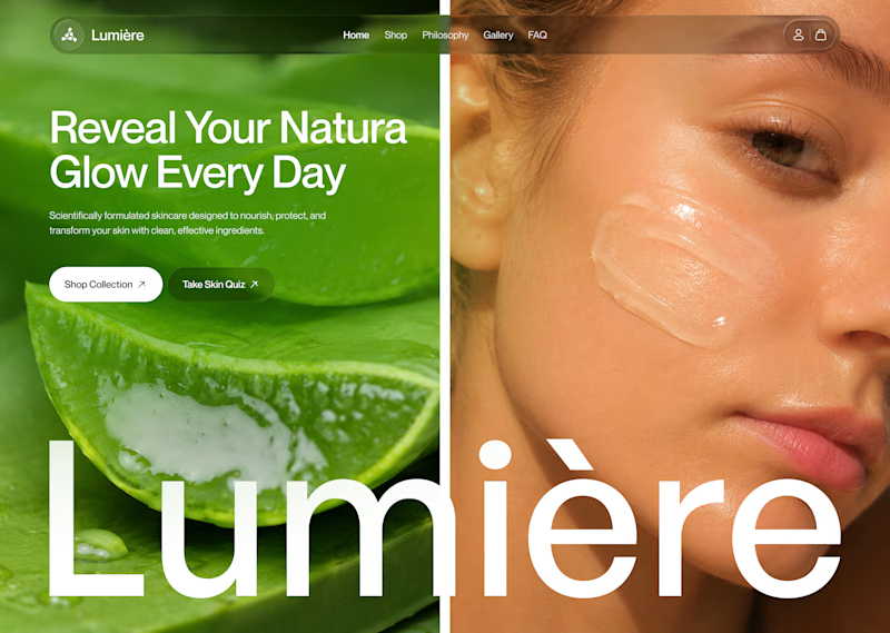
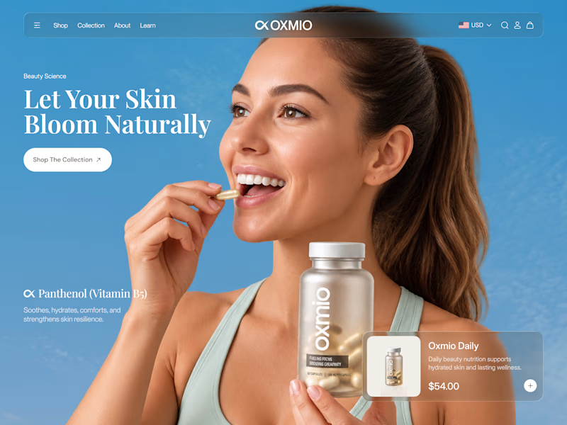
Your design has 3 seconds to earn attention. Which skincare brand wins?
A leads with confidence, energy, and aspiration. B builds trust through nature, freshness, and simplicity.
Great design doesn’t just look good. It makes people feel the brand before they read a word.
A or B? Which would make you stop scrolling?


30 voted
52%
28 voted
48%
58 votes
Closed


B without questions


A little throwback to one of our favorite collaborations with Lion Pose! 🧡
We worked with the founders to bring their vision to life through core brand identity, logo, and packaging design, creating a bold, playful visual language that feels fresh in the skincare space.
So lovely to see Lion Pose grow from its early days to the shelves of Sephora, with our packaging work recognized at the 2024 Dieline Awards!


Nice work

🍨 Meet MORA — artisanal gelato with a softer side.
Bold typography, creamy tones, and playful flavor-inspired packaging designed to make every scoop feel special.
Explore the full project on my Contra profile and let me know your thoughts!
#BrandIdentity #PackagingDesign #FoodBranding #GraphicDesign #BrandDesign
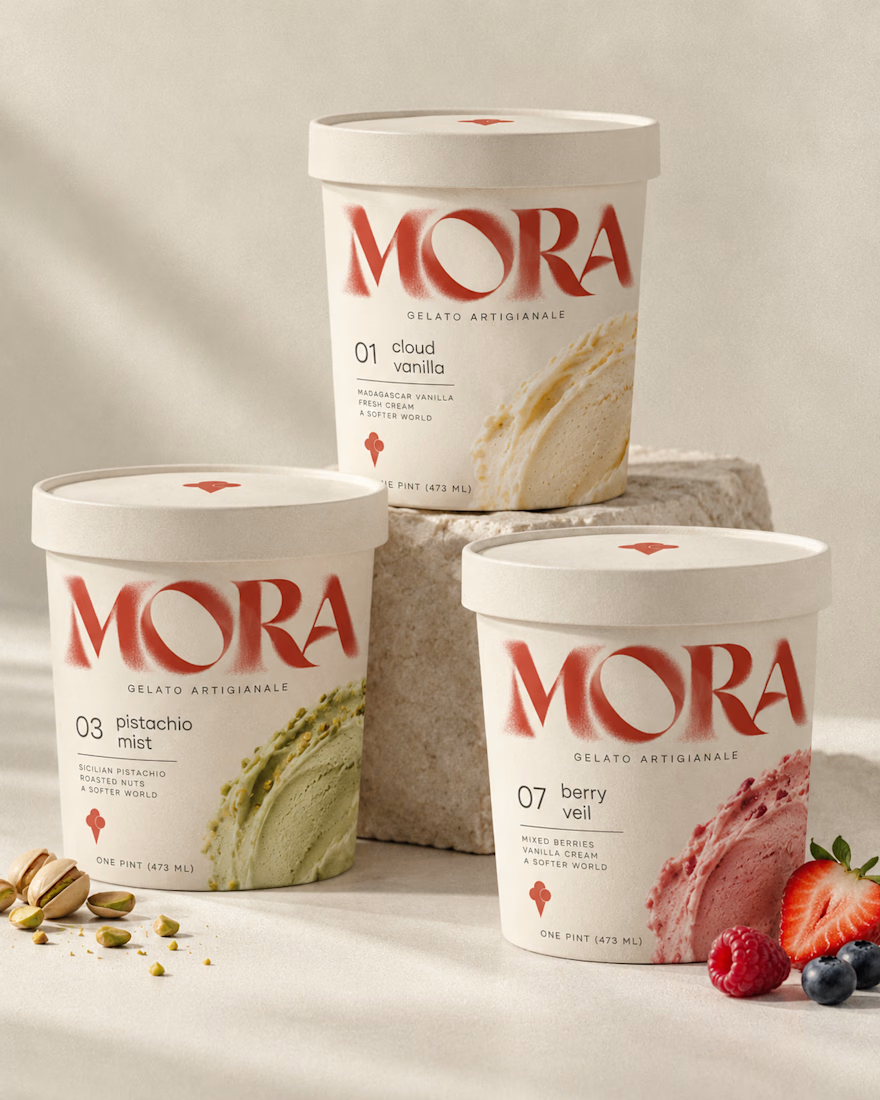
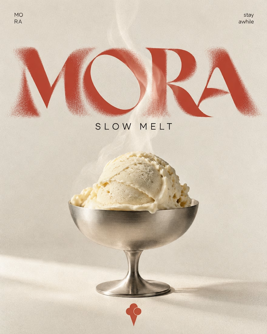
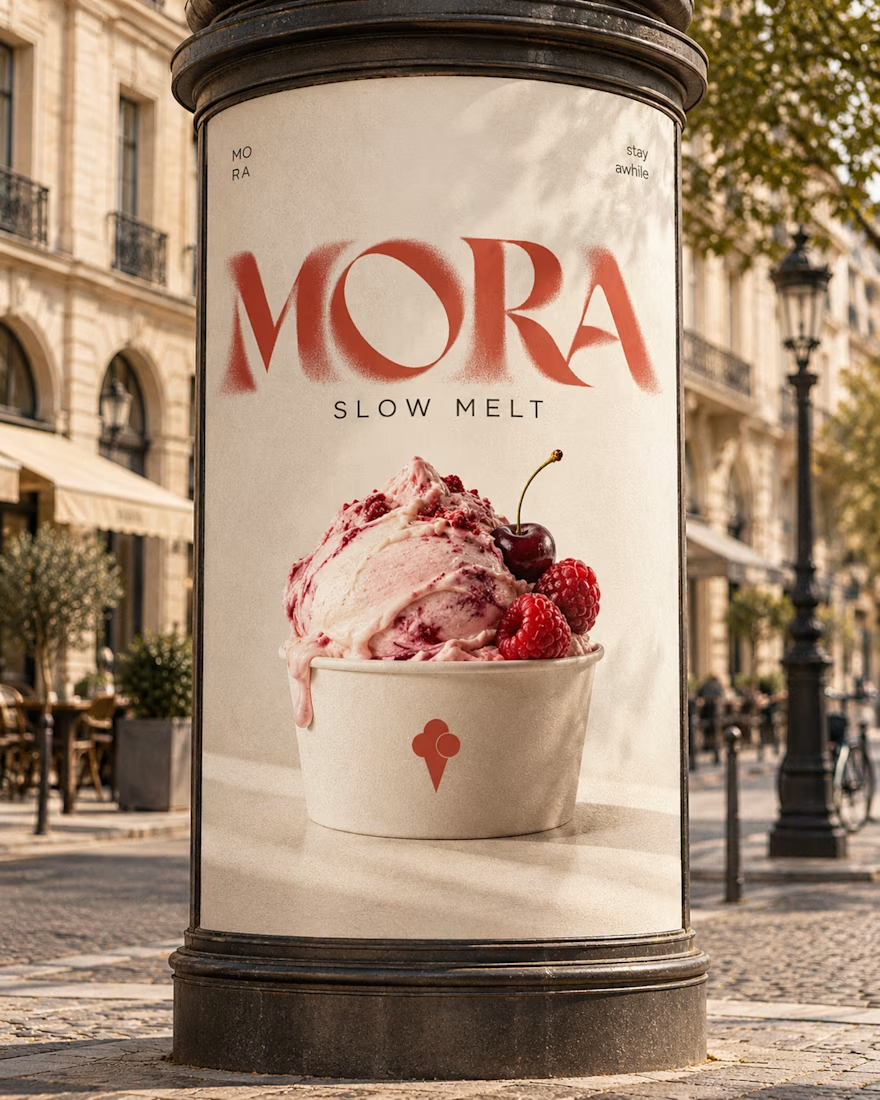

Love this MORA identity! 🍦 The bold typography against the creamy tones is such a perfect balance - feels artisanal yet playful. The flavor-inspired packaging with the watercolor smears for cloud vanilla / berry veil is a really nice touch, makes each scoop feel special as you...


