The network for creativity
Join 1.25M professional creatives like you
Connect with clients, get discovered, and run your business 100% commission-free
Creatives on Contra have earned over $150M and we are just getting started
Back to feedPost

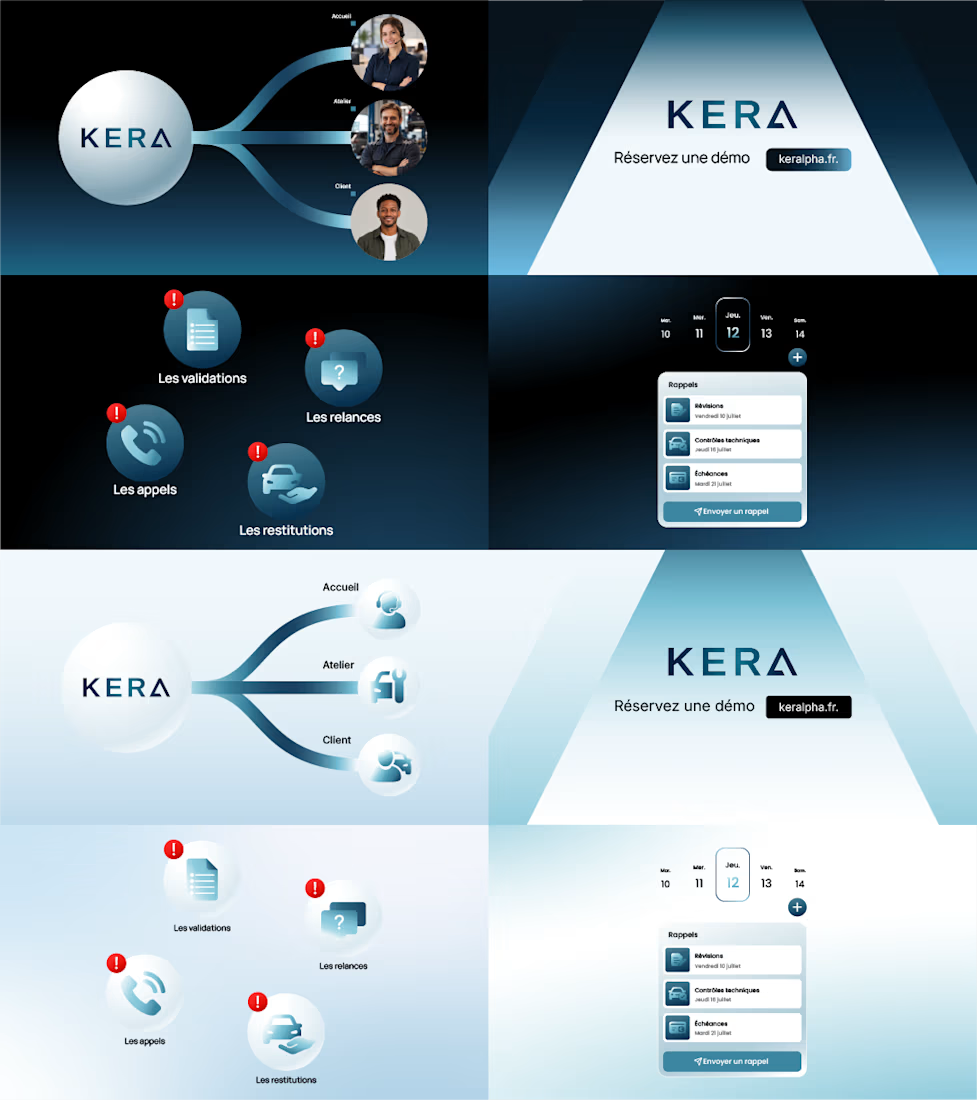
In my opinion, choosing between light mode and dark mode is not just about visual preference. Both can create quite different perceptions and characteristics, even when applied to a design with the same structure.
These visuals are two styleframe options I created for a client. The composition and information are relatively the same, but I explored two different color approaches.
For me, dark mode feels more bold, premium, modern, and cinematic.
Meanwhile, light mode gives a cleaner, more minimal, approachable, and open impression.
What I find interesting is that changes in the background, contrast, brightness, and color treatment alone can already change how a visual is perceived by the audience, without significantly changing the design structure.
That’s why, in the styleframe process, I see the choice of color mode as not only about which one looks more attractive, but also about what kind of character and perception a brand wants to build.
The network for creativity
Join 1.25M professional creatives like you
Connect with clients, get discovered, and run your business 100% commission-free
Creatives on Contra have earned over $150M and we are just getting started





Related posts

i create a 3D cube component for a Framer website to add creativity. which one is better dark or light? Check the live preview here
22 voted
51%
21 voted
49%
43 votes
Closed

Snap to the position in the last will feel more real


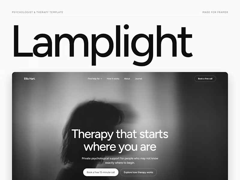
Which one grabs your attention and should be the main visual for a framer template thumbnail?

7 voted
50%
7 voted
50%

14 votes
Closed

Both works are great; it's hard to choose


Collage