The network for creativity
Join 1.25M professional creatives like you
Connect with clients, get discovered, and run your business 100% commission-free
Creatives on Contra have earned over $150M and we are just getting started
Back to feedPost
Taste Test
Which one grabs your attention and should be the main visual for a framer template thumbnail?

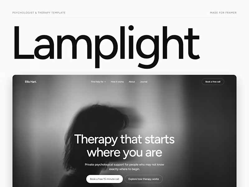
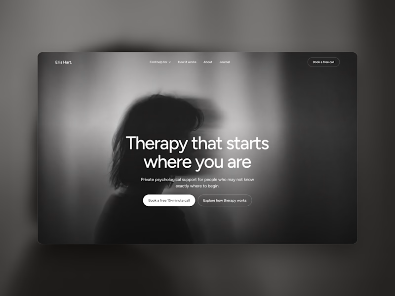
13 votes
Ends in 1d


thanks bro


I didn't understand the difference here. Please elaborate.
Mainly those 2 are possible thumbnail for my framer template. So I am taking people vote which one should I make thumbnail

The white one for me. The Lamplight name is easier to spot in a grid, and you still get a good look at the hero.
thanks for your opinion bro

Left for me. The larger “Lamplight” title makes it instantly recognizable as a template thumbnail.
thanks for your opinion bro

Both works are great; it's hard to choose
thanks bro
The network for creativity
Join 1.25M professional creatives like you
Connect with clients, get discovered, and run your business 100% commission-free
Creatives on Contra have earned over $150M and we are just getting started





Related posts

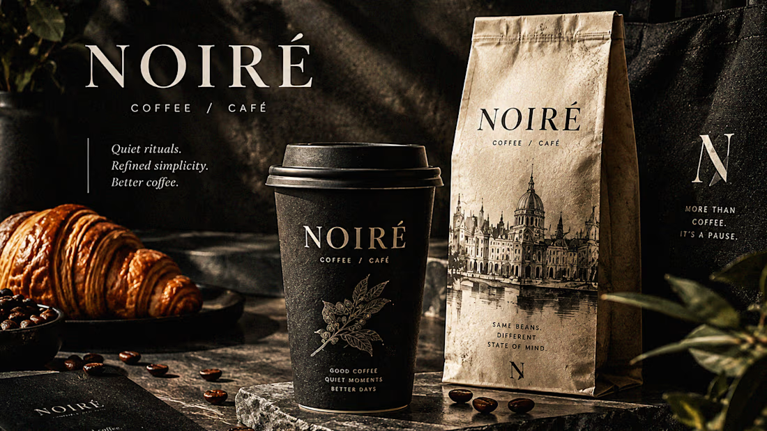
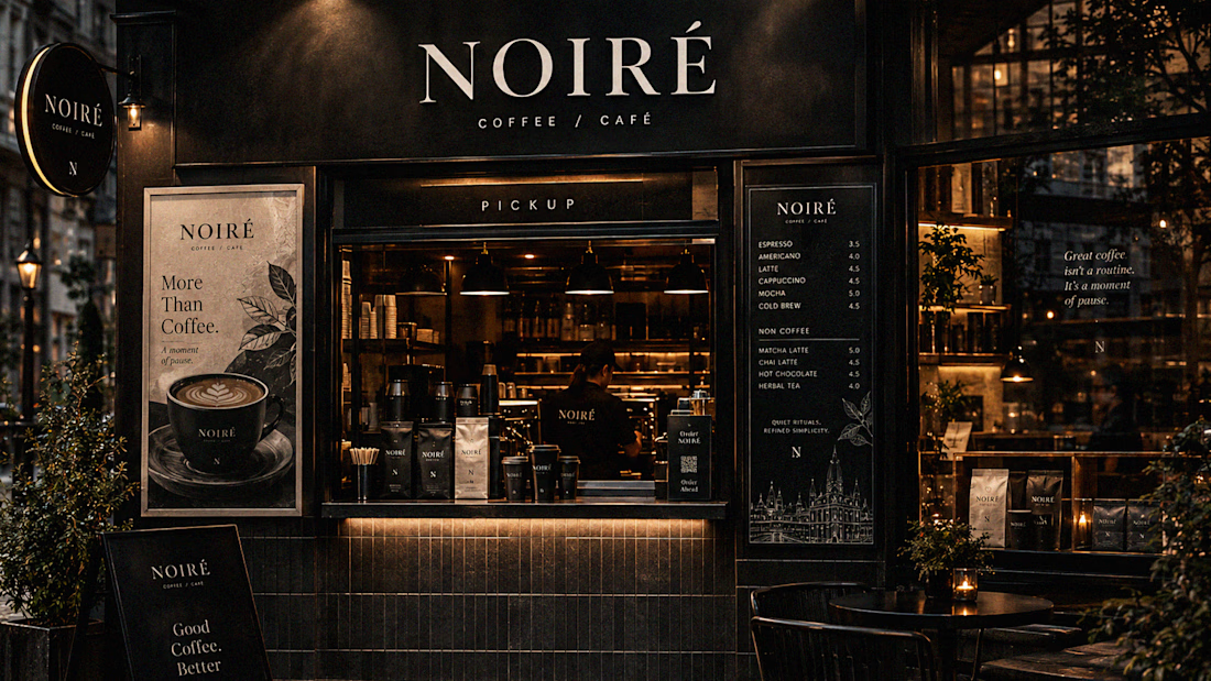
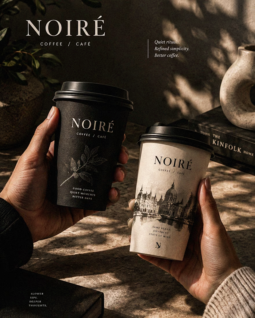
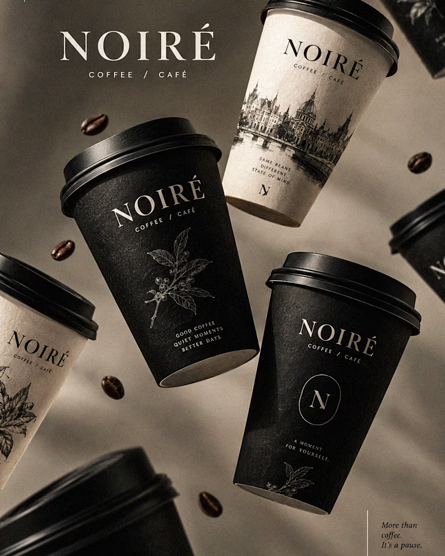
I Just Created NOIRÉ 🔥
A Coffee Brand Built Around the Pause.
NOIRÉ is a premium café brand built around a simple idea:
Great coffee should feel like a moment of pause, not another part of the
routine.
The project explores a complete visual identity, packaging
system, takeaway cups, coffee bags, tote bags, menu design, café applications and lifestyle campaign direction.
Instead of relying on the usual loud coffee aesthetics, I
built NOIRÉ around deep charcoal, warm ivory, soft graphite, refined
typography, subtle botanical illustrations and quiet editorial compositions.
The visual language is intentionally dark, tactile, and understated - giving every touchpoint the feeling of a slow morning, a quiet table, and coffee worth taking your time with.
From the cup in your hand to the café around you, every detail was designed to make the brand feel like a ritual.
Waiting for your thoughts in the comments 🙌🔥
branddesignertastetestBrand DesignGraphic DesignPackaging DesignAdobe IllustratorAdobe InDesignAdobe Photoshop




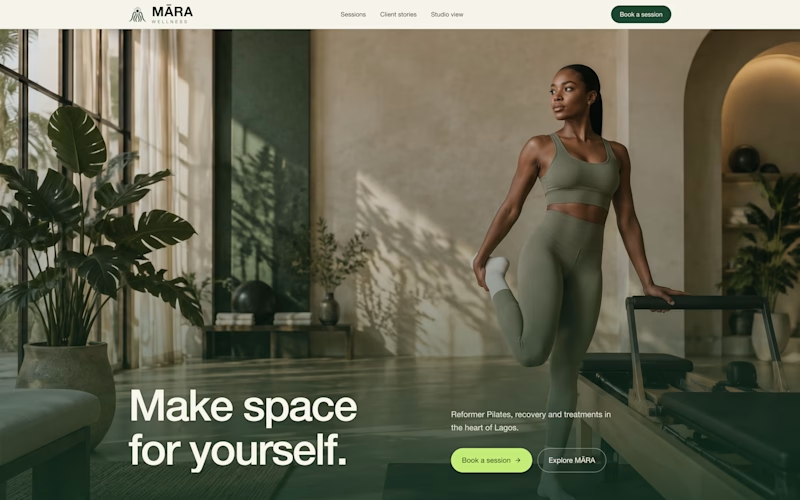
exploring some visual directions, which of this hero design looks better?
4 voted
40%
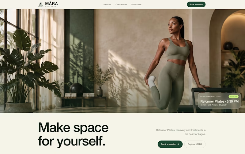
6 voted
60%
10 votes
Closed

Option 1 looks cleaner and more balanced. The layout feels more spacious and premium. ✨

Just created a cursor that transforms the content beneath it. It follows your pointer with a subtle delay, then settles precisely on it when you stop.
There are 9 effects: Invert, Monochrome, Fisheye, Duotone, Cyanotype, Embossed Paper, Solarized, Infrared, and Chromatic

This is the type of detail that shows the taste of the designer, well done!!