The network for creativity
Join 1.25M professional creatives like you
Connect with clients, get discovered, and run your business 100% commission-free
Creatives on Contra have earned over $150M and we are just getting started
Back to feedPost

Unpopular opinion: luxury branding has gotten lazy.
Same serif. Same beige. Same "less is more" until there's nothing left to feel.
Details still matter. Meaning still matters.
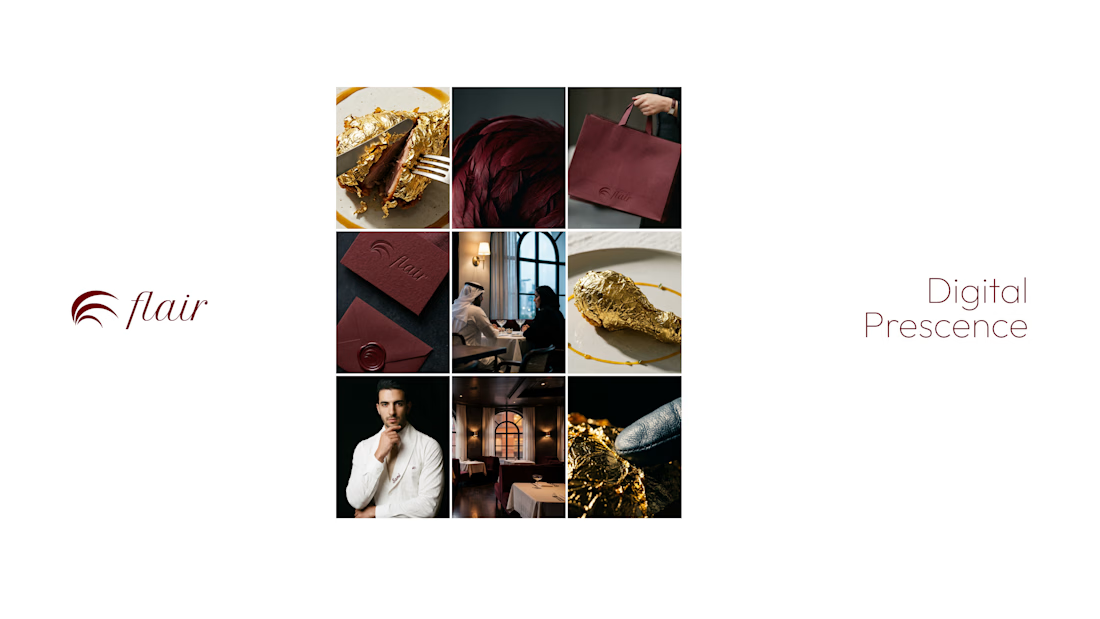
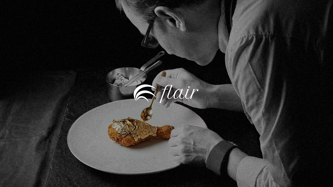
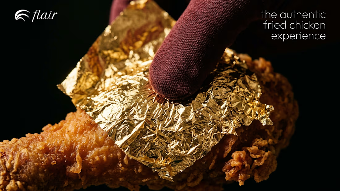
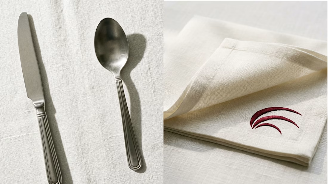
So when I built Flair, I hid something in the logo, a rooster's head that reads as a feather. You either catch it or you don't. But once you do, you don't forget it.
That's what luxury should do. Stay rooted in your memory.
I believe the world needs more life in it. More color. More craft.
Not just the safe boring minimal.
Do you see it?

Great Work..

Nice!
The network for creativity
Join 1.25M professional creatives like you
Connect with clients, get discovered, and run your business 100% commission-free
Creatives on Contra have earned over $150M and we are just getting started







Related posts


Four logo concepts, one direction: calmness, warmth, mental health and professionalism.
Which one feels most aligned with the brief to you?

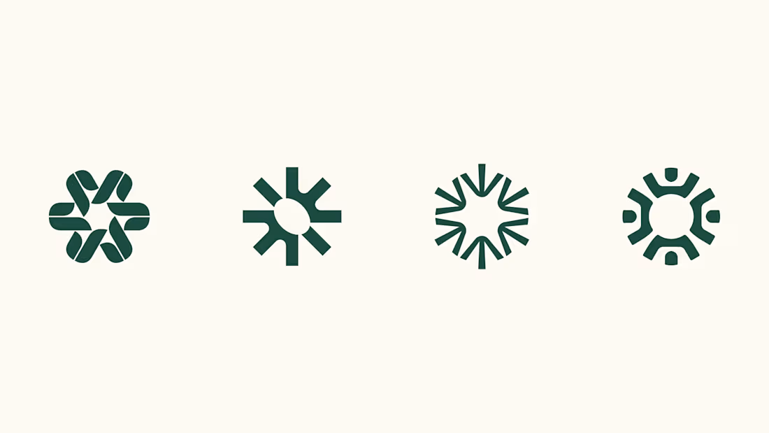

I think 3 or 4 work best. I really like the first one, but it moves away from the "calmness" concept


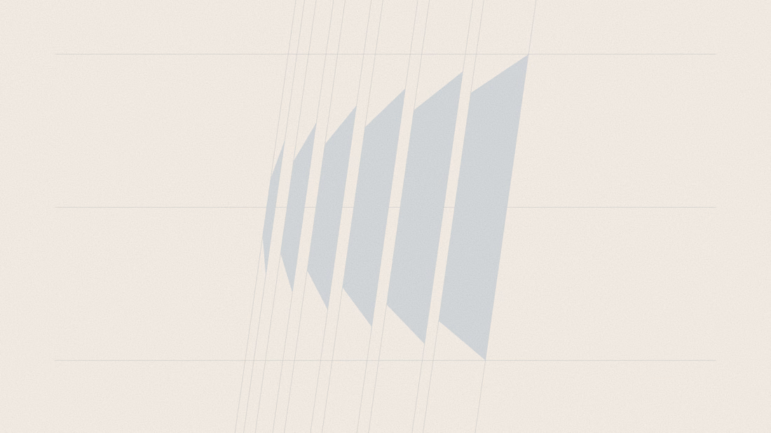
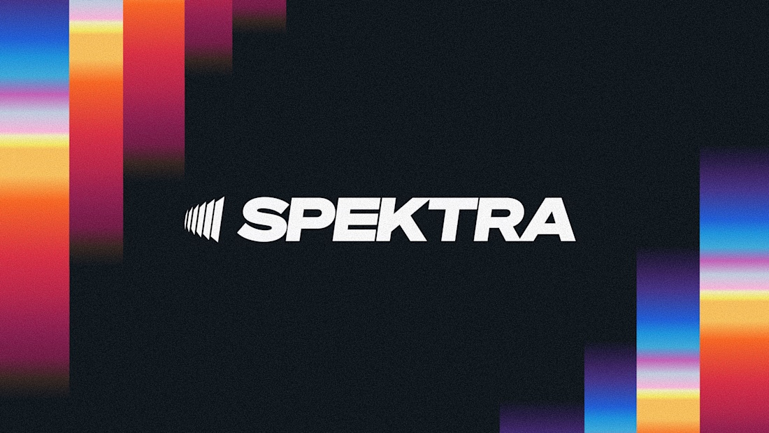
A closer look at the Spektra logo I designed.
The mark fans out from a narrow point, while the wordmark leans forward. together, they give it a sense of movement without needing much detail.
There’s a lot of color in the wider identity, so the logo holds its own in plain white. Simple geometry with enough weight to stand up to everything around it.


This is fire, Daniel
The logo conveys the story

the starting point for a new brand for a modern AI tax platform.
instead of looking at AI, we looked backwards. old currencies, ledgers, classical architecture and centuries-old symbols of value.
sharing the final very soon ↓

Nice work