The network for creativity
Join 1.25M professional creatives like you
Connect with clients, get discovered, and run your business 100% commission-free
Creatives on Contra have earned over $150M and we are just getting started
Back to feedPost

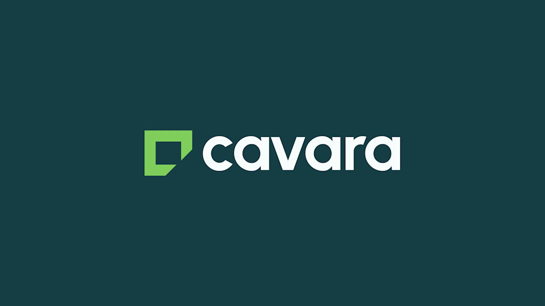
Cavara is a property firm that needs clients to trust its advice before the first meeting. The identity is built on deep teal and a bright lime, and the corner-cut mark repeats in the stat panel and the reverse of the staff ID. Teal carries the letterhead and story frames, while lime takes the envelope and the planning slide.

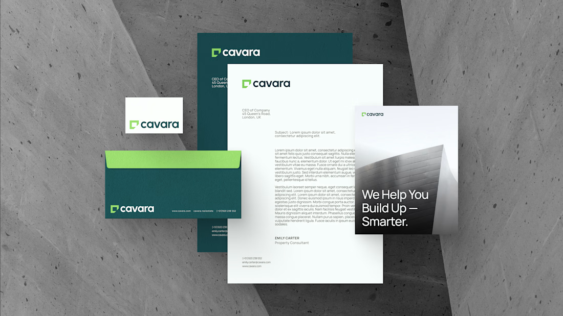
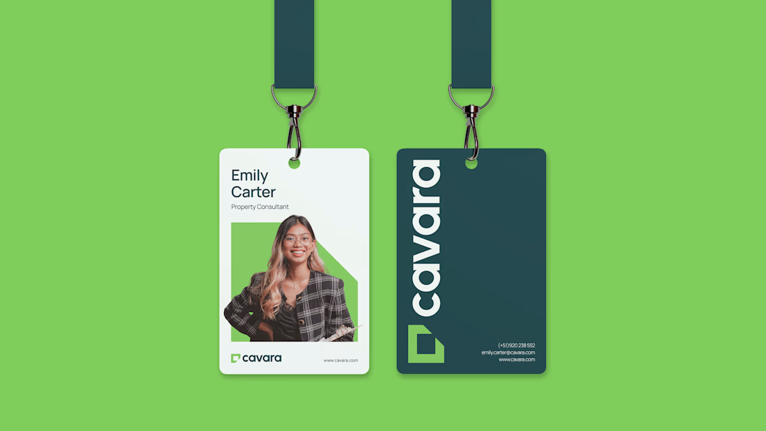


Deep teal with that bright lime is a bold pairing, and the corner-cut mark repeating on the ID badges ties it together well.
The network for creativity
Join 1.25M professional creatives like you
Connect with clients, get discovered, and run your business 100% commission-free
Creatives on Contra have earned over $150M and we are just getting started


Related posts


Ever signed for a pack of pasta? Soon you will.
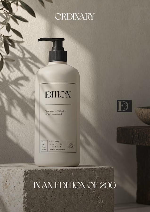
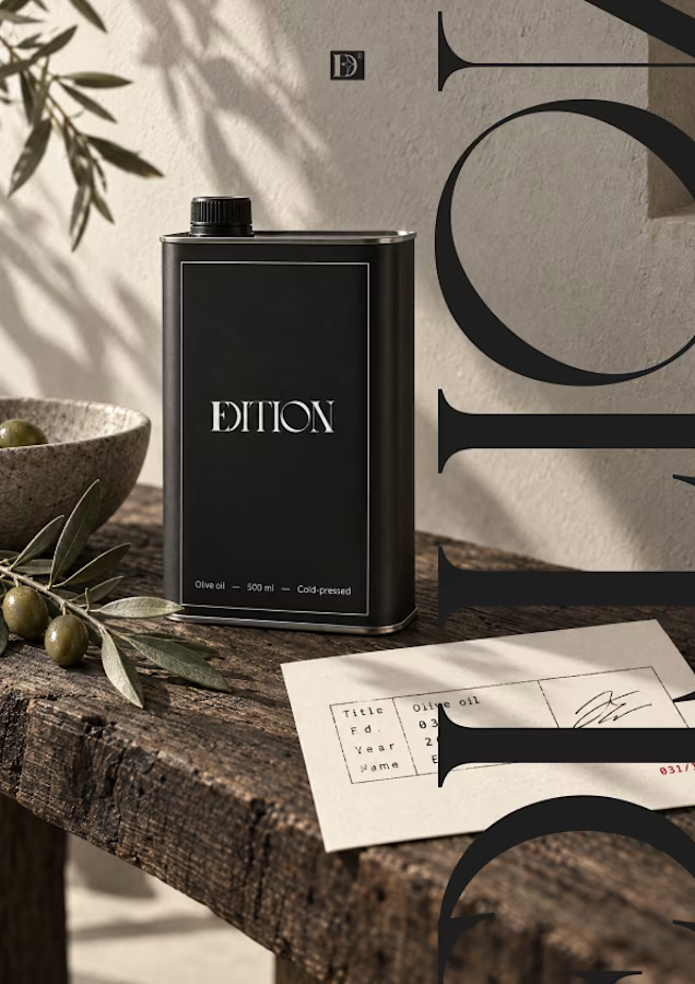
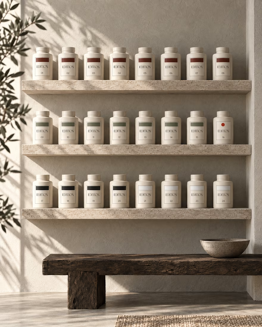
EDITION is a brand where nothing is decorative and everything is numbered.
Case study landing very soon.
What happens when you pull one forgotten brand out of a folder full of them?
Iridia sat half finished next to the rest.
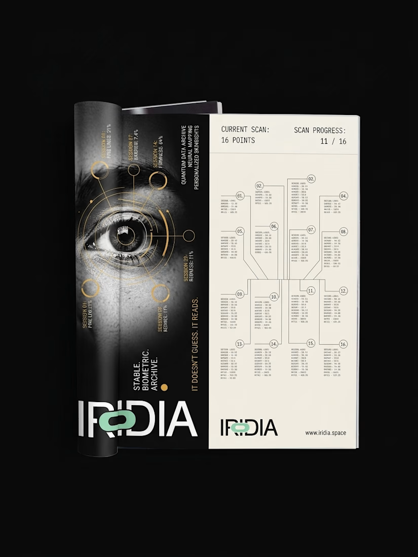
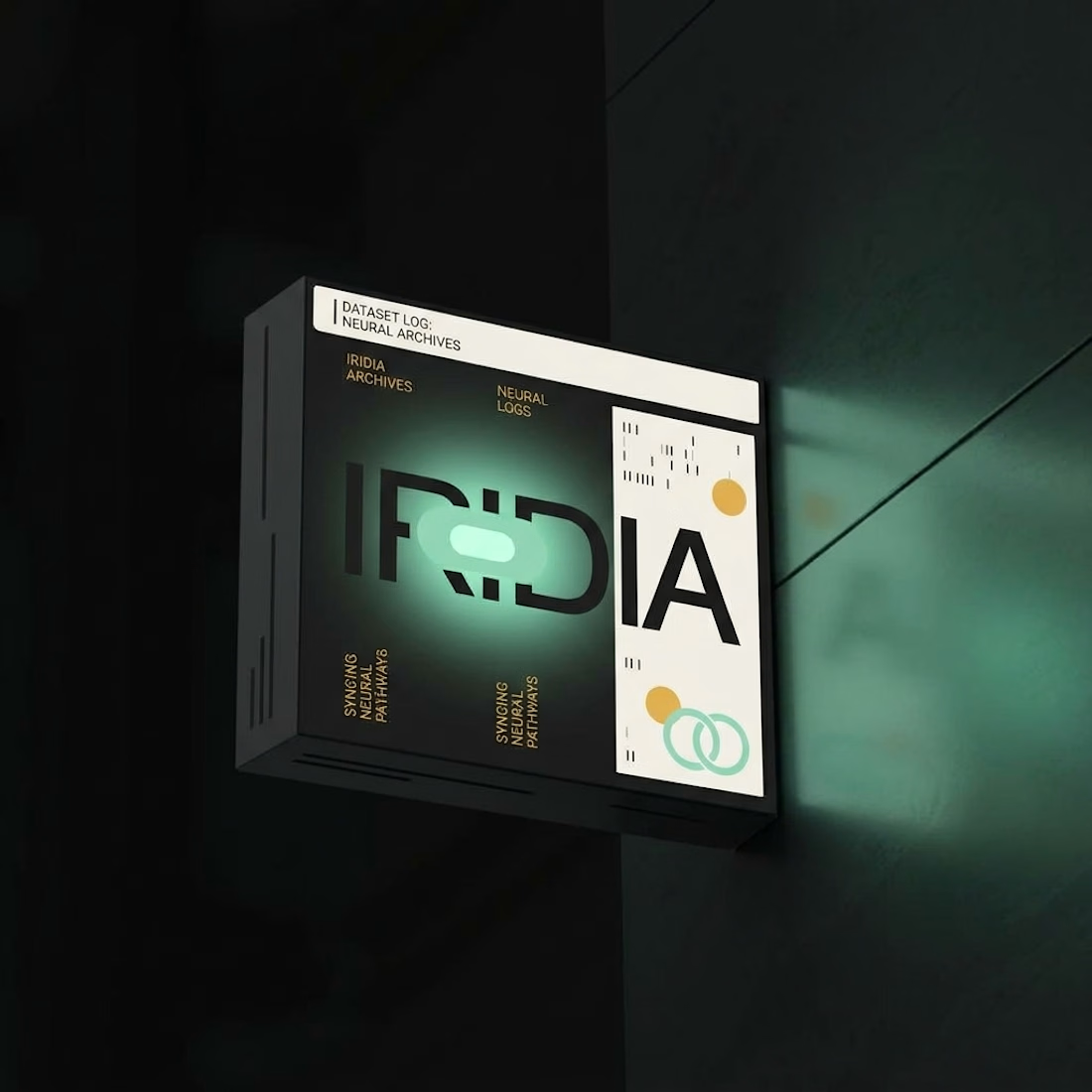
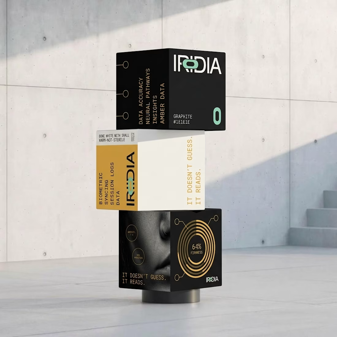
I locked the references and pushed it all the way to 10 campaigns, OOH, product and packaging.