The network for creativity
Join 1.25M professional creatives like you
Connect with clients, get discovered, and run your business 100% commission-free
Creatives on Contra have earned over $150M and we are just getting started
Back to feedPost

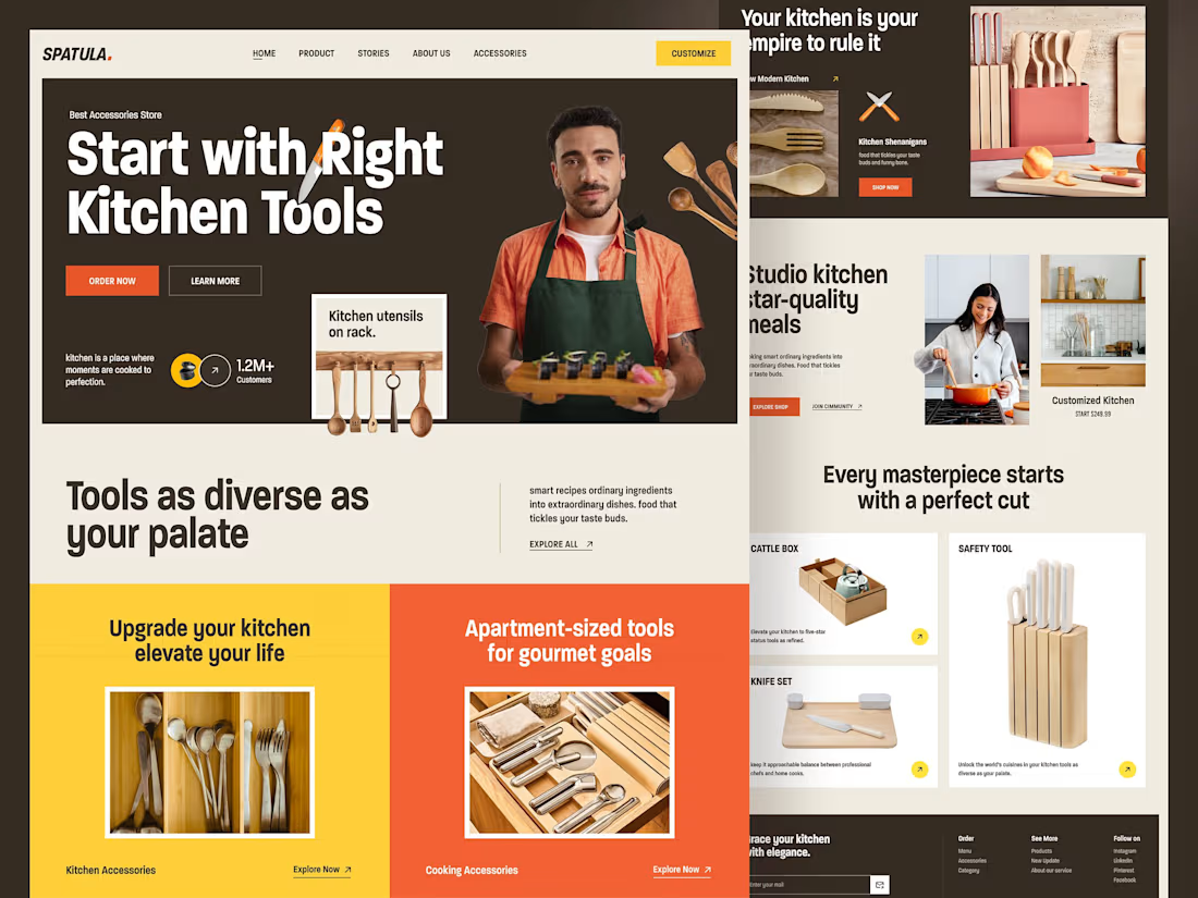
Cooking Accessories Landing Page
Modern Kitchen Brand -Motion-Driven Product Experience
A refined digital experience that presents everyday kitchen essentials with clarity, precision, and strong visual appeal. The layout simplifies product discovery while maintaining a premium, modern feel.
Animation is used purposefully to guide attention, reveal product details, and create a smooth, intuitive flow across sections.
Every element is designed to build trust, highlight quality, and move users seamlessly from exploration to purchase.
A scalable foundation built for a growing kitchen accessories brand.


The network for creativity
Join 1.25M professional creatives like you
Connect with clients, get discovered, and run your business 100% commission-free
Creatives on Contra have earned over $150M and we are just getting started

Challenges
View all


Related posts



really like the calm feel of this one


Designing the moments between money and trust.
A few screens from an ongoing fintech product we’re working on.
Financial products have a strange design challenge:
they need to feel simple enough to understand, but serious enough to trust.
For this product, we’ve been working across flows like subscriptions, account management, portfolio-related information, and customer support — with a focus on making every interaction feel intentional.
The goal isn’t to make fintech “look modern.”
It’s to make complex things feel obvious.
Clear hierarchy.
Less cognitive load.
Stronger interaction patterns.
And a visual system that can scale as the product grows.
Still a work in progress — but here’s a little glimpse at where we’re heading.


The screens strike a good balance between reassurance and personality—the trust cue is clear without making the flow feel sterile. The card hierarchy also reads well at a glance.