The network for creativity
Join 1.25M professional creatives like you
Connect with clients, get discovered, and run your business 100% commission-free
Creatives on Contra have earned over $150M and we are just getting started
Back to feedPost

What makes a healthcare brand feel trustworthy?
A. Clean and clinical
B. Warm and human
C. Premium and minimal
There’s no universal answer—the right direction depends on the audience, positioning, and type of care being offered.
Which direction would you trust first, and why?
The network for creativity
Join 1.25M professional creatives like you
Connect with clients, get discovered, and run your business 100% commission-free
Creatives on Contra have earned over $150M and we are just getting started





Related posts


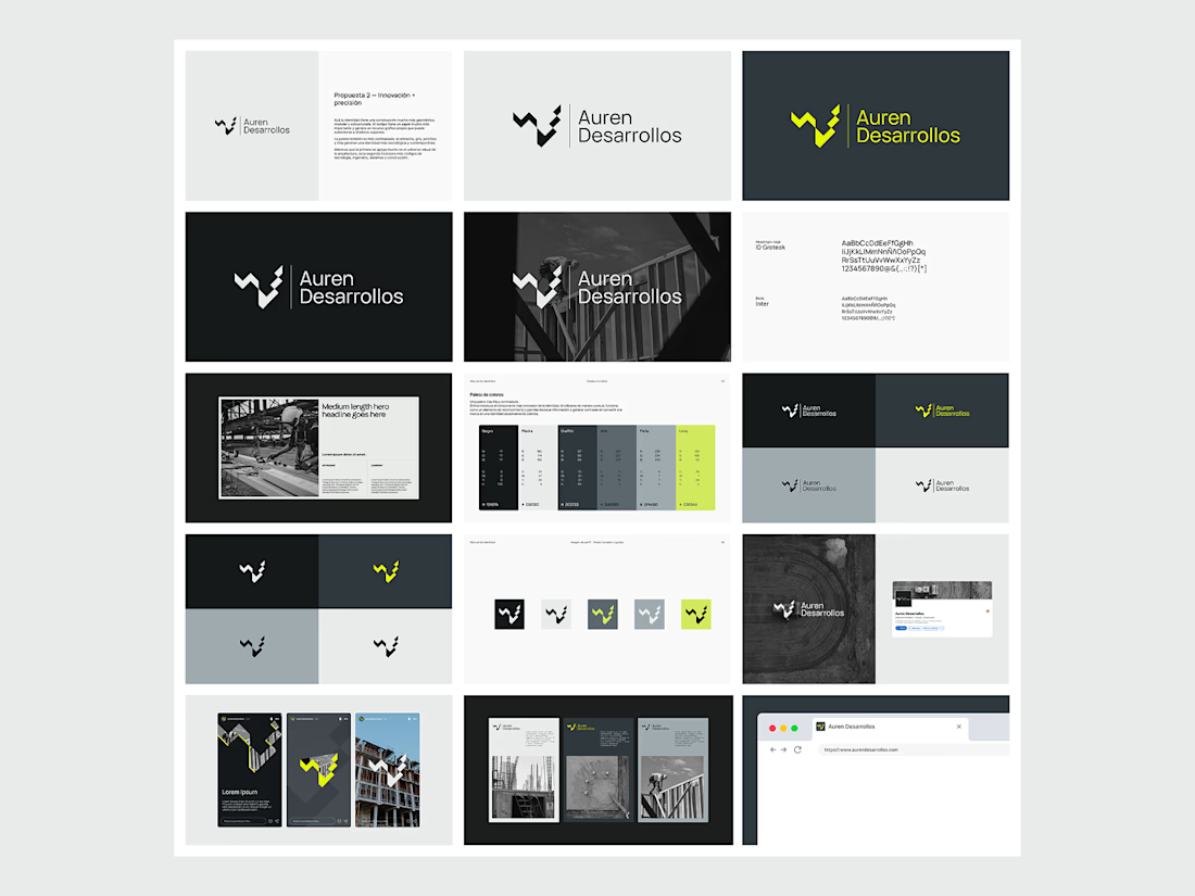
Not every direction makes it to the final brand.. this was one of the directions we explored for Auren Desarrollos, a new construction and development company we’re currently working with on its branding and website.
I’ll be sharing the final result soon, and I think the difference will be interesting to see.
What do you think?



Love the logo work!

A brand identity shouldn’t only be seen.
One thing I like to discuss with clients toward the end of an identity project is what happens when the brand leaves the screen and becomes something physical.
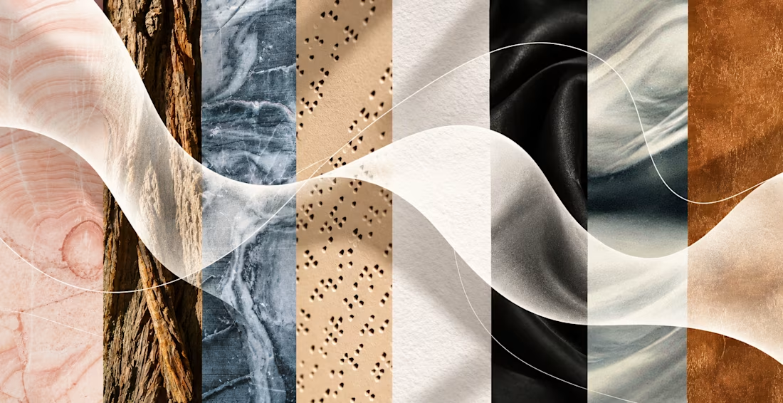
We experience the world through multiple senses, so why should a brand communicate through only one - visual?
- A business card can have a certain weight and texture.
- Packaging can use embossing, debossing, or an unexpected material.
- A label can feel rough, soft, or unusually smooth.
- A logo can be embroidered instead of simply printed.
These might seem like small production decisions, but they change the way we experience a brand.
And some brands can go even further. Think about sound in hospitality or retail. The smell of a physical space. The experience of opening a package. For fragrance brands, scent is naturally at the center of the product, but the same principle can be applied much more broadly.
That’s why I like to include production recommendations in brand guidelines whenever they’re relevant.
Because once the visual identity is finished, the next question shouldn’t only be:
How should this brand look?
But also:
How should this brand feel?

“What happens when the brand leaves the screen” is the right end-of-project question — signage, merch, and motion rules are where identities actually survive.

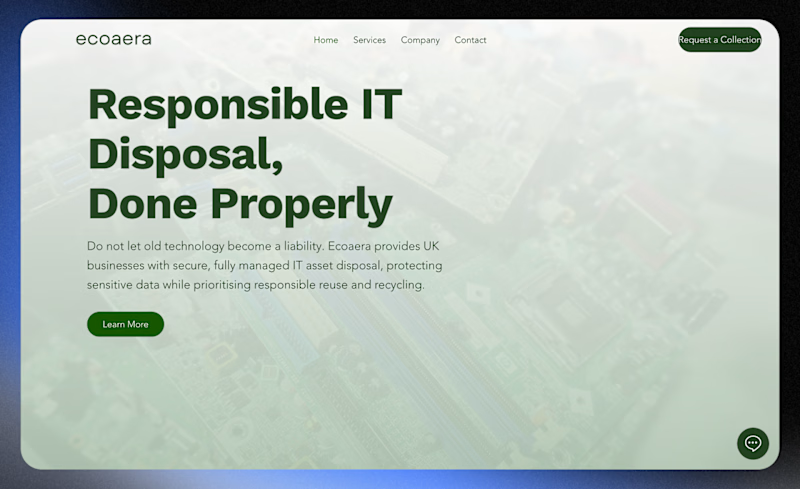
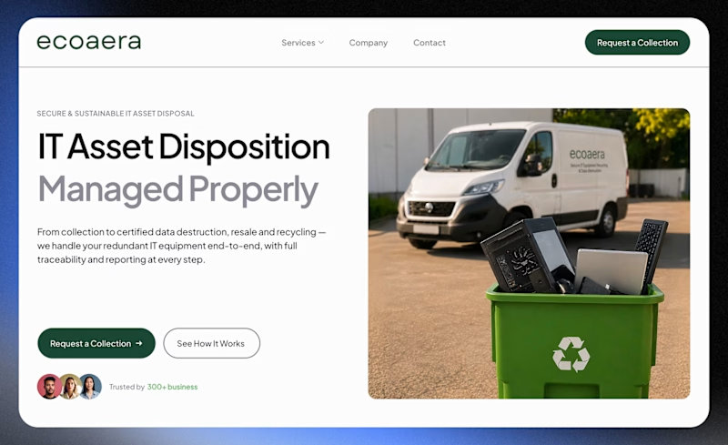
Which design feels more professional and trustworthy for a B2B company?
A recent website redesign for Ecoaera, a UK-based IT asset disposal company. We transformed their existing site into a modern B2B website with improved UX, stronger service pages, and SEO + AI optimisation.

3 votes
Ends in 1d