The network for creativity
Join 1.25M professional creatives like you
Connect with clients, get discovered, and run your business 100% commission-free
Creatives on Contra have earned over $150M and we are just getting started
Back to feedPost
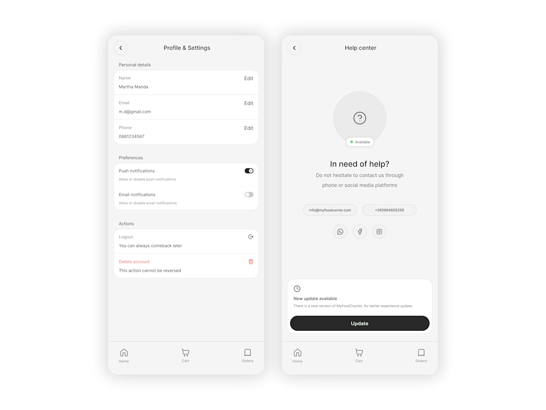
"Psychology In Design" ~ Timelessness
Ever notice how the most expensive-looking apps or sites are usually just... black and white?
It’s the design version of "quiet luxury." When you strip away the bright colors, you’re basically removing the noise. There’s nowhere to hide, so the focus shifts entirely to the stuff that’s actually hard to get right like typography, spacing, and layout. When those are dialed in, the whole thing feels effortless and high-end. It’s not trying too hard, and that’s exactly why it works.
Black and white never really goes out of style.


Clean design👍

Thank you Anar
The network for creativity
Join 1.25M professional creatives like you
Connect with clients, get discovered, and run your business 100% commission-free
Creatives on Contra have earned over $150M and we are just getting started











Related posts


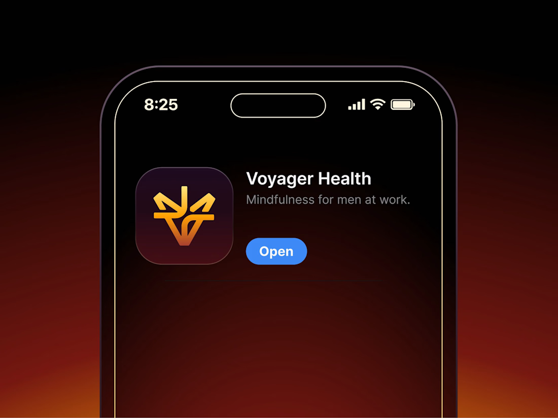

Aryna, that golden symbol pops so nicely against the plum background ✨

Poster Club turns a simple event template into your own print. I built two working Flutter versions and recorded the same editing flow in each.
Print Room: calm, editorial, with a mounted canvas and bottom tools.
Cutout Playground: bold, playful, with loose prints and tools at the edge.
Which one would you rather use?
What made the difference?
Grab it for free:
https://contra.com/products/cUHBysMu-poster-club-free-flutter-ab-ui-kit


37 voted
60%
25 voted
40%
62 votes
Closed

Print Room looks great!!

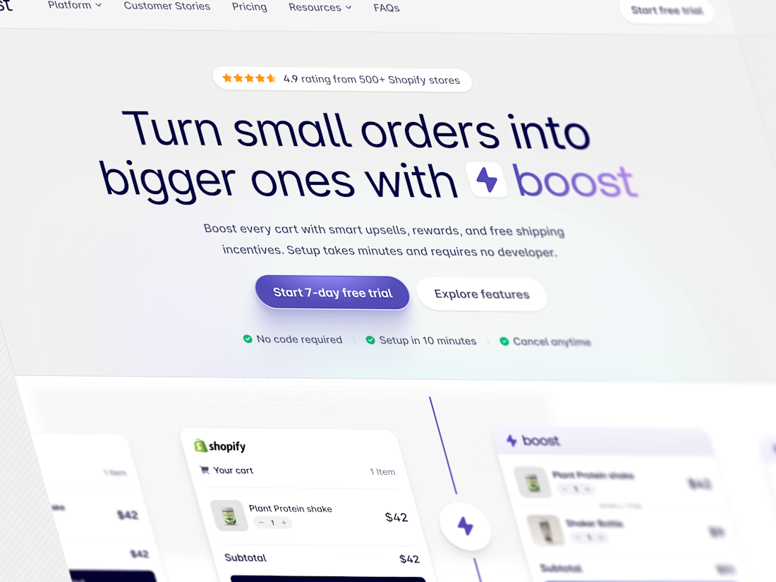
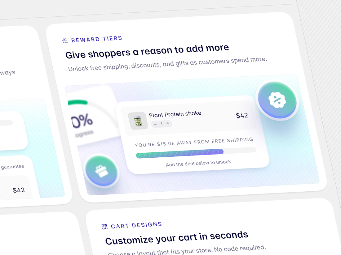

Brilliant work