The network for creativity
Join 1.25M professional creatives like you
Connect with clients, get discovered, and run your business 100% commission-free
Creatives on Contra have earned over $150M and we are just getting started
Back to feedPost

The Rebranding Real Challenge
MineralBalance operates at the intersection of health, nutrition, and laboratory analysis.
As HTMA continues to be associated with inconsistent messaging and wellness trends, the brand needed to communicate something more grounded: precision, credibility, and clarity.
The challenge was to create an identity that felt scientifically rigorous without becoming cold, clinical, or pharmaceutical.
- The Concept
At the core of MineralBalance is the relationship between individual minerals and the balance they create as a system.
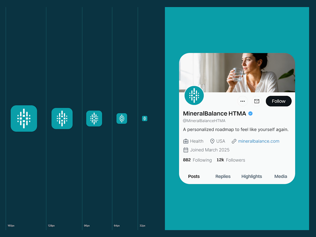
The symbol translates this idea into a simple modular form: four elements representing four essential minerals:
Na, Mg, Ca, and K. The vertical bars introduce a subtle reference to laboratory analysis and data visualization, connecting the mark to the process of measurement and interpretation.
- The Identity
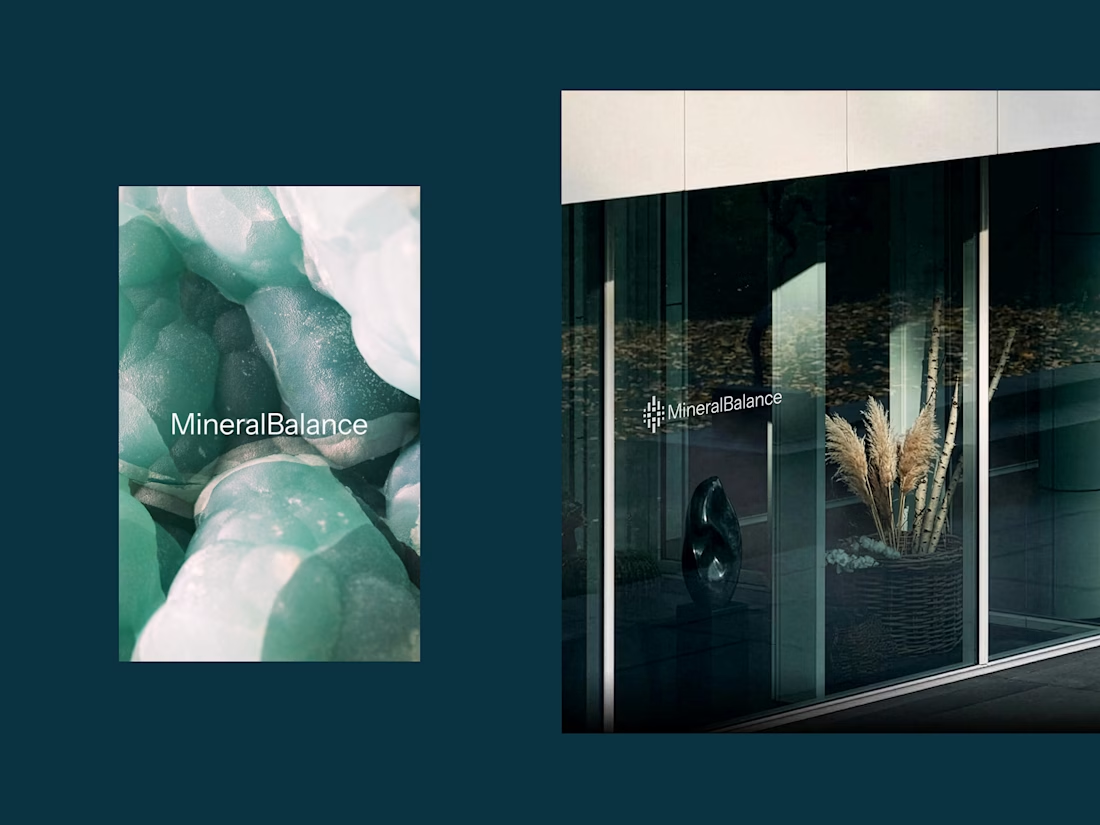
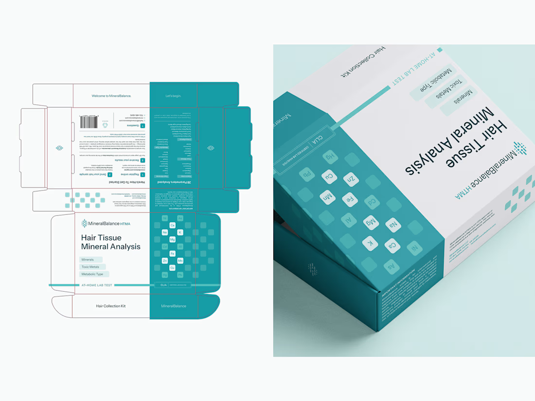
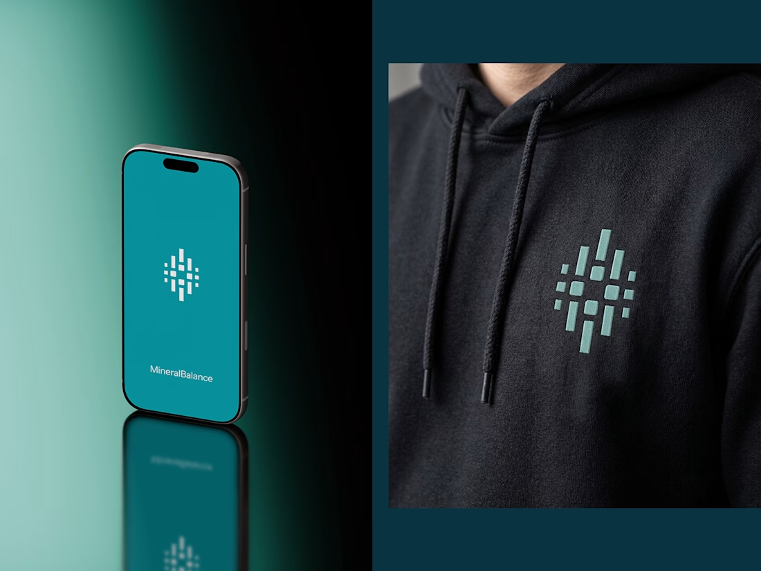
The rebrand gives MineralBalance a clearer and more distinctive visual foundation for its next stage of growth. The identity moves away from generic health and wellness conventions and creates a system that reflects what the brand is ultimately about: measuring, understanding, and finding balance.
brandingrebrandingbrandidentityBrand DesignPackaging DesignVisual DesignAdobe IllustratorAdobe Photoshop


The network for creativity
Join 1.25M professional creatives like you
Connect with clients, get discovered, and run your business 100% commission-free
Creatives on Contra have earned over $150M and we are just getting started







Related posts

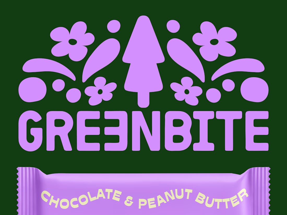
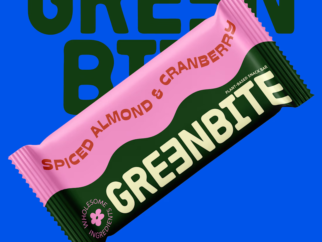
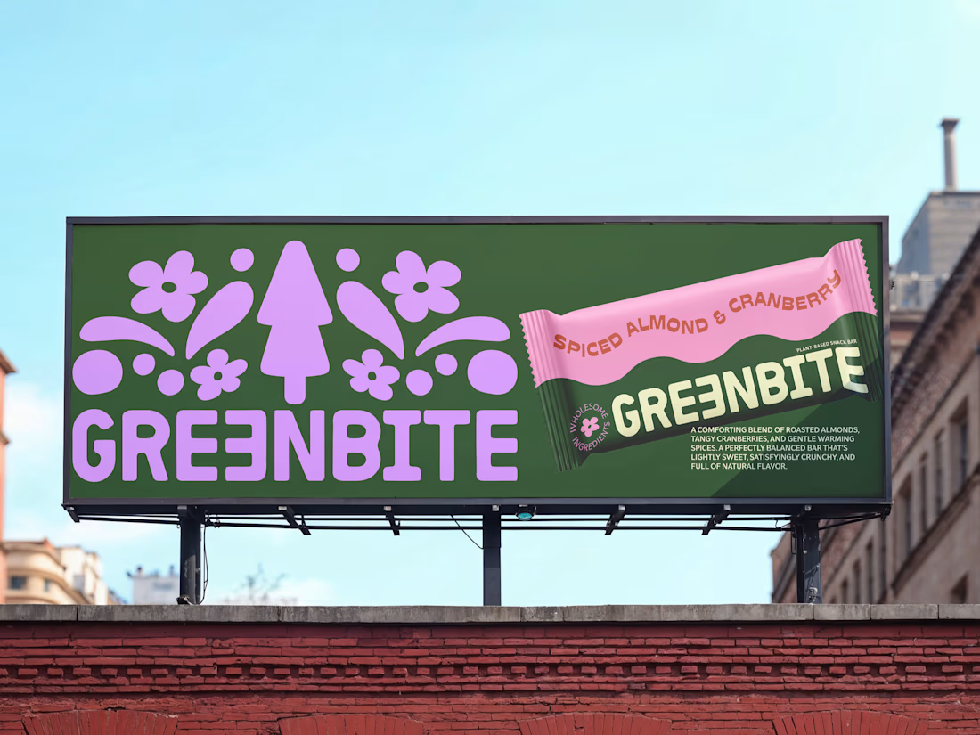
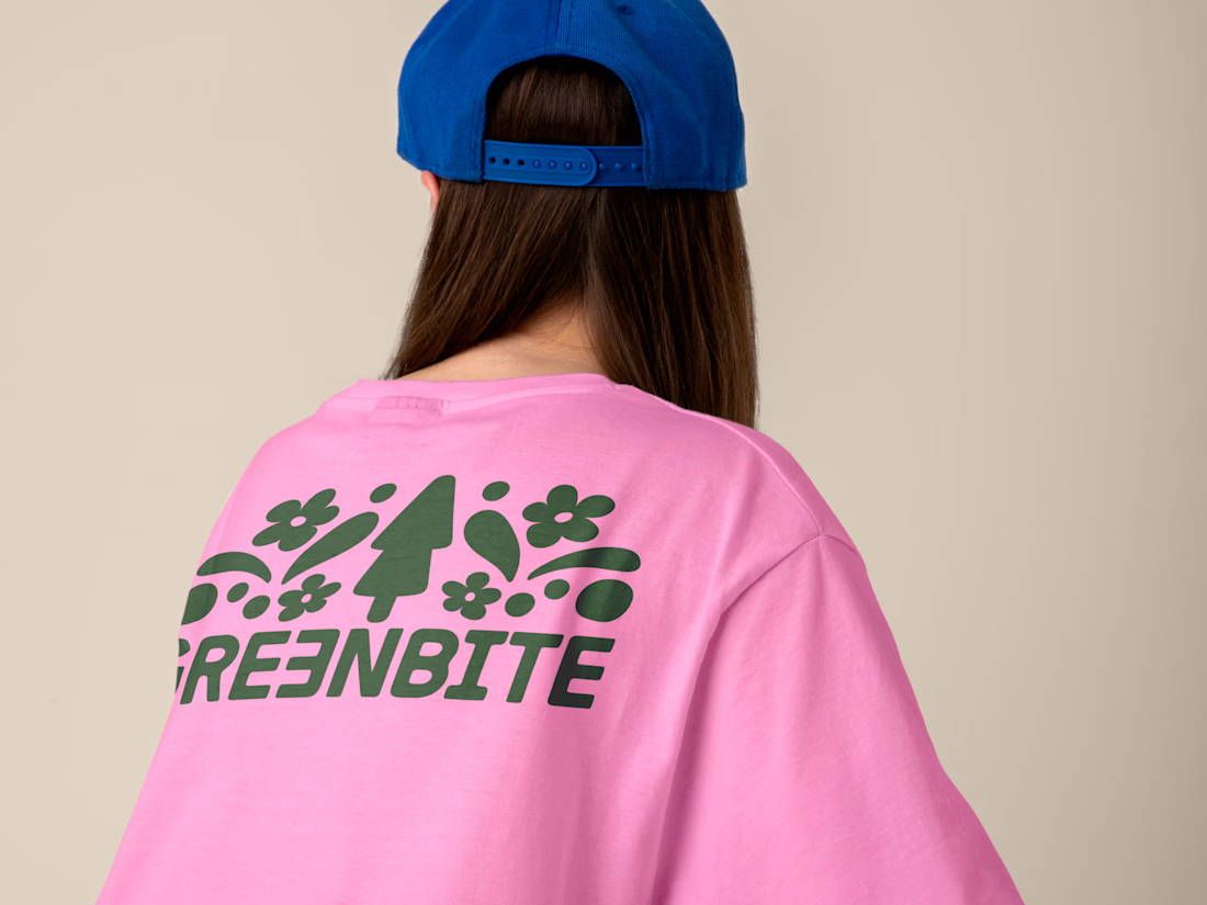
Brand identity and packaging design for Greenbite, a plant-based snack brand.
The goal was to blend organic typography with a vibrant, modern retro vibe to reflect "wholesome energy". Every element evokes natural flavors and feel good ingredients.

nice

Someone told me my work was strong on visuals, thin on systems.
So I built an entire aerial-hardware brand to prove them wrong — name, identity, product photography, two working motion specs. From one logo mark.
Website live here


Its incredible! Where is that "someone". 😆

Love at first grid!
A short 2D motion study taking the Amorado logo from its construction grid to the final mark. Animated entirely in Spline.
A fictional identity concept for Amorado.


