The network for creativity
Join 1.25M professional creatives like you
Connect with clients, get discovered, and run your business 100% commission-free
Creatives on Contra have earned over $150M and we are just getting started
Back to feedPost
Taste Test
I’ve designed two different homepage concepts for a high-performance Formula 1-inspired platform — each with a unique visual direction and user experience approach.
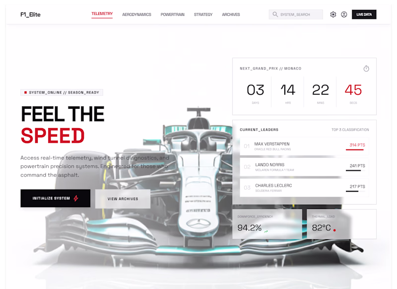
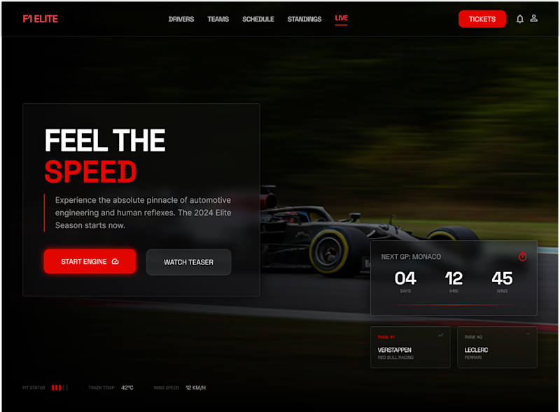
Concept 01: Dark, cinematic, and adrenaline-driven. Focused on speed, intensity, and a premium racing feel.
Concept 02: Light, minimal, and data-focused. Built around clarity, telemetry, and a modern system-driven interface.
Both designs aim to capture the essence of Formula 1 — but in completely different styles.
Now I need your opinion 👇
Which one feels better to you — Concept 1 or Concept 2? And why?
Your feedback will help refine the final direction.
3 voted
43%
4 voted
57%
7 votes
Closed
The network for creativity
Join 1.25M professional creatives like you
Connect with clients, get discovered, and run your business 100% commission-free
Creatives on Contra have earned over $150M and we are just getting started
Related posts
I started with the engraving. Not as a decoration, not as a retro nod, as the structural logic of the whole system. 19th-century cross-hatching has a quality that nothing digital can replicate: density, obsession, the feeling that every line was placed with intention. It maps perfectly to what deep research actually is. Thousands of micro-decisions, layered until something becomes true.
This is one of the coolest brand identity I've seen! I love the reasoning behind the illustration style!
Check it out
Redesigned a German telemedicine app in 5 weeks. The biggest design decision was restraint. Healthcare needs to feel trustworthy, not trendy. The UI is intentionally understated because when someone is booking a doctor or uploading their ID, the last thing they need is a flashy interface competing for attention. Boring done well is accessible to everyone.
Nice!
Trending
Claude
Claude has entered the design space. How are you using Claude Design?
Contra University
Learn from expert creatives how to earn more using next-gen AI tools.
creativeaiflow
Creative AI workflows are evolving. What tools do you use, and what are their strengths and weaknesses?
portfolioreview
The best portfolios tell a story, not just show a grid. Share yours for feedback.
freelancerlife
Freelancer life is wins, pivots, and everything in between. What’s yours right now?
