The network for creativity
Join 1.25M professional creatives like you
Connect with clients, get discovered, and run your business 100% commission-free
Creatives on Contra have earned over $150M and we are just getting started
Back to feedPost
Sometimes, all it takes is being in the right space, surrounded by the right energy, to remind you of what’s possible.
I joined Contra just a few weeks ago, and honestly, I didn’t expect to feel this inspired so quickly. There’s something about this community, the creativity, the people, and the opportunities that makes me feel like things are finally moving. 🌱
Ideas are turning into action. Connections are happening. New possibilities are opening up. And most importantly, I’m feeling more excited about what I’m building and where I’m going.
It’s still the beginning, but I can already feel the shift. And that’s what makes it so special. 🤍


Love this energy!!

Agreed. Contra really puts their best foot forward so it makes creatives want to do the same. Hope we keep that energy and welcome!

That line about the right space and the right energy really lands, Alexandra. There is something about this community that turns ideas into action faster than anywhere else.

Yes right 😍 I love that about Contra, it is really something special.
The network for creativity
Join 1.25M professional creatives like you
Connect with clients, get discovered, and run your business 100% commission-free
Creatives on Contra have earned over $150M and we are just getting started



Related posts

3 years on Contra. A lot of effort. Still trying to figure out what I'm missing
I've been on Contra for almost three years, and I want to be genuinely honest about my experience I've invested so much time into this platform I've built and published projects consistently shared my work engaged with other creatives participated in challenges applied to opportunities and tried different ways to get noticed
But despite all that effort I still haven't managed to turn my presence here into consistent paid work
I'm not writing this to complain about the platform I genuinely want to learn from people who've figured it out
For those of you who successfully get clients through Contra
What actually helped you land your first few clients?
How important is the Discovery Score in getting discovered by potential clients?
Are there strategies that made a real difference beyond posting projects and sending proposals?
If you were starting again today, what would you do differently?
I've reached a point where I'm seriously reconsidering how much time and money I should continue investing in the platform
I'd really appreciate honest advice especially from designers who've been through the same experience and eventually figured it out
Sometimes a piece of practical advice from someone who's been there can make all the difference.


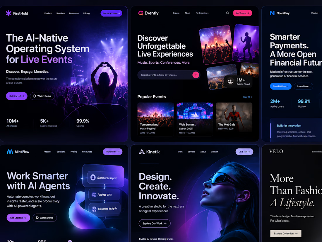
Developed a creative website concept for a modern software company, combining polished UI/UX with subtle animations and interactive elements.


Liquid Chromatic Gallery - an immersive, infinite visual experience powered by fluid motion with Framer Component
Scrolling becomes part of the visual experience, with smooth, liquid-like movement and prism chrome effect that gives the entire website a more dynamic, expressive and memorable feel.
✨✨✨


The liquid scroll effect is lovely.