The network for creativity
Join 1.25M professional creatives like you
Connect with clients, get discovered, and run your business 100% commission-free
Creatives on Contra have earned over $150M and we are just getting started
Back to feedPost

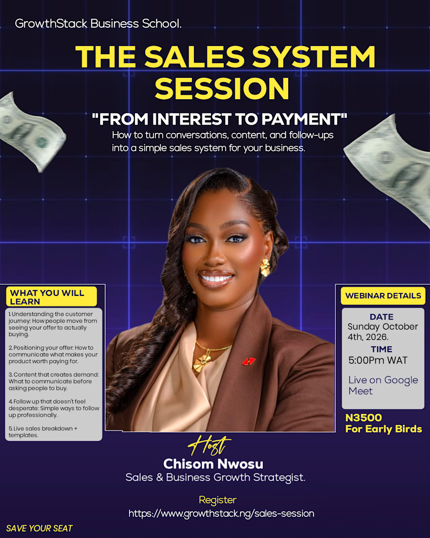
What if your content is getting views… but not sales? 👀
That was the problem I wanted this design to communicate.
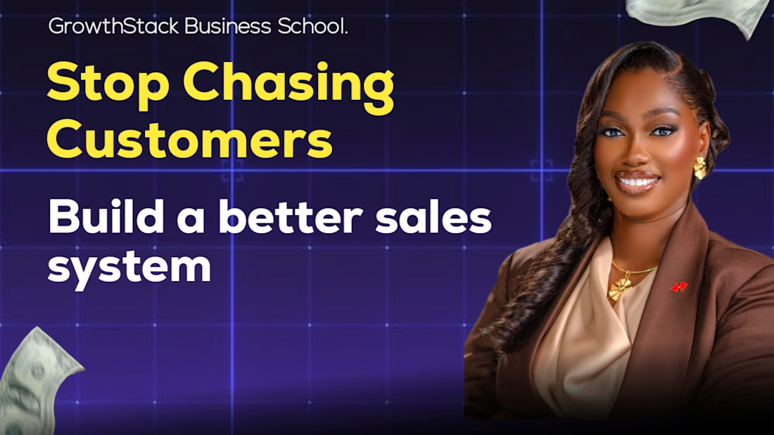
For this sales campaign, I didn't want to create another ordinary promotional flyer. I wanted the audience to recognize the problem first, understand the value of the session, and then feel motivated to take action.
So my design approach was:
Problem → Attention → Solution → Action.
I used strong yellow typography to highlight the key message, a dark tech-inspired background to create a modern business feel, and the speaker's image to build credibility and human connection.
The goal wasn't just to make the design attractive.
The goal was to make the message clear enough for the right audience to stop, understand, and care.
Design is communication. Design is problem-solving.
Am @Onyinye Juliet a brand designer
#graphicdesigner
#growth
#branding



The network for creativity
Join 1.25M professional creatives like you
Connect with clients, get discovered, and run your business 100% commission-free
Creatives on Contra have earned over $150M and we are just getting started





Related posts

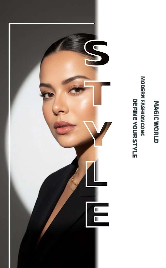
✨ Modern Fashion Poster Design - STYLE ✨
Designed a clean, high-fashion poster concept focusing on bold typography and minimalist aesthetics.
Concept: Modern Fashion | Define Your Style
Tool: Canva / Photoshop
Style: Luxury, Minimal, Editorial
Open to feedback and freelance work!
#GraphicDesign #PosterDesign #FashionDesign #Canva #ContraCommunity

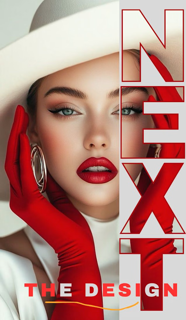
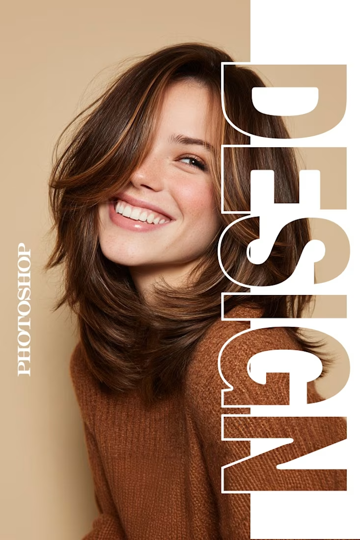
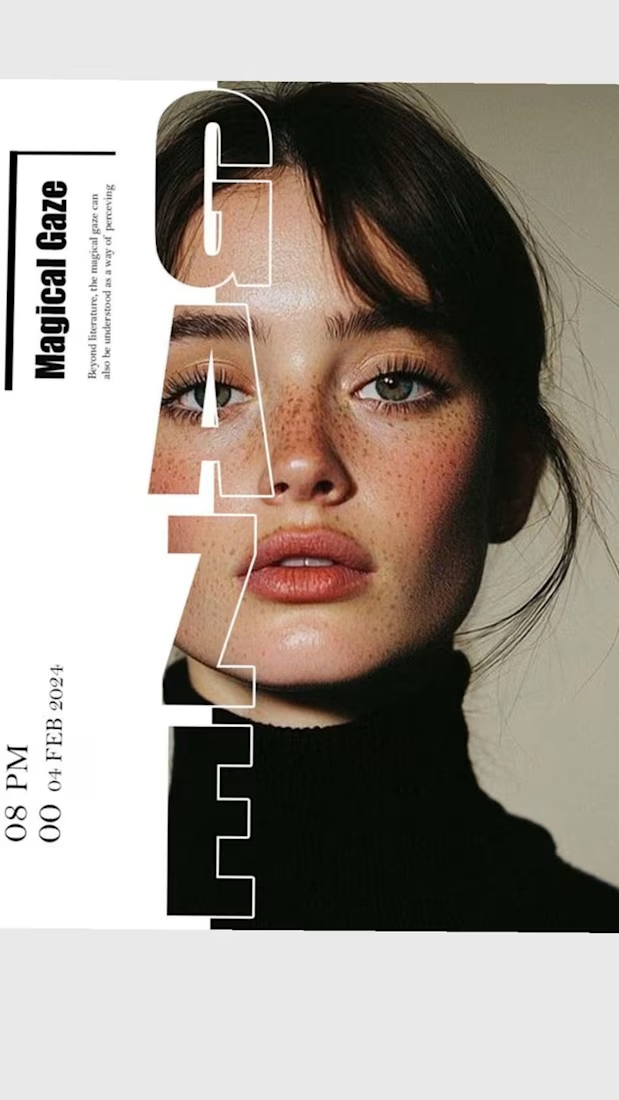

The way you let the bold type dominate the empty space really drives the luxury feel.

Brand identity work for WesoftAI




A closer look at Aureva, a Paris-based skincare brand I worked on.
The brief was to create a brand identity and packaging that felt premium yet approachable. I paired distinctive typography with soft earth tones, using color to give each product its own place within the range.
The full case study is now on my profile.
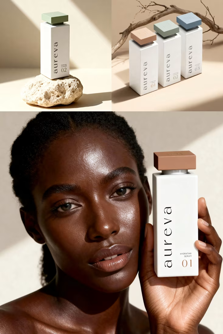

Premium branding