The network for creativity
Join 1.25M professional creatives like you
Connect with clients, get discovered, and run your business 100% commission-free
Creatives on Contra have earned over $150M and we are just getting started
Back to feedPost

Why Amazon A+ Content Is More Than Just Beautiful Images
Many authors and Amazon sellers spend weeks creating a great product, only to lose potential buyers because their product page doesn't tell a compelling story.
That's where Amazon A+ Content comes in.
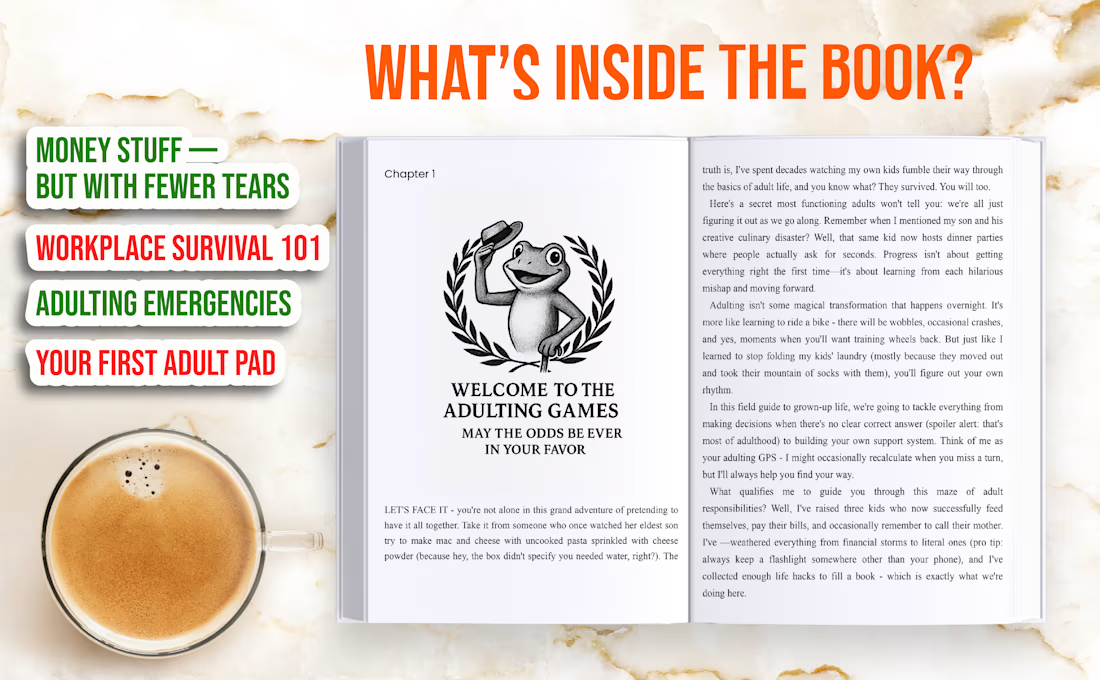
For this project, I designed a complete A+ Content layout that transforms a standard Amazon listing into an engaging brand experience.
What makes effective A+ Content?
✔ Visual storytelling
Instead of long paragraphs, strategic graphics and layouts communicate the book's value within seconds.
✔ Highlighting key benefits
Buyers don't just want to know what they're buying—they want to know how it helps them. Well-designed callouts quickly answer that question.
✔ Building trust
Professional branding, consistent typography, and clean layouts make a product look more credible and premium.
✔ Increasing buyer engagement
Interactive-looking layouts, lifestyle mockups, and chapter previews encourage shoppers to spend more time on the listing, helping improve purchase decisions.
Design Features Included:
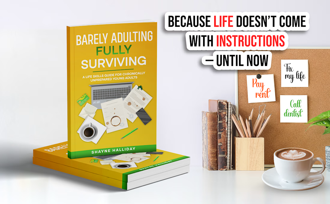
1Premium book mockups
Lifestyle scenes
Feature comparison sections
"What's Inside the Book?" preview
Benefit-focused headlines
Clean typography hierarchy
Brand-consistent color palette
Mobile-friendly visual layout
Why A+ Content Matters
Amazon shoppers make buying decisions in just a few seconds. Strong A+ Content helps your listing:
Explain your product clearly
Increase perceived value
Build customer confidence
Improve conversion rates
Strengthen your brand identity
Differentiate your book from competitors
Whether you're publishing a self-help book, children's book, cookbook, devotional, journal, or business guide, professionally designed A+ Content helps turn visitors into buyers.
I enjoy creating Amazon A+ Content that is not only visually appealing but also strategically designed to communicate value and enhance the customer shopping experience.

The network for creativity
Join 1.25M professional creatives like you
Connect with clients, get discovered, and run your business 100% commission-free
Creatives on Contra have earned over $150M and we are just getting started





Related posts

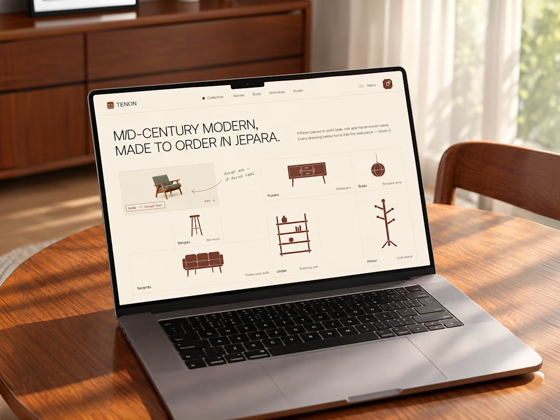
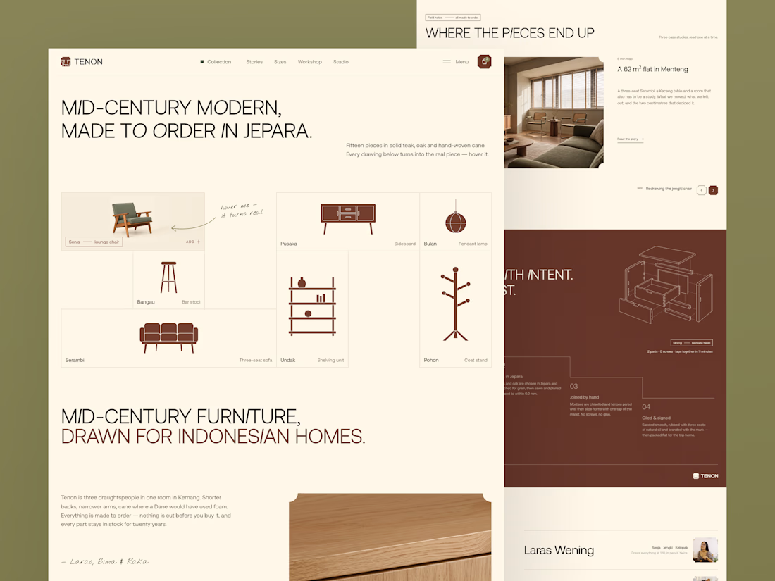
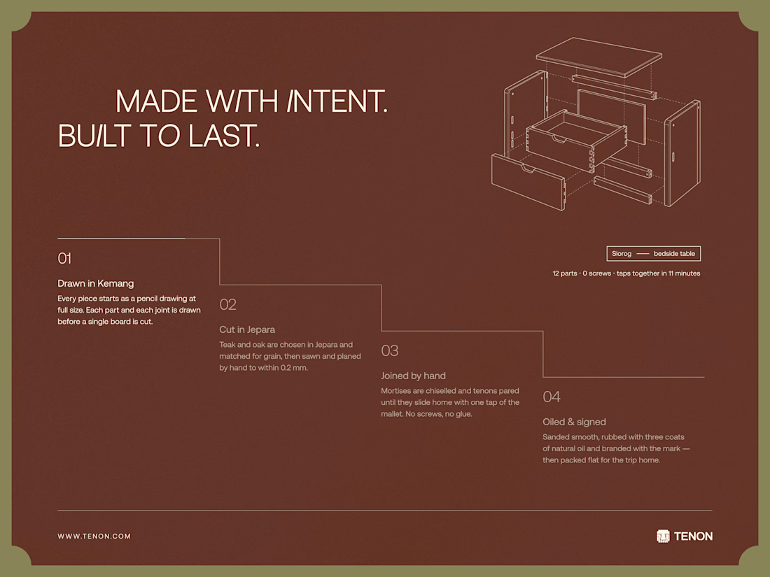
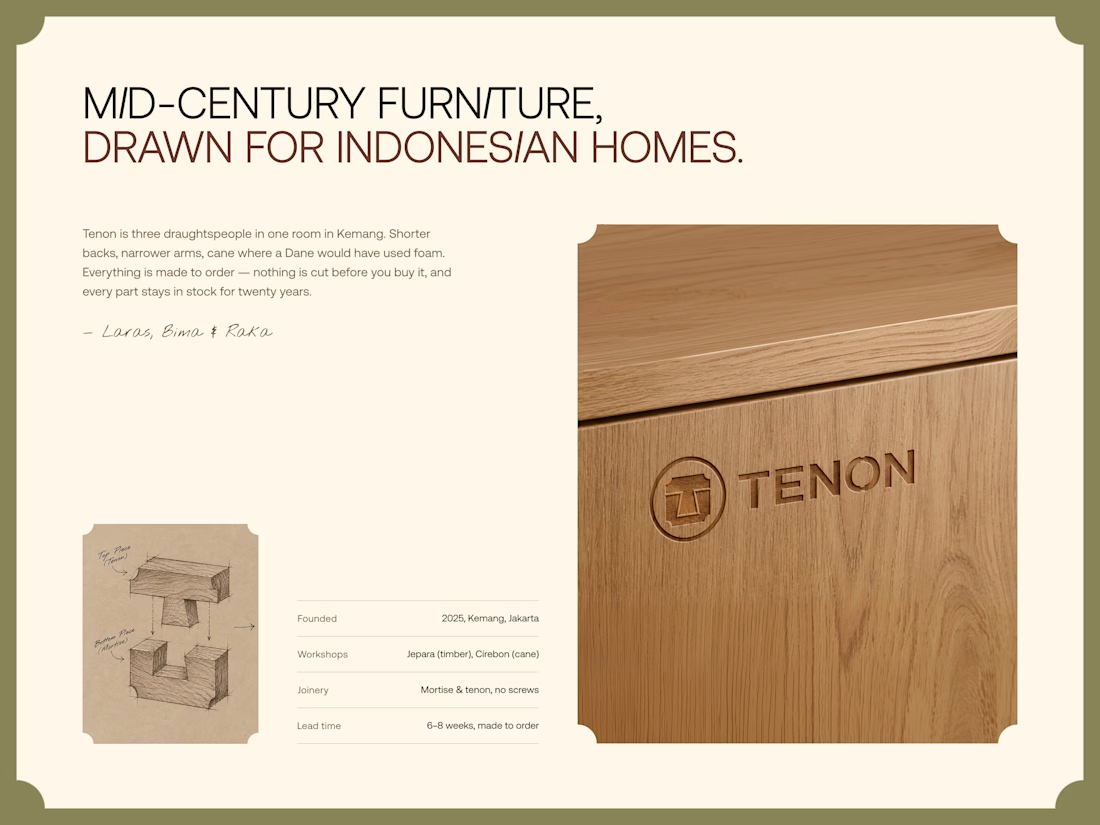
Tenon is Furniture Website Design
Exploring a digital experience for an Indonesian furniture brand inspired by mid-century modern design.
The website brings together product discovery, storytelling, and visual direction to make the digital experience feel as considered as the furniture itself.
Made to order. Made to last.



Love the color choice used




The soft highlight on the Messages bubble makes it feel like real glass. Which tool did you render these in?

A recent SaaS website design project done for a modern healthcare platform.

love the project. honestly this is impressive


