The network for creativity
Join 1.25M professional creatives like you
Connect with clients, get discovered, and run your business 100% commission-free
Creatives on Contra have earned over $150M and we are just getting started
Back to feedPost

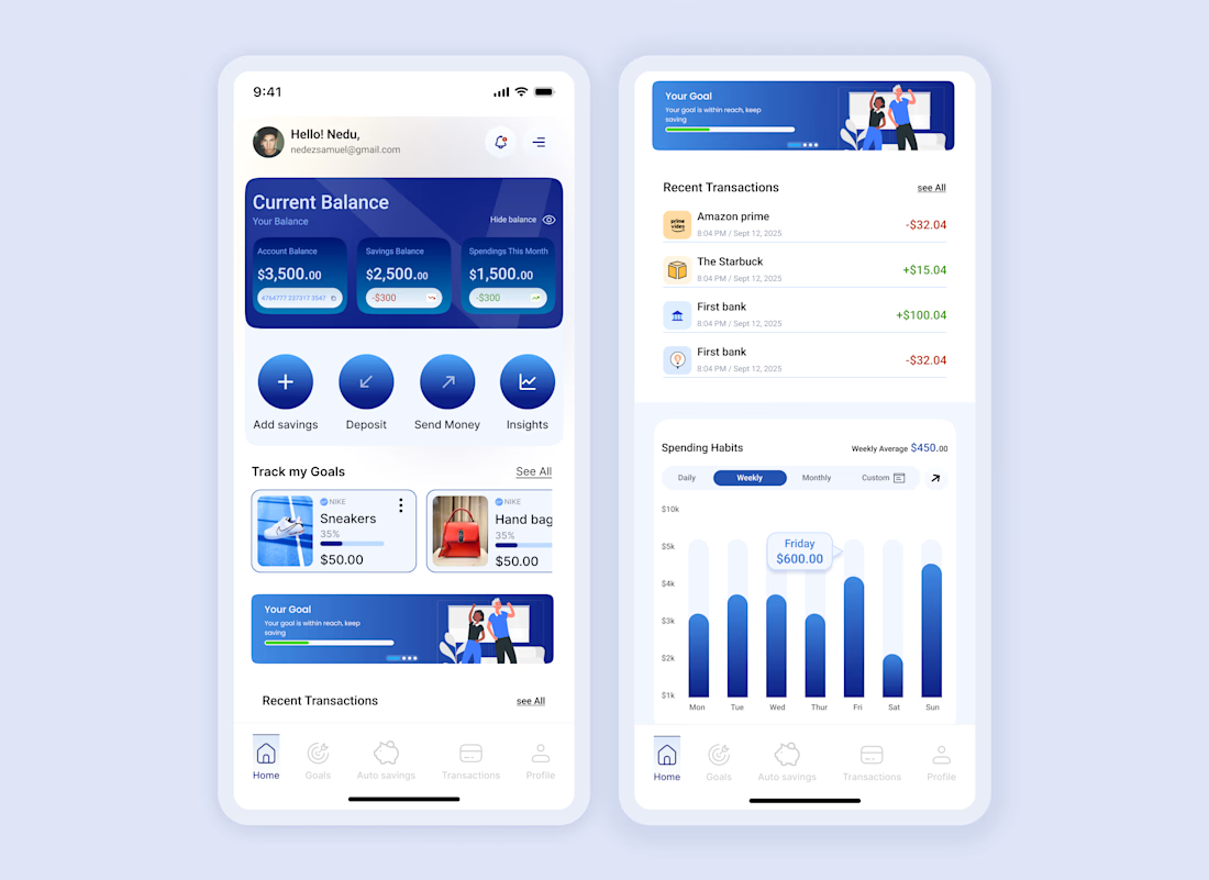
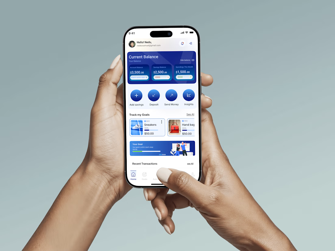
A fintech app design to help end users to track their financial goal easily and improve their saving habits



Nice work
The network for creativity
Join 1.25M professional creatives like you
Connect with clients, get discovered, and run your business 100% commission-free
Creatives on Contra have earned over $150M and we are just getting started





Related posts

Light or refined - which E-Bike product breakdown section design would you choose?
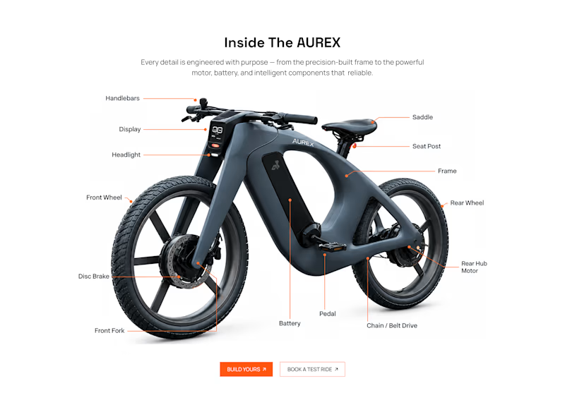
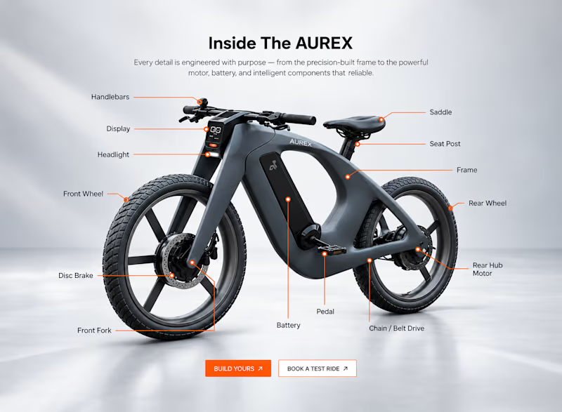
Two concepts for the same AUREX e-bike. Same product, same components, two different presentation styles:
A - Soft Studio: subtle gray depth, larger product focus, and a more premium visual feel.
B - Clean Minimal: bright white background, tighter spacing, and a more technical editorial layout.
Which direction feels stronger for a premium e-bike brand and why?

5 voted
31%
11 voted
69%
16 votes
Closed

A feels more premium to me. The soft gray depth and bigger product focus make the bike feel like something special. B is great for specs, but A sells the feeling

LumaClean was losing hours to manual quoting, scheduling, confirmations, rescheduling, and follow-up. LumaFlow turns that entire process into one automated booking workflow.
I built LumaFlow for a fictional Chicago cleaning business, LumaClean.
The problem was simple: too much back-and-forth just to turn a customer inquiry into a confirmed booking.
So I built a workflow that handles the journey:
→ Instant quote
→ Smart availability
→ $40 deposit
→ Booking confirmation
→ Reminders
→ Rescheduling
→ Booking recovery
The goal wasn't to build another pretty booking page.
It was to give the owner less work to do.


Vert nice

I designed and developed this interactive cyberpunk street food experience for Gǒng Sì Night Market.
Capturing the grit and rain-slicked atmosphere of a near-future Kowloon market meant balancing speculative world-building with tactile interaction design. Combining animated neon typography and canvas puddle reflections with an interactive stall menu, a retro terminal ordering flow, and a simulated thermal receipt printer gave the entire digital commissary an authentic, lived-in weight.😊 🔥


