The network for creativity
Join 1.25M professional creatives like you
Connect with clients, get discovered, and run your business 100% commission-free
Creatives on Contra have earned over $150M and we are just getting started
Back to feedPost

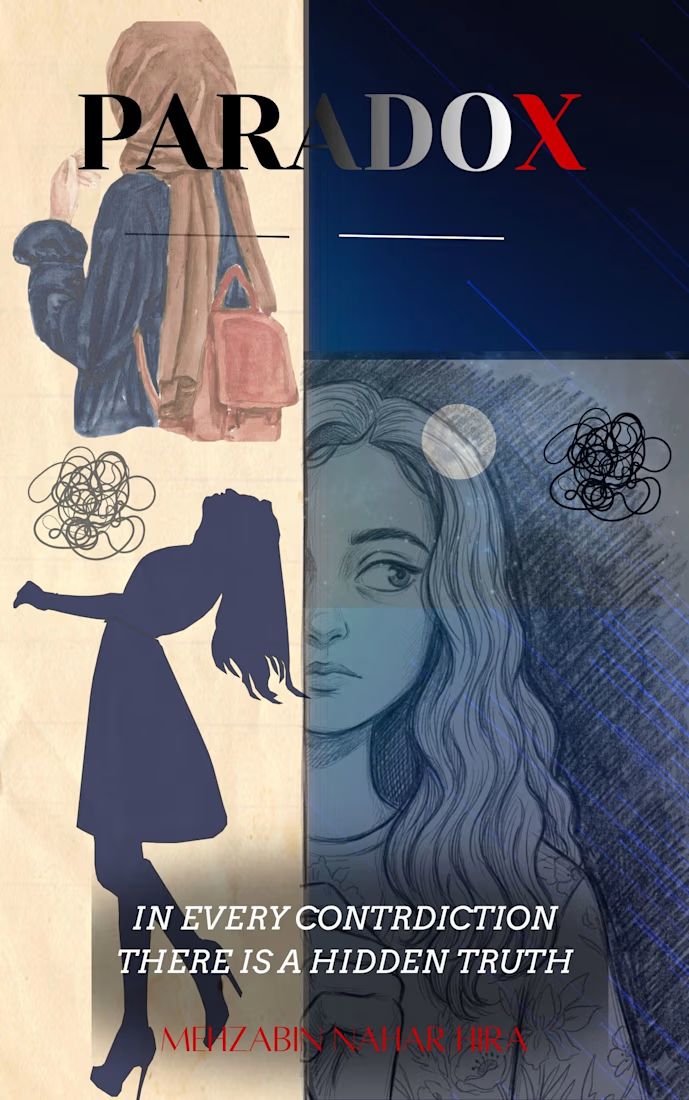
This is a highly compelling and well-structured book cover design. It effectively visualizes the core theme of a split identity, internal conflict, and the search for truth amid contradiction.
Visual Elements Breakdown
Symmetry and Contrast: The vertical split down the center uses a classic light-vs-dark motif. The left side feels grounded, textured, and paper-like. The right side introduces a moody, deep blue digital aesthetic and high-contrast charcoal pencil textures.
The Four Quadrants:
Top-Left: A clean, elegant illustration of a woman from behind wearing a hijab and a backpack. This suggests a journey, modesty, or an outward public identity.
Top-Right: A minimalist dark space that balances the layout, anchored by the word PARADOX. The subtle blue diagonal lines add a sense of movement or digital interference.
Bottom-Left: A sharp silhouette of a woman leaning back with a scribble or "mental tangle" cloud above her head. This perfectly captures a feeling of being overwhelmed, lost, or caught in an emotional loop.
Bottom-Right: A beautifully drawn sketch of a face looking off-center. Her expression is thoughtful, slightly melancholic, and deeply introspective.
Typography and Text Placement
Title: The font choice for PARADOX is strong, sharp, and clean. Having the final "X" colored in red is a fantastic touch. It immediately draws the eye, implies a missing variable, a crossroad, or a hidden danger, and breaks up the monotony of the black text.
Tagline: "In every contradiction there is a hidden truth" is perfectly centered across the divide. The serif typeface looks academic and serious. It acts as an anchor that bridges the silhouette and the portrait together. Note: There is a minor typo in the word "CONTRDICTION" (it is missing the "A" for CONTRADICTION), which you might want to adjust if this is a final print layout!
Author Name: Placing MEHZABIN NAHAR HIRA at the very bottom in a red font matches the "X" in the title beautifully, creating a satisfying visual symmetry across the vertical axis.
The cover does an exceptional job of looking both artistic and literary. It builds an immediate sense of mystery and psychological depth.
If you plan to refine this layout further, let me know:
Would you like suggestions on how to tweak the font styles or colors?
Should we experiment with changing the background textures to make the split more seamless?
Do you want help formatting this into a full front-and-back paperback cover spread?
Tell me what aspect you would like to explore next.


The network for creativity
Join 1.25M professional creatives like you
Connect with clients, get discovered, and run your business 100% commission-free
Creatives on Contra have earned over $150M and we are just getting started
Trending
retrofuturism
Share your favorite designs from the past exploring the distant future. Or your own take on the aesthetic 🚀
halftone
Dots. Texture. Grain. Let's see your designs using the halftone technique.

Midjourney
Creatives are showing off what they're making with Midjourney.
colorgrade
Video editors sound off: How do you enhance the mood of your video in color grading?
Related posts


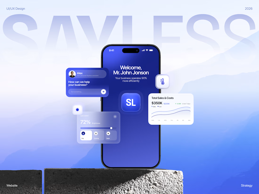
SAYLESS — website for an AI automation company
Full Behance case here 💙
Here's the thing about selling AI automation: nobody actually wants "workflow orchestration." People want fewer hours in the week and a smaller bill at the end of the month.
That's what made this one fun. Everyone in this space promises efficiency, and almost nobody shows what that means in money. So I built the whole site around making the value obvious before you even understand how the product works.
A few bits I'm happy with:
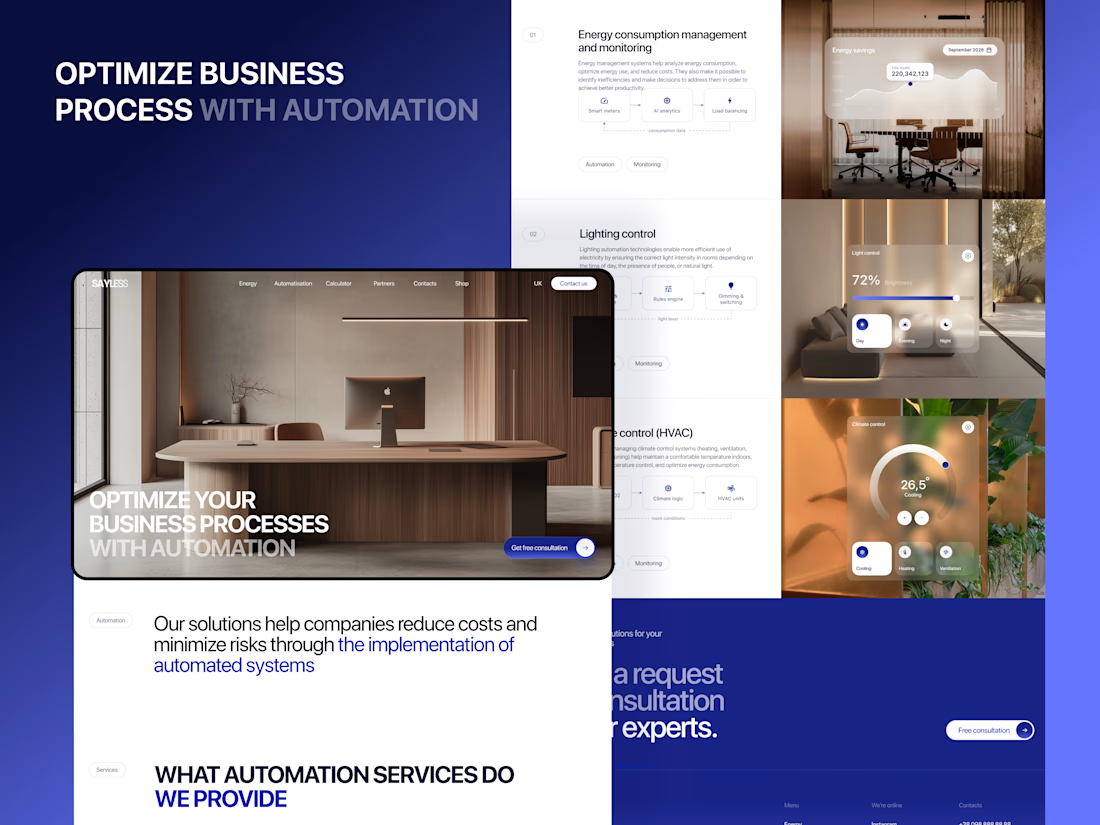
The cost calculator sits right on the page. No "contact us for a quote." You pick your own scope and the estimate moves as you go. Everyone in this category hides pricing, so just… showing it says a lot. Nice side effect — the wrong-fit leads filter themselves out before anyone gets on a call.
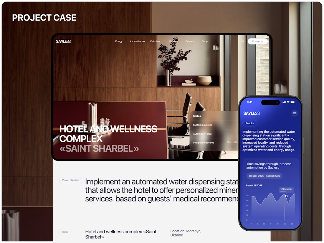
Before/after charts do the talking. Your current process next to the automated one. The gap between the two bars is basically the whole pitch, which means the copy gets to relax a bit.
Savings shown per month, not as a percentage. A percentage is trivia. A monthly number is money you're already spending on nothing.
Deep premium blue with warm, editorial photography. Every AI company reaches for the same cold neon gradients, so I went the other way. It ends up feeling like a premium consultancy rather than a dev tool — closer to whoever's actually approving the budget.
Design & UI/UX by me. Happy to walk anyone through the thinking.



It looks stunning 😍

Logistics Social Media Branding & Ad Design – B2B Brand Design
In the competitive B2B SaaS and supply chain landscape, having reliable technology isn't enough—you need a trusted, enterprise-grade brand presence that communicates security, speed, and efficiency at first glance.
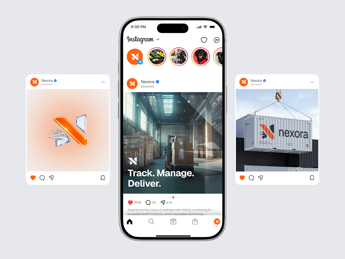
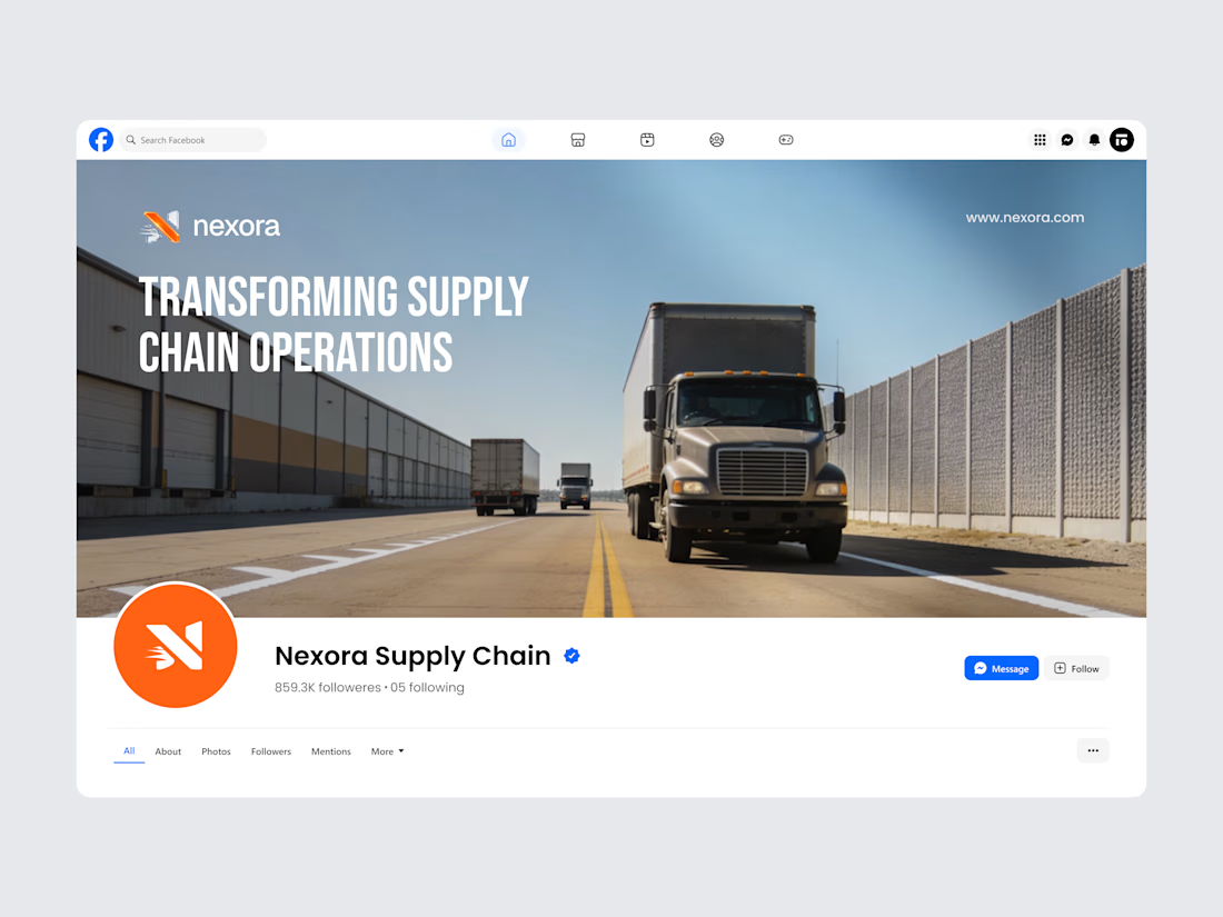
We designed this comprehensive Social Media Branding & Paid Ad Campaign for Nexora (Supply Chain Management Platform). Built for Logistics SaaS founders, FreightTech platforms, 3PL providers, and B2B supply chain startups, this visual system translates complex enterprise software into high-impact social media creatives, Facebook cover banners, and performance-driven Instagram ads.
The Problem We Solved
B2B logistics software often struggles with generic, clinical branding that fails to stand out on crowded social feeds. Outdated marketing visual assets fail to convey modern technological innovation, making customer acquisition through paid social campaigns expensive and low-converting.
This strategy combines bold 3D brand identity assets, high-contrast industrial photography (cargo ships, warehouses, semi-trucks), and punchy value-prop messaging ("Track. Manage. Deliver." and "Transforming Supply Chain Operations") to maximize ad click-through rates (CTR) and inbound enterprise lead quality.
Key Features & Branding Highlights
3D Brand Mark Visuals: Dynamic, multi-layered 3D logo iconography giving the brand a modern, high-tech SaaS feel across social media feeds.
Performance-Driven Social Ad Carousels: Optimized Instagram ad layouts highlighting core software benefits, high engagement metrics, and clear brand placement.
Cohesive Multi-Platform Presence: Custom-designed corporate Facebook banner headers showcasing fleet operations paired with official verification styling to build instant authority.
Industrial Imagery Strategy: Strategic blend of logistics photography (container shipping, modern warehousing, heavy transport) styled with corporate orange and dark navy color palettes.
Building a Supply Chain, Logistics, or B2B SaaS Platform?
Whether you're an ambitious founder launching a freight dispatch platform, scaling a fleet management tool, or building next-generation supply chain visibility software, we craft strategic brand identities and social marketing assets that drive investor interest and enterprise customer growth.

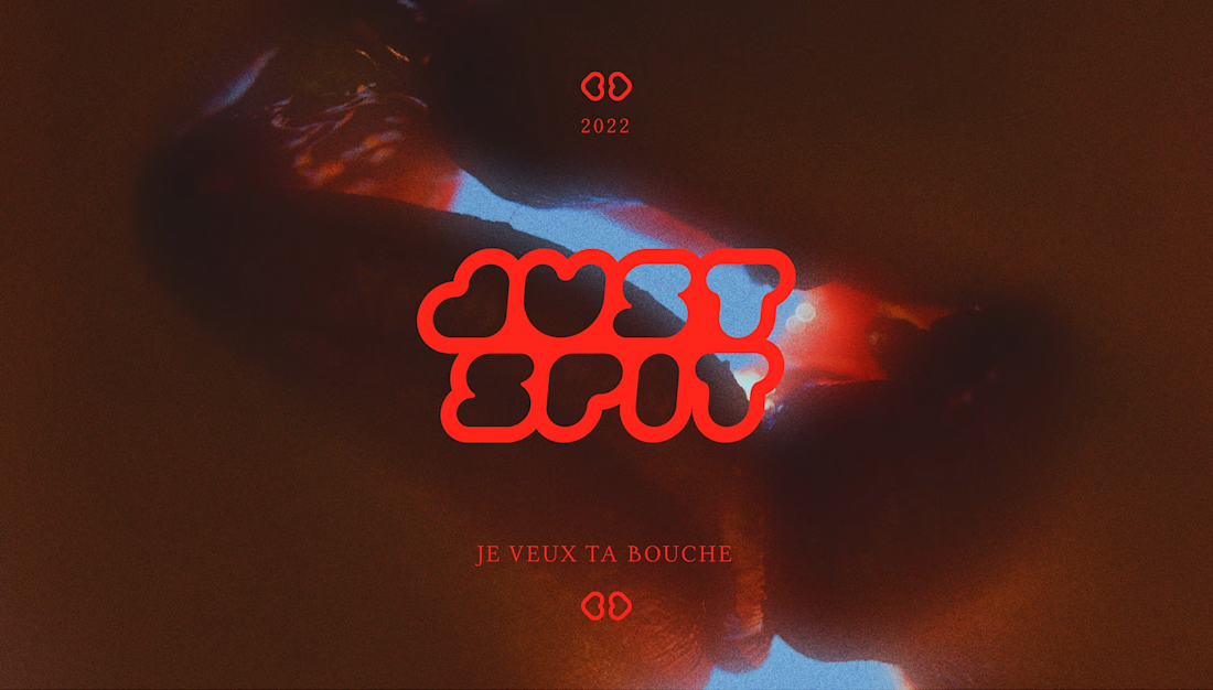
What if the singer Angèle had her own mouthwash brand, directly inspired by her artistic universe? This is the idea I was led to explore through this project 😊
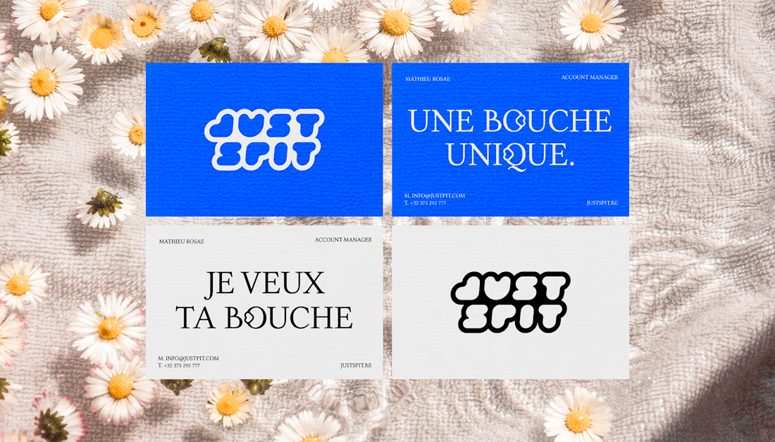
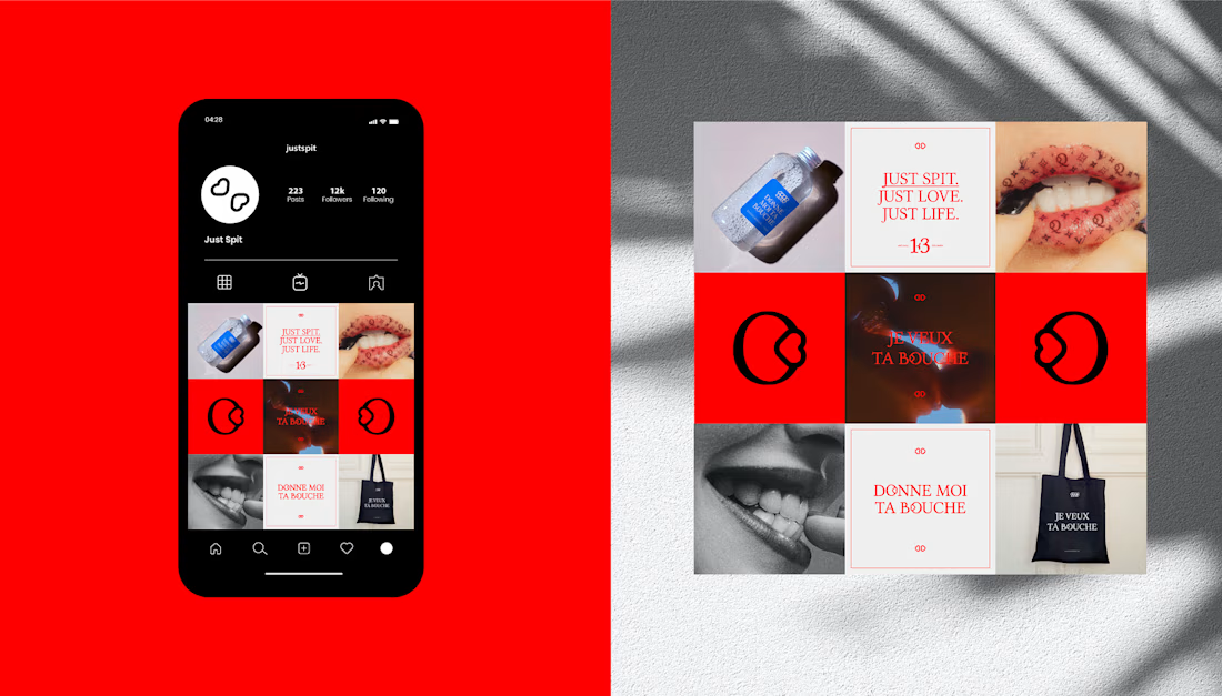

obsessed with both takes on this, though those reds & the pop of blue call to me so strongly!