The network for creativity
Join 1.25M professional creatives like you
Connect with clients, get discovered, and run your business 100% commission-free
Creatives on Contra have earned over $150M and we are just getting started
Back to feedPost
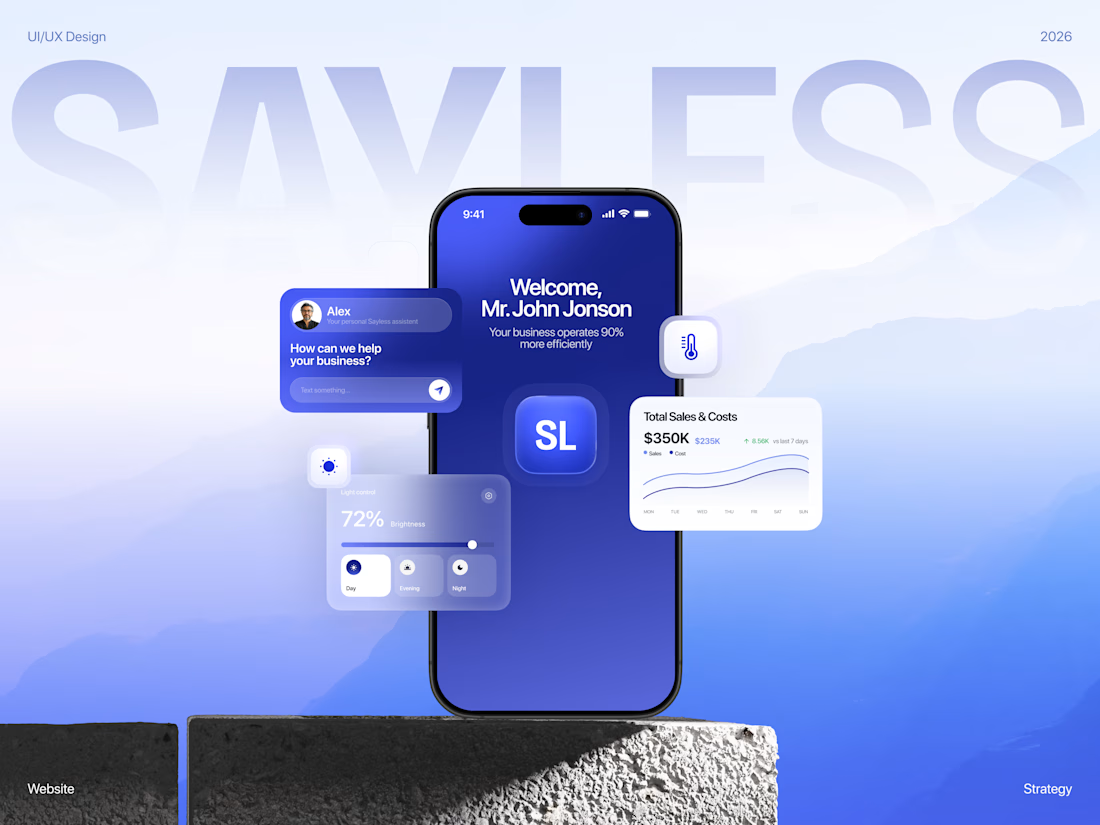
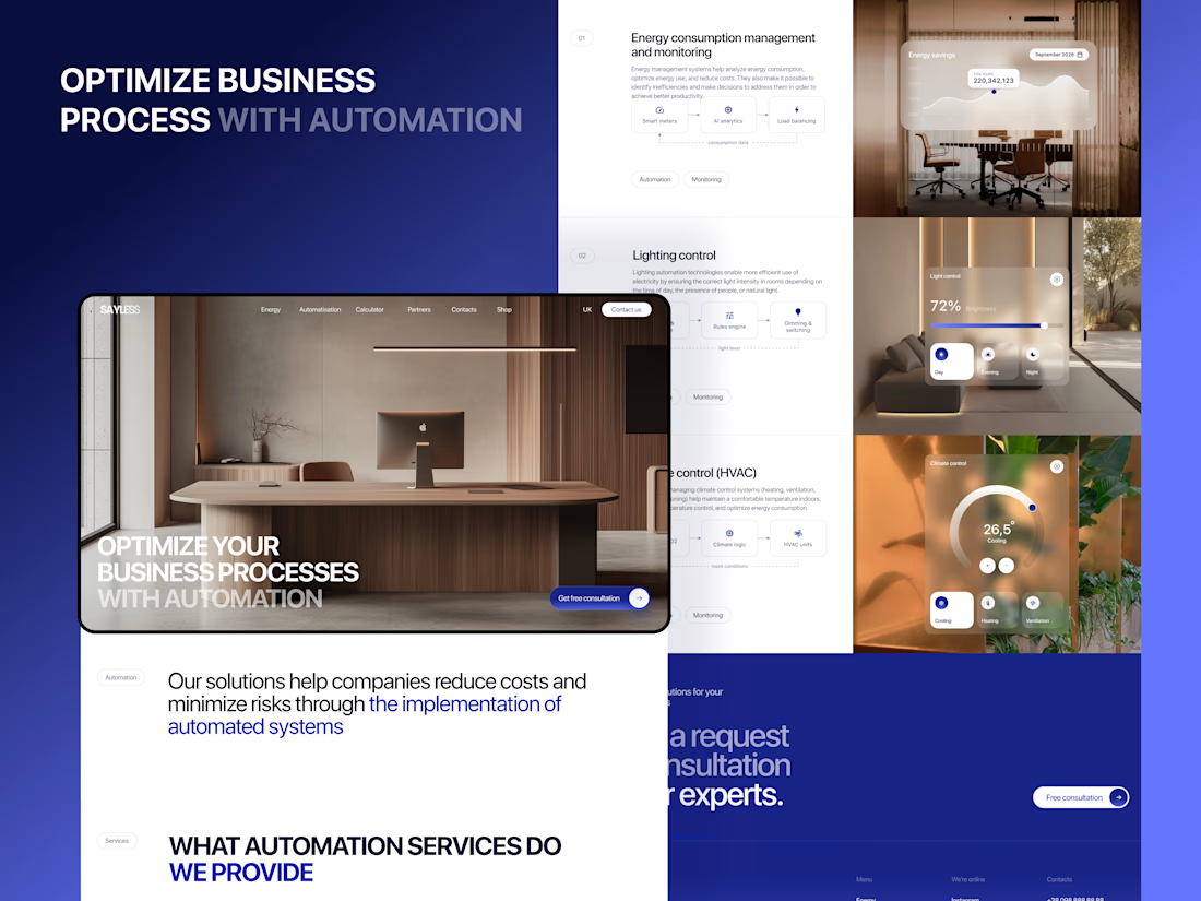
SAYLESS — website for an AI automation company
Full Behance case here 💙
Here's the thing about selling AI automation: nobody actually wants "workflow orchestration." People want fewer hours in the week and a smaller bill at the end of the month.
That's what made this one fun. Everyone in this space promises efficiency, and almost nobody shows what that means in money. So I built the whole site around making the value obvious before you even understand how the product works.
A few bits I'm happy with:
The cost calculator sits right on the page. No "contact us for a quote." You pick your own scope and the estimate moves as you go. Everyone in this category hides pricing, so just… showing it says a lot. Nice side effect — the wrong-fit leads filter themselves out before anyone gets on a call.
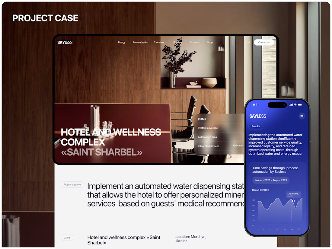
Before/after charts do the talking. Your current process next to the automated one. The gap between the two bars is basically the whole pitch, which means the copy gets to relax a bit.
Savings shown per month, not as a percentage. A percentage is trivia. A monthly number is money you're already spending on nothing.
Deep premium blue with warm, editorial photography. Every AI company reaches for the same cold neon gradients, so I went the other way. It ends up feeling like a premium consultancy rather than a dev tool — closer to whoever's actually approving the budget.
Design & UI/UX by me. Happy to walk anyone through the thinking.



It looks stunning 😍


Thank you! 😍

An interesting idea and a brilliant visualisation 💯
Thank you so much! 😊

Super cool work!!
Thank you 😊

Great concept kateryna

Amazing project🔥
Thanks 😊

Love the style! ⭐️
Thank you 😊

brilliant work, that first image is so sleek. a winner by me, easy.
Thank you so much 😍 😊

Nice working keep it up


the "nobody wants workflow orchestration" line is so right

Love this strategy and execution! clean and premium work! Fantastic 🔥

What made you confident enough to put the cost calculator right on the page? That feels like the riskiest call here, most agencies I know are terrified of scaring off leads with a number before a conversation, but I love that you leaned into it instead.


Interesting, how much time did you spend on this?

Nice wrok, nicely structured and easy to read. Was your inspiration the Apple design system?

The monthly savings number instead of a percentage is such a sharp call, a percentage really is trivia when someone's trying to feel the change rather than calculate it. I'd guess that's also what gets a screenshot forwarded to whoever controls the budget. Does it land as...

This is genuinely impressive and inspiring!

Great work

This is strong B2B positioning: outcomes like saved hours and lower costs are much easier to understand than workflow orchestration. The product story feels clear before the details even begin.


Nice design !


Really clean!

Awesome work


This is really good work

Really love the overall visual direction.

Great design

Lovely!


Fantastic work!

"fewer hours in the week and a smaller bill at the end of the month" - that is so true!

Great job Kateryna :) Really love the color palette!

Top notch work
The network for creativity
Join 1.25M professional creatives like you
Connect with clients, get discovered, and run your business 100% commission-free
Creatives on Contra have earned over $150M and we are just getting started









Related posts

A little peek at the brand work we did for Elio Mortgage.
A warm, approachable identity full of warm vibrant colors paired with soft sun rising inspired gradients, inner glows and custom illustrations & more. Loved this direction!
Full case study coming soon, from process to final identity.
Plenty of logo explorations to share too!


That color palette takes the whole identity to a different level!! I loove it.


Figma Football
An unofficial football concept inspired by Figma and its visual language.
The ball was created using a custom 3D generator I built in ChatGPT, with animated interface icons and graphics developed with Claude.
Part design experiment, part exploration of how custom AI-powered tools can become part of the creative process.

The interface icons translate surprisingly well into a football identity.