The network for creativity
Join 1.25M professional creatives like you
Connect with clients, get discovered, and run your business 100% commission-free
Creatives on Contra have earned over $150M and we are just getting started
Back to feedPost

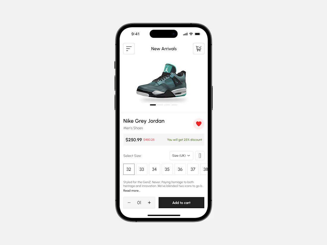
E-commerce App UI Exploration - Product Details Screen
A clean, modern product page designed to make online shopping feel simple, engaging, and effortless.
From high-quality product visuals and clear pricing to size selection, wishlist actions, and a prominent Add to Cart button, every element is designed to help users make confident purchase decisions.
✨ Minimal product presentation
🛍️ Intuitive shopping experience
❤️ Quick wishlist interaction
📏 Easy size selection
💰 Clear pricing and discount visibility
🛒 Seamless add-to-cart experience
Great e-commerce UX is about more than showcasing products, it’s about removing friction between discovery and purchase.
What do you think of this product page design?
#UIDesign #UXDesign #EcommerceDesign #MobileAppDesign #ProductDesign #Figma #ShoppingApp #UIExploration

The network for creativity
Join 1.25M professional creatives like you
Connect with clients, get discovered, and run your business 100% commission-free
Creatives on Contra have earned over $150M and we are just getting started






Related posts


Fresh case study 🚀🚀🚀
Brand identity for Peak, an all-in-one website builder for WordPress that I design and build. A four-letter mark, a warm paper-and-ember palette and one system that runs from the favicon to the packaging.

A four-letter mark that has to hold from favicon to packaging is a tough constraint. Did you draw one letterform first and build the other three from it, or design them together as a set from the start?

From the cover to what’s inside 👀
Thank you to everyone who voted in my cover test. This time, I’m trying two short previews of DCS 654: my library of 654 dessert-inspired colors and matching textures, with ready-made palettes for your own design work.
Which video makes you more curious to explore the library: A or B?
And what made you choose that one?
You can take a closer look here: https://dcs.mariya.design/
36 voted
61%
23 voted
39%
59 votes
Closed


I’d pick B. It makes the colors and textures feel more engaging and makes me want to explore the full library.

Built something that isn’t client work for a change.
Flowkidz. Short games that teach kids design, websites, AI, code and internet safety.


