The network for creativity
Join 1.25M professional creatives like you
Connect with clients, get discovered, and run your business 100% commission-free
Creatives on Contra have earned over $150M and we are just getting started
Back to feedPost

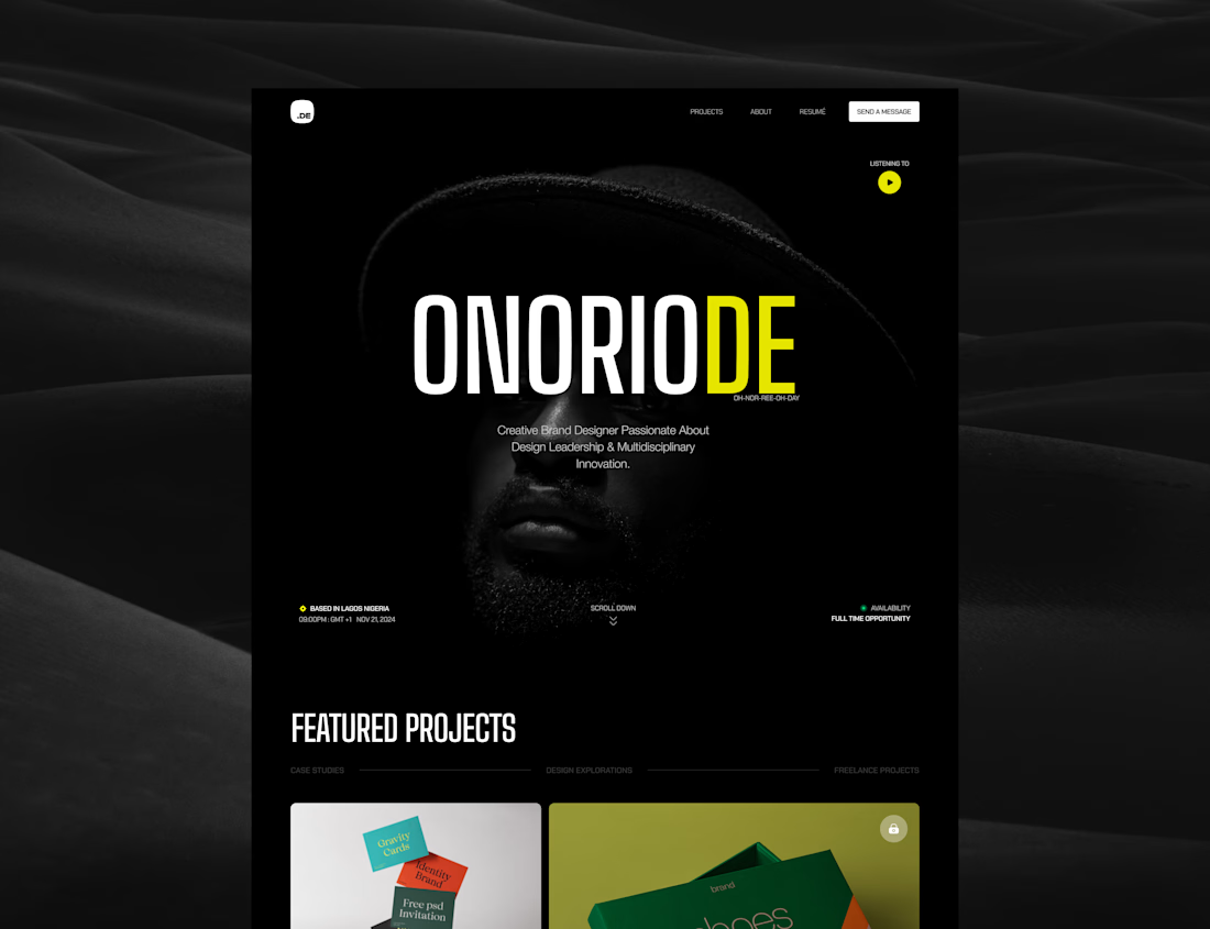
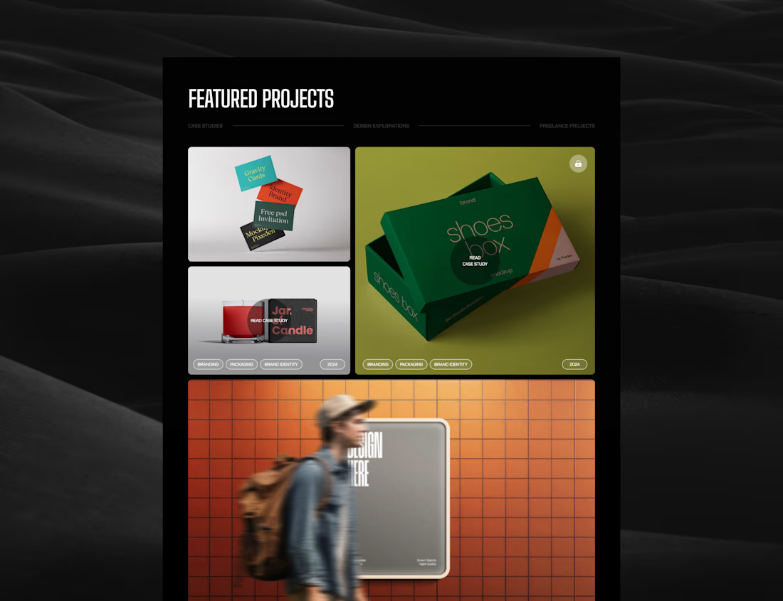
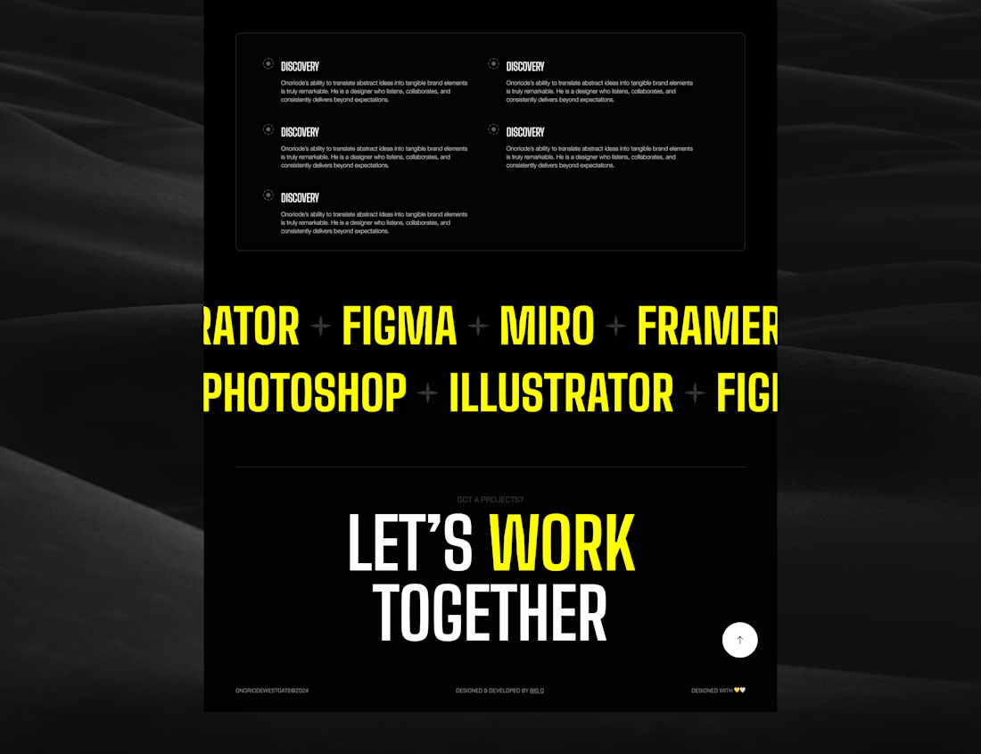
Portfolio Website for a Brand Designer
Challenge: A brand designer needed a portfolio website that felt deeply aligned with his personality, values, and creative direction, minimal, black & white, and intentionally expressive without feeling over-designed.
Approach: Designed a stripped-back digital experience focused on contrast, typography, and spacing to reflect his creative philosophy while ensuring the work remained the central focus.
Outcome: Delivered a portfolio that the client felt accurately represented his identity and creative vision, aligning closely with how he wanted to be perceived by clients and employers.


The network for creativity
Join 1.25M professional creatives like you
Connect with clients, get discovered, and run your business 100% commission-free
Creatives on Contra have earned over $150M and we are just getting started





Related posts


Twenty-five years of credits, finally on a website that looks the part.
Just take a look at what kind of web we create ✨👇
Reflection of the brand history with taste, precision, and premium branding.
Scroll responsibly: https://productionportugal.com 😉🔥


Wow! Nice setup 🎥

I wanted to make a photography website that felt more like an experience than a portfolio.
So I built CINÉRA — a cinematic photography studio website with a 3D gallery, interactive archive, real availability, and a complete booking flow.
You can explore the work, pick a date and time, add your shoot details, and get booked without the usual back-and-forth.
On the studio side, there’s a dashboard to manage bookings and inquiries, plus automatic booking confirmations to take a bit of the repetitive work off the photographer’s plate.
This was built for an appointment-based business challenge, and honestly, I had way too much fun making it.


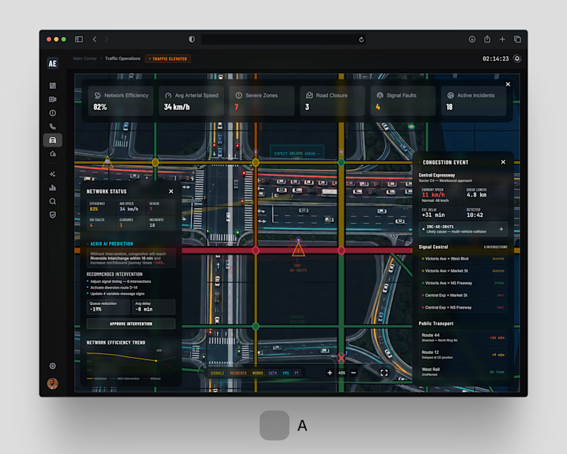
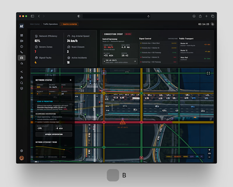
One problem. Two design directions. Which would you choose?
For AEGIS / 001.05 . Traffic Operations, we explored two approaches to the same challenge: helping city operators understand congestion, incidents and network-wide disruptions without overwhelming them with information.
Both solve the same operational problem. Different approaches to hierarchy and interaction.
If you were behind the control desk . Option A or Option B?
#smartcities #enterpriseux #productdesign #digitaltransformation #jemirae


1 voted
33%
2 voted
67%
3 votes
Closed