The network for creativity
Join 1.25M professional creatives like you
Connect with clients, get discovered, and run your business 100% commission-free
Creatives on Contra have earned over $150M and we are just getting started
Back to feedPost
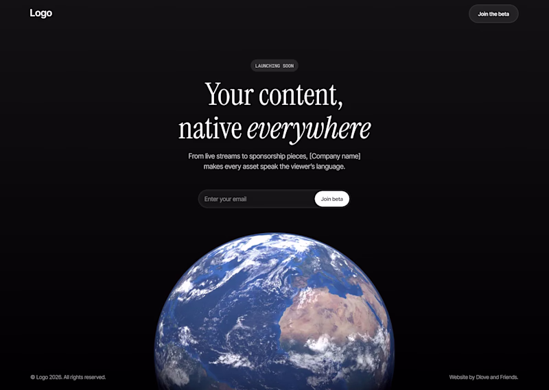
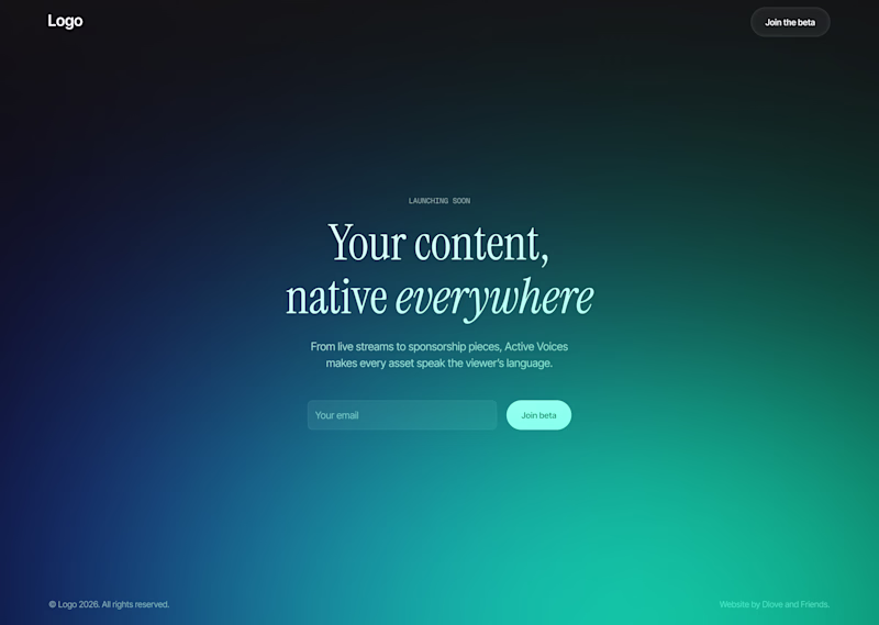
Taste Test
Rejected hero section concepts for a current project.
Which one looks better?
110 voted
70%
47 voted
30%
157 votes
Closed
Both are clean, but A reads faster and feels more intentional. The composition guides the eye better.
Thanks! I do really like the composition as well it feels very clean and simple
Love the first one!
Thanks! That's my choice as well
Thank you so much!!
Of course haha. It is for a translation platform so pitching the entire planet is kind of the idea. But B is definitely better for a more branded and specific identity!
B feels more scalable to me. I can imagine features, screenshots, and content living under it without fighting the hero
Interesting insight!
OptionA🔥
A looks awesome David 🙌
Thanks!
The gradient is pretty awesome haha. They both have their strengths I think
Both look good - i'm not sure why they got rejected do you have any reason? 🤔
The client decided on a look closer to the Option B, but with different colors and layout. I believe it just aligns with their vision more
The first concepts doesn't have a branded feel, maybe the second one is inttroducing the company colors which is more ideal to built a user's trust.
Interesting insight! I do agree the gradients do create a more branded feel. Maybe there would be a way to combine them both
Spot on!
As a webflow expert, I think first could more better and energetic if you add spline or gsap animation.
That's a cool idea! Maybe the earth rotating on scroll or by itself like that would be really cool
I appreciate your opinion.
It looks good awesome!!
I prefer A
I would go for B, because when it comes to marketing, B actually seems professional
The network for creativity
Join 1.25M professional creatives like you
Connect with clients, get discovered, and run your business 100% commission-free
Creatives on Contra have earned over $150M and we are just getting started
Trending
Claude
Claude has entered the design space. How are you using Claude Design?
Contra University
Learn from expert creatives how to earn more using next-gen AI tools.
creativeaiflow
Creative AI workflows are evolving. What tools do you use, and what are their strengths and weaknesses?
portfolioreview
The best portfolios tell a story, not just show a grid. Share yours for feedback.
freelancerlife
Freelancer life is wins, pivots, and everything in between. What’s yours right now?