The network for creativity
Join 1.25M professional creatives like you
Connect with clients, get discovered, and run your business 100% commission-free
Creatives on Contra have earned over $150M and we are just getting started
Back to feedPost
Taste Test
Which one do you prefer?
68 voted
52%
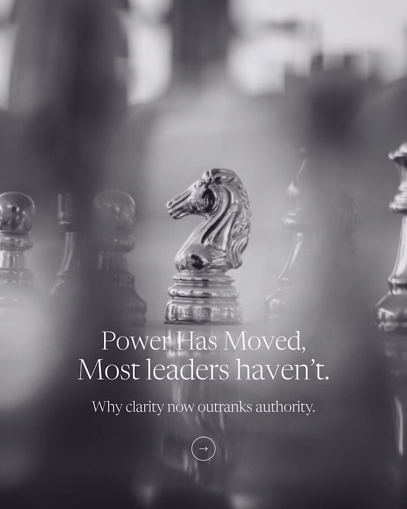
62 voted
48%
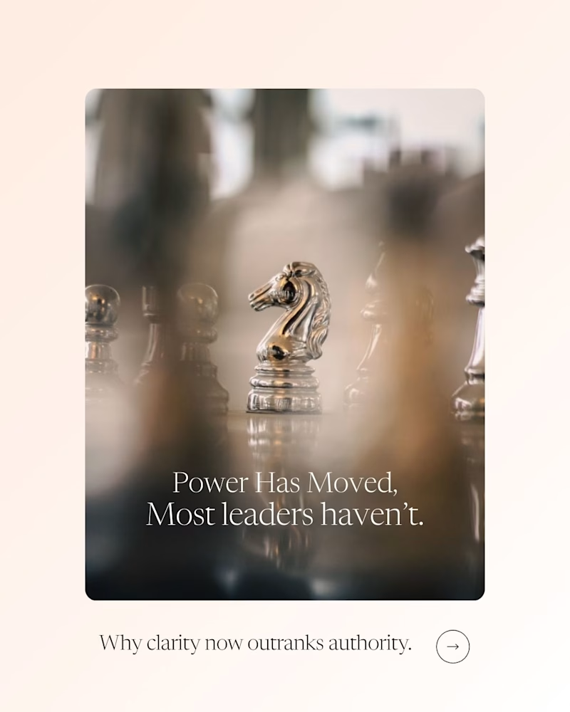
130 votes
Closed
I prefer the color one between these versions, but the bw version can challenge the color one if it was given slightly higher brightness and contrast. Regardless, great work
I would try that, Thank you
Totally agree. A bit more brightness and contrast would definitely help the B&W compete — though the warmth adds a layer of realism that really supports the message.
Vintage one looks much better.
Vintage seems perfect Fizza 🙌
Gives premium feel 🔥
i prefer With color
Love the b&w version but a darker bg behind the text would elevate this!
am going for A cara
I liked the one with colour. It looks elegant. The one on the right looks more luxurious.
with color is best😍
I’d go with option B. The higher contrast between text and image improves readability, and the color treatment helps draw focus to the horse as the visual anchor. This allows the image to carry more weight, with the message supporting it rather than competing for attention.
vintage
Vote for color version.
The soft tones make it feel more real and present — like you’re in the moment, not observing it from afar. The B&W one feels a bit more passive and distant, while the color adds warmth and emotional pull.
i prefer the vintage one, looks dope
As much as I love black and white. The color seems to give this a better presence.
Both look good. Vintage for a little younger, savage, Gen-Z type of audience. The one with color might impress the audience more that is mature. What you say, Fizza?
Although, I liked the "pure silver" look in the vintage one, I think color adds very much to the look 👍
The Vintage works for me
Would just work on the contrast of the overall image, darker blacks and possibly slightly bolder text.
great stuff though
Both versions are great but With color gives a more elevated feel 👍🏼
I prefer the coloured one
vintage looks better, gives more premium vibe
WOAHH... IMO with color
The network for creativity
Join 1.25M professional creatives like you
Connect with clients, get discovered, and run your business 100% commission-free
Creatives on Contra have earned over $150M and we are just getting started
Trending
Claude
Claude has entered the design space. How are you using Claude Design?
Contra University
Learn from expert creatives how to earn more using next-gen AI tools.
fifaworldcup2026
The World Cup is here and the whole world's watching. How are you designing for the world stage?
creativeaiflow
Creative AI workflows are evolving. What tools do you use, and what are their strengths and weaknesses?
freelancerlife
Freelancer life is wins, pivots, and everything in between. What’s yours right now?