The network for creativity
Join 1.25M professional creatives like you
Connect with clients, get discovered, and run your business 100% commission-free
Creatives on Contra have earned over $150M and we are just getting started
Back to feedPost
Taste Test
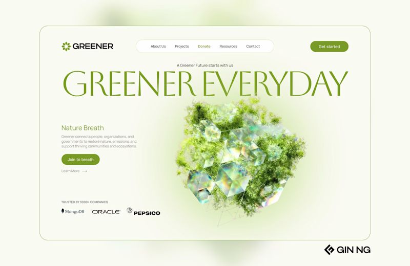
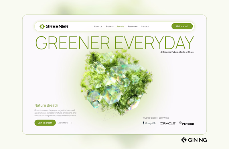
i went with 2 but the image placement could definitely be better
Thank you for your vote 😍
#1 feels more organic, maybe because of headline font also!
Thank you for your vote , Akin
they sort of look the same, but I will go with B cos it just looks aesthetically better
1st
In my opinion 1st is better
I'm so torn!
I absolutely love the composition and the balance of #1, but I like the contrast and the font of #2 better!
Thank you for your comment & voting.
Excellent designs Gin 🙌
I loved the 2 nd one 🔥 . Seems lighter and better in respect to colour and font.
Thank you for your vote Pranav 😊
1 looks more minimalistic :)
Me too haha, btw thank you for your vote
right side is better look
thank you for your vote
I'd suggest header and title section from option 1 and centered image and content organization from option 2.
Think that would make it more modern, still easy to make fully responsive 🙌
I think 2 is looking clean.
looks great both
nice
i like the second one
2 looks better
The second one would work better
Two has a bit more hierarchy for me. The eye goes logo → headline → CTA → visual, instead of getting stuck in the center
First one is good!
2 looks unique and better
Nice work
1 as it use the space very intentionally and feel Minimalist...
1 looks more connected with the whole theme
I like the nav menu in 2, but the layout in 1!
The network for creativity
Join 1.25M professional creatives like you
Connect with clients, get discovered, and run your business 100% commission-free
Creatives on Contra have earned over $150M and we are just getting started
Trending
Claude
Claude has entered the design space. How are you using Claude Design?
Contra University
Learn from expert creatives how to earn more using next-gen AI tools.
fifaworldcup2026
The World Cup is here and the whole world's watching. How are you designing for the world stage?
creativeaiflow
Creative AI workflows are evolving. What tools do you use, and what are their strengths and weaknesses?
freelancerlife
Freelancer life is wins, pivots, and everything in between. What’s yours right now?