The network for creativity
Join 1.25M professional creatives like you
Connect with clients, get discovered, and run your business 100% commission-free
Creatives on Contra have earned over $150M and we are just getting started
Back to feedPost
Taste Test
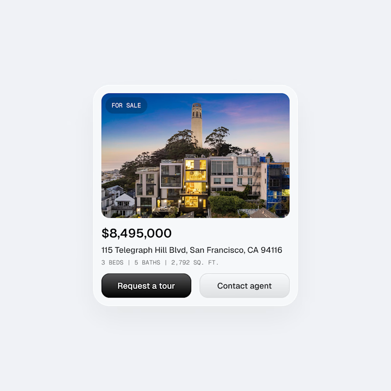
Making some real estate listing UI cards. Which one do you prefer?

105 voted
85%
19 voted
15%

124 votes
Closed

Good one

Thanks Abu!

Great work, David! Both cards look clean, but I'd lean towards the 'No Border' option.
The 'No Border' card leverages the white space and subtle shadow (assuming there is one, or the background contrast) to separate the element, which feels more modern and less visually noisy.
...
Thanks man! Appreciate the feedback.
Yeah I think a ghost button probably help with visual hierarchy like you said. The gradient on the second button definitely detracts a little bit from the main one
Thanks!
You're welcomed.


It will depends a lot of the rest of the design where they are in, if your design is more software I recommend the border, if not, recommend the without.
It will be for a web app, so when listed alongside other property listings, I think borderless would probably be better to reduce clutter.
But if the cards were only in a short amount or by itself, border would probably be the way to go

Thanks Ben! It definitely helps with visual hierarchy, but others would disagree haha
True I did say it was a card 😂 technically that is the correct choice

Wanted to go with boarder but no boarder got better visibility and I hope you know why! But, I wonder if you try to give no boarder about 1px of solid color boarder then that might work too. Just sharing my options. Good work either way, mate!
Thanks Mohammad! Definitely some more room to iterate based on all the comments haha.
Thanks for the feedback!
Glad to hear, David!

I think both are the same.

Border adds clarity!
Thanks!

With Border 💯
Thanks Victrex!

Thanks Neha!

The one with the border is more defined, gives the eyes a visual anchor.
Border all the way 🙌
Thanks Abhinav!

well the one which will not look cluttered when there are bunch of cards. so option A
Thanks Talha!

Thanks Olatunde!

Nice
Thanks Uzzal!

Nice work

option 2>
Thanks Nicolas!
The network for creativity
Join 1.25M professional creatives like you
Connect with clients, get discovered, and run your business 100% commission-free
Creatives on Contra have earned over $150M and we are just getting started




