The network for creativity
Join 1.25M professional creatives like you
Connect with clients, get discovered, and run your business 100% commission-free
Creatives on Contra have earned over $150M and we are just getting started
Back to feedPost
Taste Test


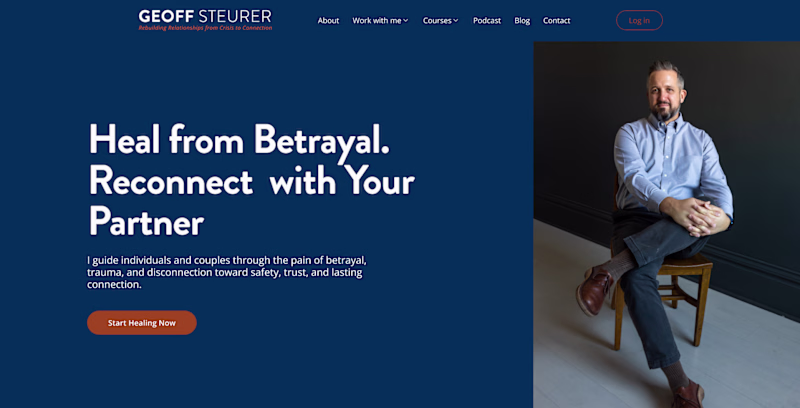
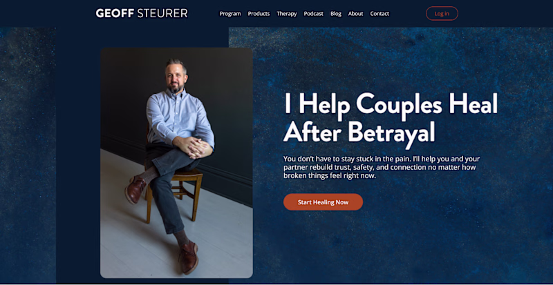

I expected a bigger difference in the votes. You'll need a tiebreaker :)

I prefer the right layout.
The headline gets immediate attention, the hierarchy feels clearer, and the emotional message lands stronger before the user focuses on the photo.
Great work on both versions though :)

The right layout is better for understanding for users

yea, we are all used to that

Awesome work! Try shifting the CTA higher, above the fold urgency beats pretty any day. Right layout plus bold orange button = money

Right layout is better

Right layout with left text would be 10/10


Amazing work

Personally i love the right layout

Both look great

whats you feel looks more friendly to work with????


loving left one so far @Serge Herasymchuk 🔥

The human mind is programmed to start reading from the left, so I'll go with the left aligned.

Huh? Why is Right layout on the left, and Left layout on the right?
Also, what does my head in is the orphan words, whichever one you decide to go with, please make sure you don't leave orphan words such as Partner in the right (left?!) layout.


There is really no way to prevent orphan words 100% of the time on websites. But we should definitely do whatever we can to prevent it for the majority of users.
Yes, there absolutely is. You rework the copy to not have orphans at least in the 2 major viewports.
You can do that for a specific screen ratio but everyone views websites in different sized windows. It's still gonna happen in some views no matter what word magic you work. It's more important that the copy is compelling and speaks to the customer/client. Then you do everything...

I love the opaque blue on the left layout but prefer the image being within the section like on the right. And the copy on the left is so much clearer! Looking sharp either way @Serge Herasymchuk.

I don't see non button...

for purely with visuals, the right looking better, but it would be better with a different photo, which shows less body and more face, because its makes people feel more connected
For usage of words the left layout better, because its more appealing to hear even the meaning the...

The right is better by design and copy

Left is better, right will only work if the website is in arabic or hebrew.

Definitely left. The human eye is more focused on reading text on the left.

No one.

The right layout looks like the obvious winner, man why is there no mobile app for contro the browser experience on mobile is so bad, i don't even know how to vote, but the one with right layout tag
The network for creativity
Join 1.25M professional creatives like you
Connect with clients, get discovered, and run your business 100% commission-free
Creatives on Contra have earned over $150M and we are just getting started


Trending
maxearnings
The next frontier of payments is live on Contra. How are you maximizing revenue?
freelancerlife
Freelancer life is wins, pivots, and everything in between. What’s yours right now?
aidesignflow
AI tools are redefining how designer work. What does your workflow look like?
micrographics
Micrographics started as utility - barcodes, packaging, instruction labels. How would you use them?
aivideo
AI video tools are moving at warp speed. What tools are you using?