The network for creativity
Join 1.25M professional creatives like you
Connect with clients, get discovered, and run your business 100% commission-free
Creatives on Contra have earned over $150M and we are just getting started
Back to feedPost
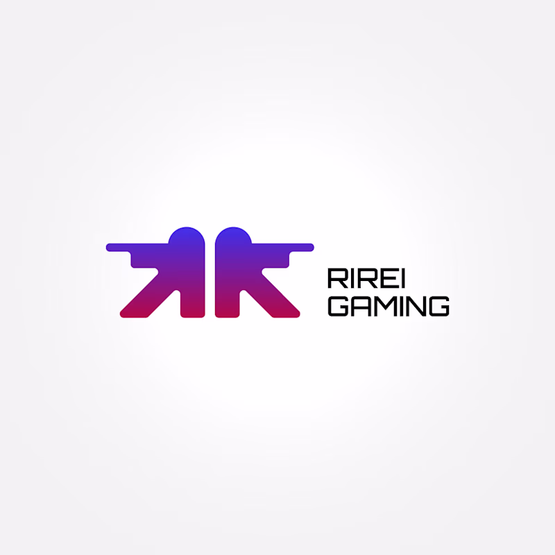
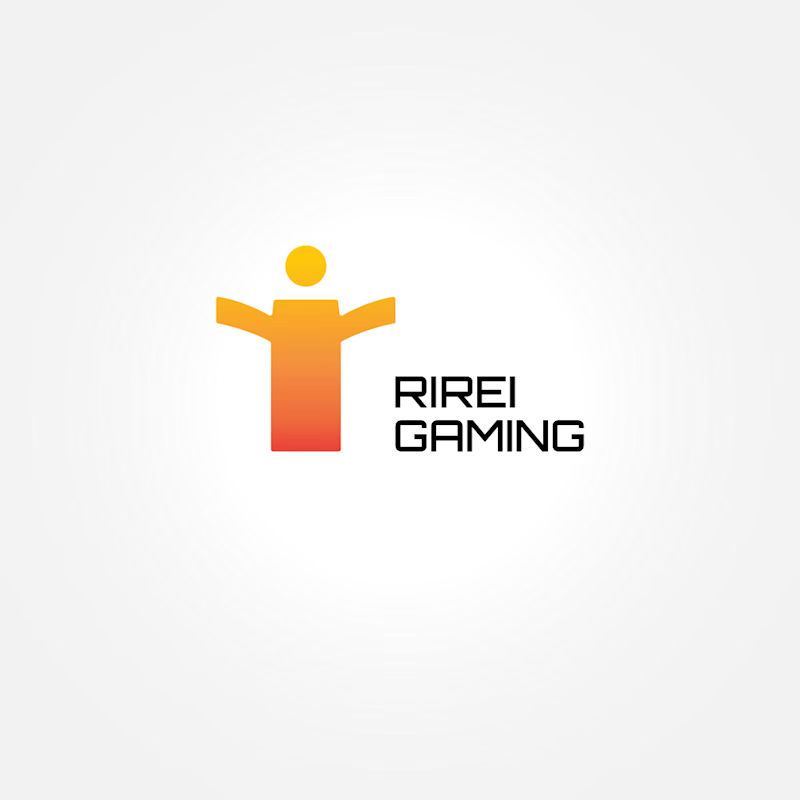
Taste Test


Thank you for the feedback!🙌 I'll keep it in mind 🧠
🙏

A
Ty for voting! 🙌

Going with A. The two soldiers silhouette is such a strong concept for an esports brand. It reads aggressive and competitive which is exactly the energy gaming orgs want to project. The color gradient on it is clean too.
Thanks! Looks like I’m the only one considering option B. The winner is clear.

Option A for sure.
But what if there was only one figure instead of two?
The name combines two words that both start with R, and in my opinion, it works better visually as a mark.

Going with B
Grazie 🙌

Great choice!

A for sure
Yeah, looks like it's an easy W for option A

I prefer option A
Good to know!

Option A is looking more relevant, great work!
Thank you!

Really Great work, Keep it up !
Ty! You too, Rakib!

Really Great work
Grazie!


A for me.
Thank you for voting!
Incredible execution!
Glad you like it!

Thank you for voting!