The network for creativity
Join 1.25M professional creatives like you
Connect with clients, get discovered, and run your business 100% commission-free
Creatives on Contra have earned over $150M and we are just getting started
Back to feedPost

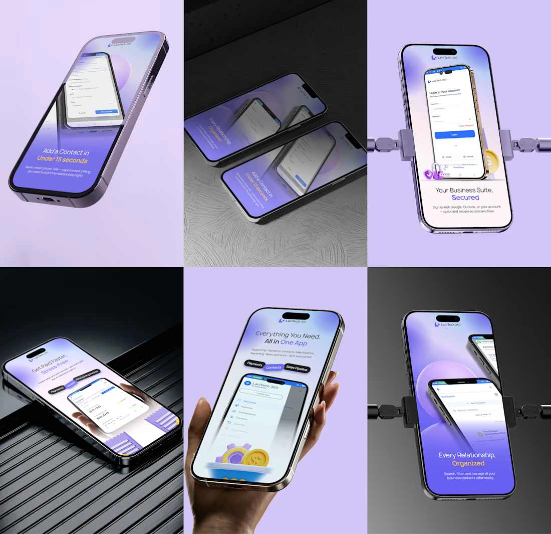
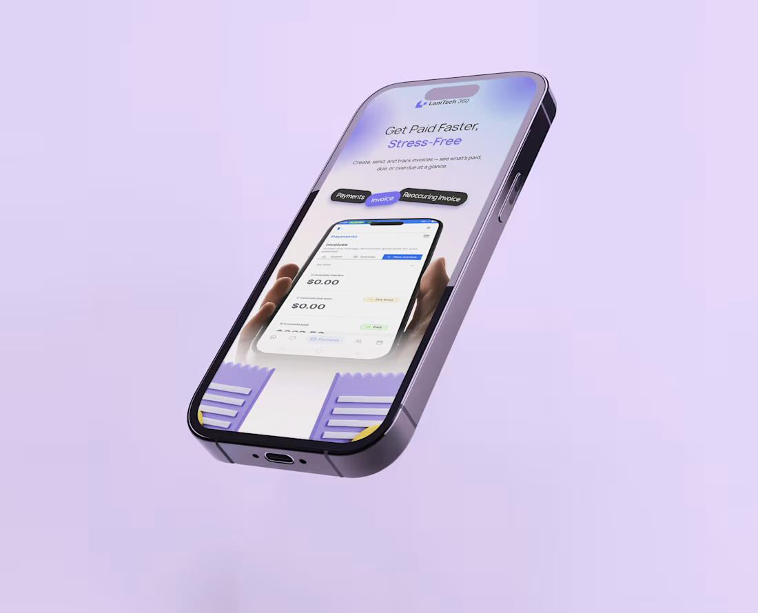
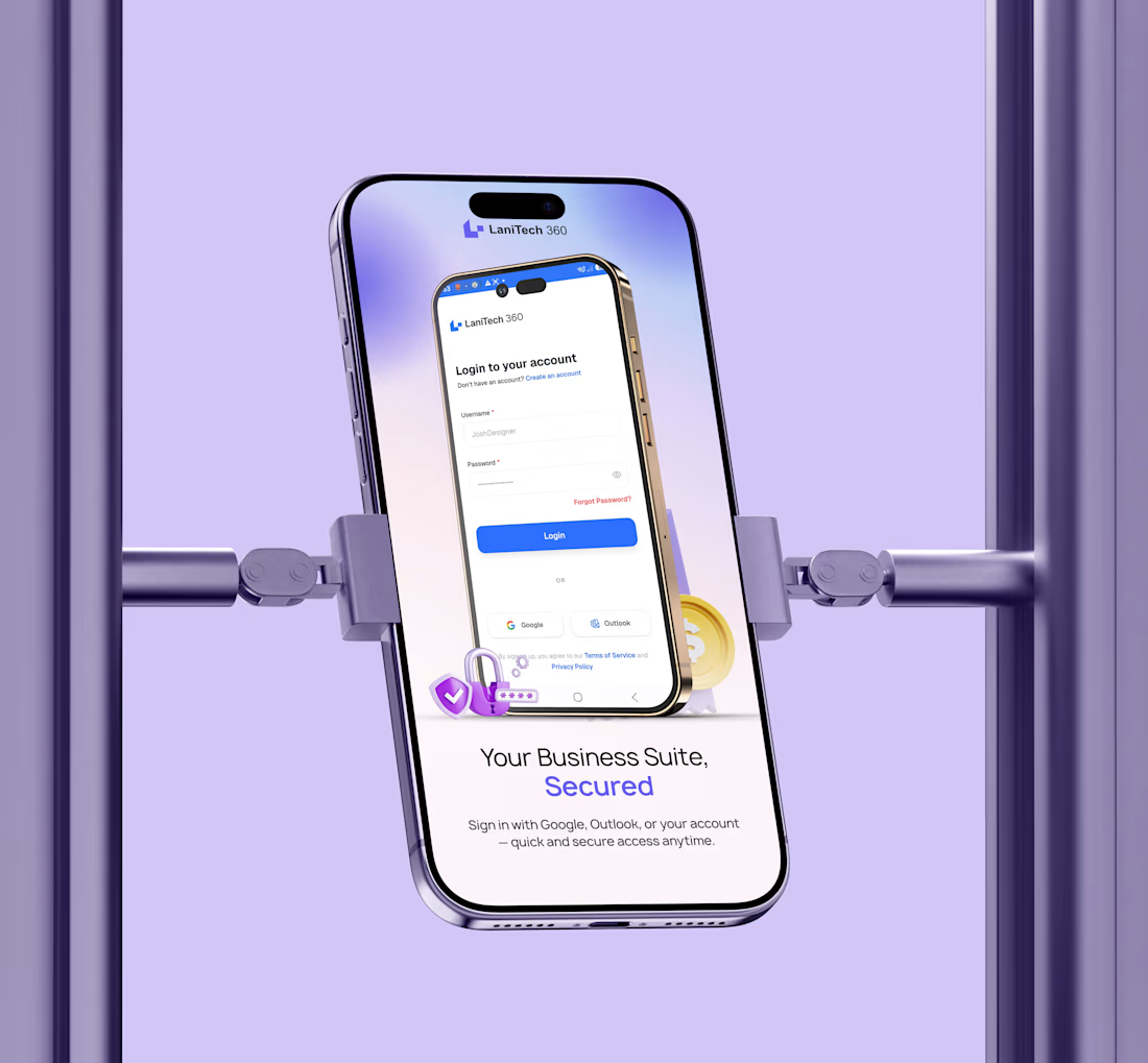
App Store screenshots are more than visual assets—they’re part of your product’s first impression.
When a potential user lands on your app listing, they should be able to understand what your product does, the problem it solves, and the value it offers within seconds.
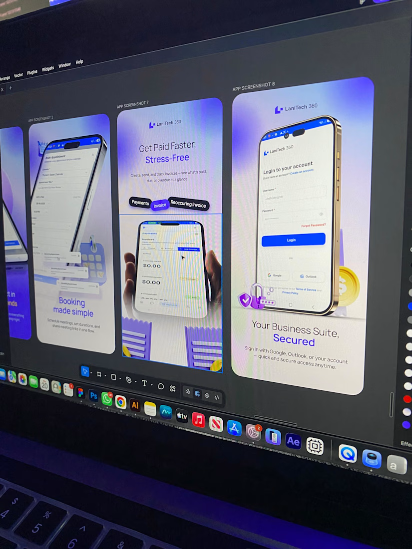
That’s why I approached these Lanitech360 App Store screenshots from a product-design perspective—not just a visual-design perspective.
Each screen was designed to:
• Communicate a clear benefit
• Highlight key product features
• Make the interface easy to understand
• Create a consistent visual experience
• Guide users toward the value of the product
Great App Store screenshots don’t simply show your UI. They tell the story of your product.
If your app is getting visibility but not enough downloads, the way you present it could be part of the problem.
Need App Store screenshots that communicate your product clearly and make a stronger first impression? Let’s work.
Live Link: https://lnkd.in/eJXKH2r2
#UIUXDesign #ProductDesign #AppDesign #AppStoreScreenshots #MobileAppDesign #UXDesign #UIDesign #AppMarketing #ProductDesigner #ConversionDesign #VisualDesign #Lanitech360


The network for creativity
Join 1.25M professional creatives like you
Connect with clients, get discovered, and run your business 100% commission-free
Creatives on Contra have earned over $150M and we are just getting started







Related posts

Hotel details screen for a booking app I’ve been designing.
Focused on clear information hierarchy, visual comfort, and helping users make quick booking decisions.
Excited to start sharing my work here 🚀
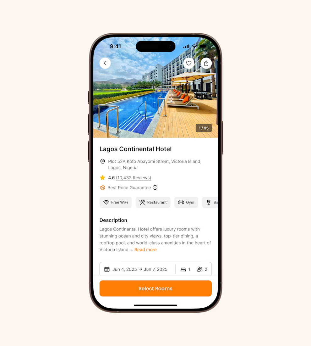

It's basic design but it's great❤️

Refreshing my portfolio and revisiting one of my favorite projects from 2025 🧡💙
Bilsoft has made accounting software for over 20 years, and 100,000+ businesses use it every day. When we started, the trust was there, but the brand had grown piece by piece until it looked like several different companies.
The tricky part was a tension most fintech brands face. The software has to feel precise and serious, but the people using it are small business owners who just want things to be simple. So I drew the wordmark on a strict grid and softened every corner. The name does the rest: “Bil” means knowing, “Soft” means steady. Then I built it into a system the team could use without a designer in the room.
While putting the case study together, I added something new: a motion piece where the logo builds itself letter by letter.
Curious how others here handle this: when a client’s product is serious but their users want simple, which way do you lean? 👇
Full case study on my Contra profile.


I lean simple on the surface, serious underneath — and your grid-plus-softened-corners move is exactly that split. The structure carries the precision, the corners carry the approachability, so a small business owner isn't intimidated before they've even logged in. With 100,000+...

A generative ambient station of drones, rain, and distant thunder.
I built this project to test A generative ambient station of drones, rain, and distant thunder. The core engineering challenge was sustaining uncompromised 60 FPS rendering using Web Audio API while handling continuous user interaction without framework overhead.
WHAT I WAS TESTING:
I focused on two core engineering benchmarks:
Continuous algorithmic generative music that never repeats, with sub-bass drone layers
Atmospheric rain, vinyl static, and distant thunder audio synthesis
THE TECHNICAL SIDE:
Built entirely with native Web Audio AudioNodes. Oscillators tuned to just-intonation intervals modulate lowpass filters, while brownian noise generates random rain and thunder rumbles.
Everything executes in the browser using Web Audio API, Generative Ambient Synthesis, Binaural Noise Engine. No third-party frameworks, no heavy runtime bundles, and zero external tracking.
WHAT I LEARNED:
Audio clipping easily occurs when multiple generative sound layers peak concurrently. Implementing a master dynamics compressor node preserved acoustic clarity.
Finding the sweet spot between mathematical precision and frame budget took careful profiling, but the result runs at a steady 60 FPS even on modest hardware.
TRY IT YOURSELF:
The live build is deployed on my JSFiddle. Open it in your browser, test the controls, and observe the render response times.
If you are building high-performance 3D, physics, or creative web systems and want to collaborate, reach out here on Contra.


its real?