The network for creativity
Join 1.25M professional creatives like you
Connect with clients, get discovered, and run your business 100% commission-free
Creatives on Contra have earned over $150M and we are just getting started
Back to feedPost
Hotel details screen for a booking app I’ve been designing.
Focused on clear information hierarchy, visual comfort, and helping users make quick booking decisions.
Excited to start sharing my work here 🚀

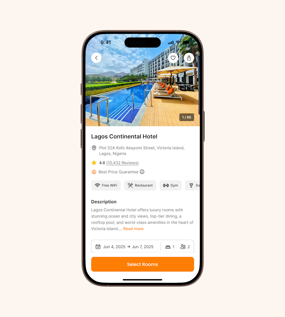


the hierarchy is calm without going boring — booking screens usually panic and this one doesnt

That was the goal! Keeping things clear and easy to navigate without losing the visual appeal. Appreciate it 🙌

It's basic design but it's great❤️
Sometimes keeping it simple is what makes it work. Appreciate it! 🙌🏼
Absolutely ❤️

welcome! putting the price guarantee and review count right under the name is a good call, that's what people check before they scroll. i'd try a price on the select rooms button so the tap feels less blind.
Thanks for the thoughtful feedback! 🙌 I like the idea of showing the price upfront on the select rooms button. Definitely worth exploring!

Thank you! That’s a great point. Showing the starting price upfront could definitely make the next step feel more informed 🙌

Love the focus on clarity and user experience! Making decisions easier through well-organized information is always a win.
Absolutely! The goal is always to make the experience feel simple and intuitive for users. Appreciate it! 🙌

Gabriel, the orange booking button stands out nicely against the white layout
Thank you Thayline! 😊 I wanted it to stand out naturally and make the primary action easy to spot.
The network for creativity
Join 1.25M professional creatives like you
Connect with clients, get discovered, and run your business 100% commission-free
Creatives on Contra have earned over $150M and we are just getting started



Related posts

What if sending money felt a little more like giving a gift?
For Nova, I explored a banking app that brings payments, cards, and a bit of personality together. You can check your balance, browse recent transactions, send or request money, top up, and pay bills.
My favorite part is the digital postcard feature. Before sending a transfer, you can add a little illustrated card—a heart, a birthday greeting, or a playful character. A simple way to make birthday money or a thank-you feel more personal.
I carried that same 3D character into onboarding, pairing it with bold red gradients and large, clear payment details. There’s room for play, while the recipient and amount stay easy to check.
Would you add a postcard to a transfer? I’d love to know what occasion you’d use it for.






Redesigned the ModaZ fashion e-commerce storefront with a clean, modern shopping experience focused on product discovery and brand presentation. The project included a refreshed homepage, curated product collections, new arrivals, best-selling sections, and responsive layouts.
I also focused on improving navigation, product visibility, and the overall shopping journey to create a more engaging online store.
Have a fashion brand that needs a storefront upgrade? Let's talk.


I love the layout. Impressive work

Did a motion for the Cockpit concept ⁕ 🔈 ON
Design & Creative Direction: Me
Motion & Sound: Claude Code
Cockpit is an AI agent management platform concept that helps teams:
- Set boundaries
- Monitor activity
- Manage approvals
- Track knowledge sources
- Measure performance and costs
It brings together five key AI UX challenges:
👉 Autonomy
👉 Observability
👉 Human Approvals
👉 Context
👉 Analytics
The idea is simple:
As AI agents become more capable, the experiences we design around them need to make their actions more transparent, predictable, and manageable.
Thanks!


Human approvals is the part most agent UIs skip. Good call making it one of the five challenges.