The network for creativity
Join 1.25M professional creatives like you
Connect with clients, get discovered, and run your business 100% commission-free
Creatives on Contra have earned over $150M and we are just getting started
Back to feedPost


The network for creativity
Join 1.25M professional creatives like you
Connect with clients, get discovered, and run your business 100% commission-free
Creatives on Contra have earned over $150M and we are just getting started





Related posts

Top 1% on Contra. 🎉
A little milestone, but a reminder that showing up and doing good work consistently actually pays off.
If you're just starting out and wondering if it's worth it: it is. Keep going.
Thanks to all my clients and everyone here who's been so supportive.

That's Legendary bro congrats 🔥🔥🔥🔥

A personal identity experiment for Super Intelligence.
The symbol combines a star and the letters SI into one compact mark.
Logo design + motion.


Excellent use of geometry in the logomark!

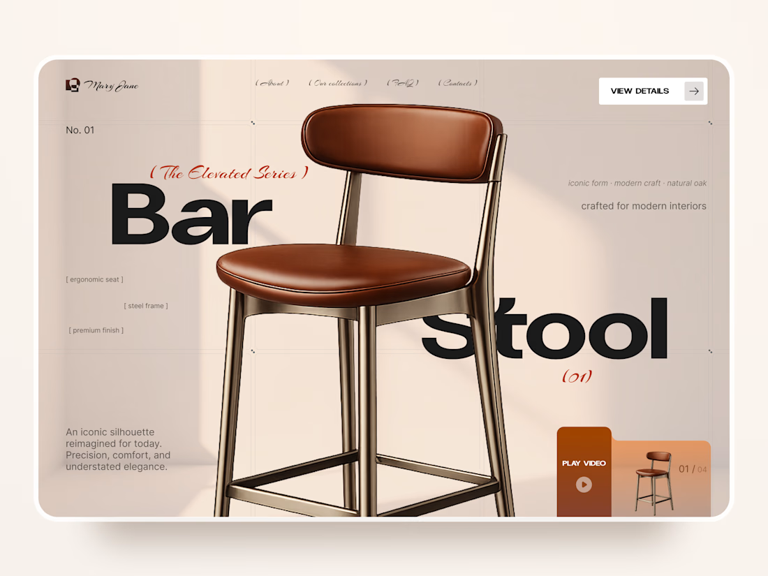
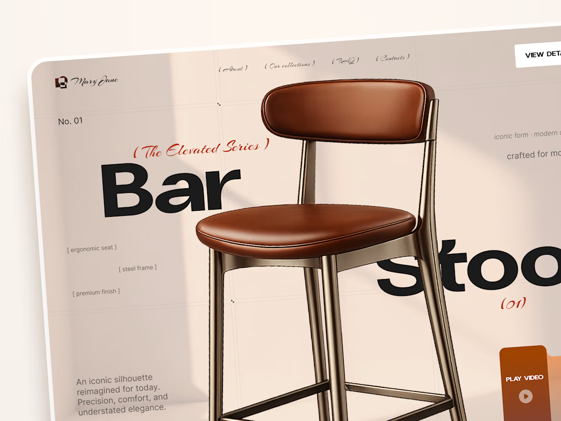
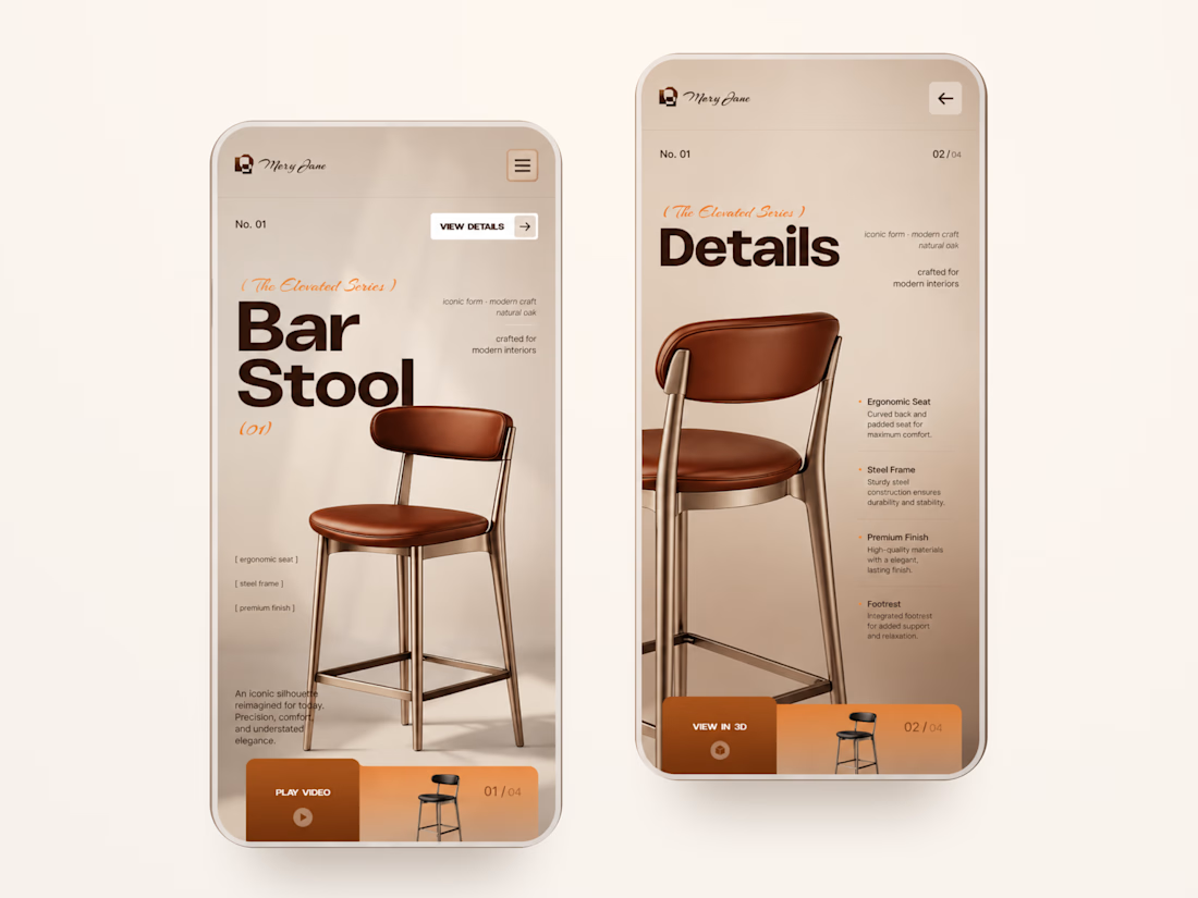
Mary Jane — Bar Stool Product Landing Page 🪑✨
A refined product landing page concept for a modern furniture brand, built around one statement piece
The design combines warm neutral tones, oversized typography, and editorial layouts to give the bar stool a premium, design-focused feel
Special attention was given to:
• Product-first composition
• Clean editorial typography
• Warm premium aesthetic
• Product details and features
• Video and 3D presentation
• Responsive mobile layout
The result is a simple, elegant experience that keeps the product at the center while giving the brand a distinctive visual character 🤎


Nice work