The network for creativity
Join 1.25M professional creatives like you
Connect with clients, get discovered, and run your business 100% commission-free
Creatives on Contra have earned over $150M and we are just getting started
Back to feedPost

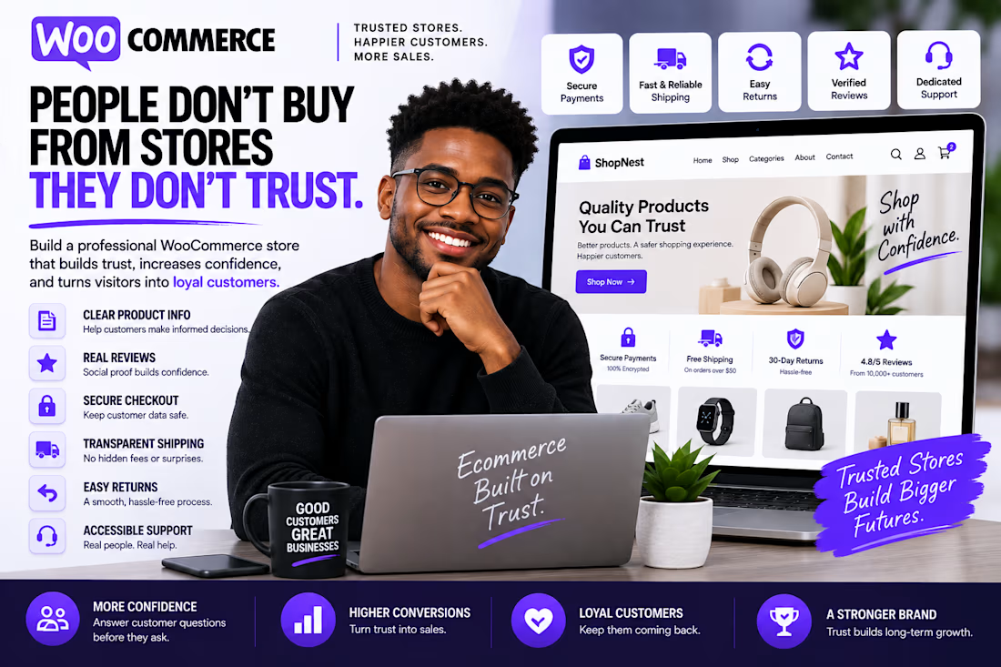
People Don't Buy From Stores They Don't Trust.
You can have great products and beautiful design, but customers still need a reason to feel confident before they purchase.
A strong WooCommerce store should communicate trust through:
→ Clear product information
→ Real reviews
→ Secure checkout
→ Transparent shipping
→ Easy returns
→ Professional branding
→ Consistent design
→ Accessible contact information
Trust isn't one section of the website.
It's built into the entire shopping experience.
Before asking customers to buy, your website should answer one question:
"Why should I trust this store?"
Good eCommerce design doesn't just make products look attractive.
It makes customers feel comfortable buying them.
#WooCommerce #WebDesign #Ecommerce #WordPress #UXDesign #OnlineStore #EcommerceDesign


The network for creativity
Join 1.25M professional creatives like you
Connect with clients, get discovered, and run your business 100% commission-free
Creatives on Contra have earned over $150M and we are just getting started

Challenges
View all


Related posts


SAME CONTENT. TWO DIFFERENT EXPERIENCES.
We compared two versions of a service card for a local service business.
A - Everything at once
The detailed description, features, and buttons share the same emphasis. The information is there, but it takes longer to find what matters.
B - What matters first
The service name, short value statement, rating, price, and booking action follow a clear sequence. Less searching, more confidence in the next step.
Hierarchy doesn’t remove information. It helps reveal it at the right moment.
Which version feels clearer to you - A or B?

15 voted
22%

53 voted
78%

68 votes
Closed


Visual hierarchy is the difference between cognitive friction and conversion velocity. Version B wins because it respects user attention scannability drives immediate confidence, while cluttered details in A only delay the primary action. Clean structural prioritization always outperforms dumping raw information.

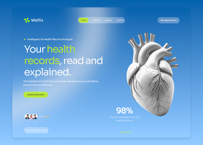
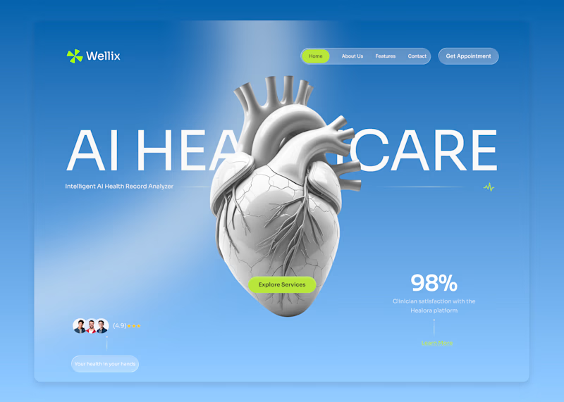
Wellix two homepage directions. Which one would you pick?
Wellix is an AI tool that reads health records and explains them in plain language lab results, scans, and charts turned into something a person can actually understand without a medical background.
Same brand, same palette, same illustration just two different ways of arranging the hero.
Which one would you go with, A or B? Drop a comment I'd like to hear which one lands better for you.

60 voted
61%
39 voted
39%
99 votes
Closed

Version. A does the job


Pops out better in Light