The network for creativity
Join 1.25M professional creatives like you
Connect with clients, get discovered, and run your business 100% commission-free
Creatives on Contra have earned over $150M and we are just getting started
Back to feedPost

Mini brand refresh and launch campaign for Kraymer Art
adobephotoshoptypographydesignbrandBrand DesignGraphic DesignVisual DesignAdobe IllustratorAdobe PhotoshopChatGPT


The network for creativity
Join 1.25M professional creatives like you
Connect with clients, get discovered, and run your business 100% commission-free
Creatives on Contra have earned over $150M and we are just getting started



Related posts


Is text on album covers really tacky?
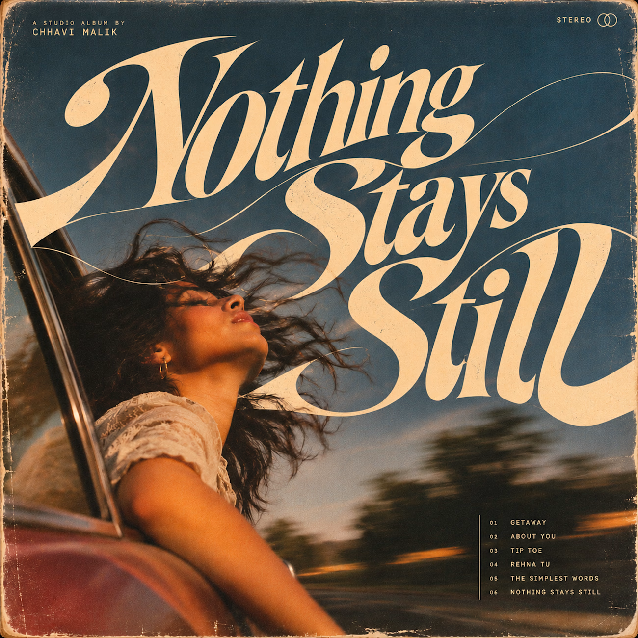
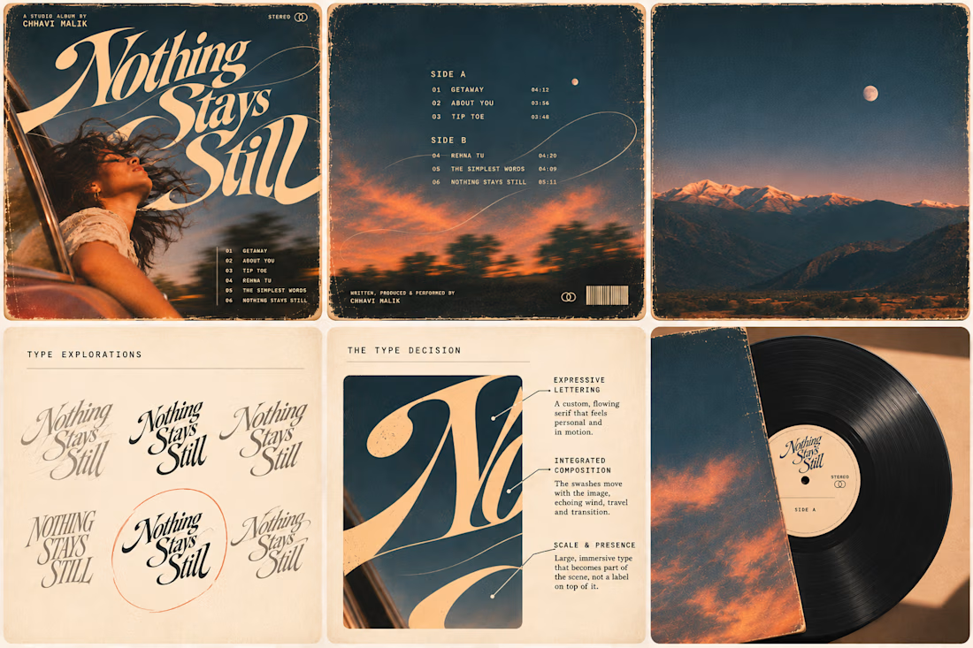
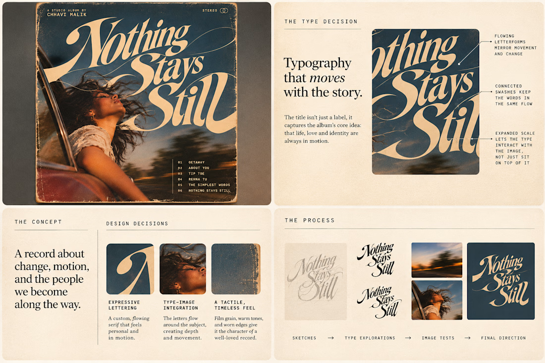
This question has been doing the rounds on X and I have to say, I'm firmly on the other side of that argument. I've always loved seeing typography become part of the artwork rather than just a title sitting on top of it.
So I wanted to put that idea to the test with an imagined album called Nothing Stays Still, inspired by change, fleeting moments and everything in between:)
I played around with the lettering until it felt expressive, a little restless, and inseparable from the photograph.
Because I think badly considered typography is tacky. Typography itself? Give it a chance :)
What's an album cover where the type really makes it for you?


What happens when a hummingbird gets translated into thread, then into pixels, then dropped into the sky?
Design exploration of the day: Relic Signal.
Bayer dithering, difference blend, five brand colors, one tiny messenger.
Craft on one side, static on the other.

Just launched: Faro, a luxury travel website template for Framer.
Travel agencies and tour operators do not sell with a checkout. They sell with conversation. So Faro is built around one goal: turn visitors into enquiries.
What makes it work
Cinematic flight-window hero that plays your video as visitors scroll
Enquiry-first pages: every button leads to your contact form, with no cart to set up
Tour packages with pricing cards, a comparison table, add-ons and FAQs
Destination and journey pages with itineraries, highlights and quick facts
What's inside
11 pages, including Home, Destinations, Journeys, About, Contact, Thank You, 404 and legal pages
2 CMS collections (Destinations and Signature Journeys) with sample content
Reusable components, color styles and text styles for fast rebranding
Fully responsive, with a mobile menu, Back button and Back To Top button
SEO-ready structure and a built-in documentation page
Design: deep navy, brass gold, Fraunces and Inter. Calm, premium and easy to edit.
Launch price: $39 through November 2026.
Live preview: [https://farotravel.framer.website/ ]
Get Faro on Framer: [https://www.framer.com/marketplace/templates/faro/ ]
I'd love your feedback. If you build with it, tag me so I can see what you make.


The airplane window opening on the hero says travel without a single stock photo, and the gold Start Planning button stays in the nav the whole time. Does that hero animation add noticeable load time on mobile?