The network for creativity
Join 1.25M professional creatives like you
Connect with clients, get discovered, and run your business 100% commission-free
Creatives on Contra have earned over $150M and we are just getting started
Back to feedPost

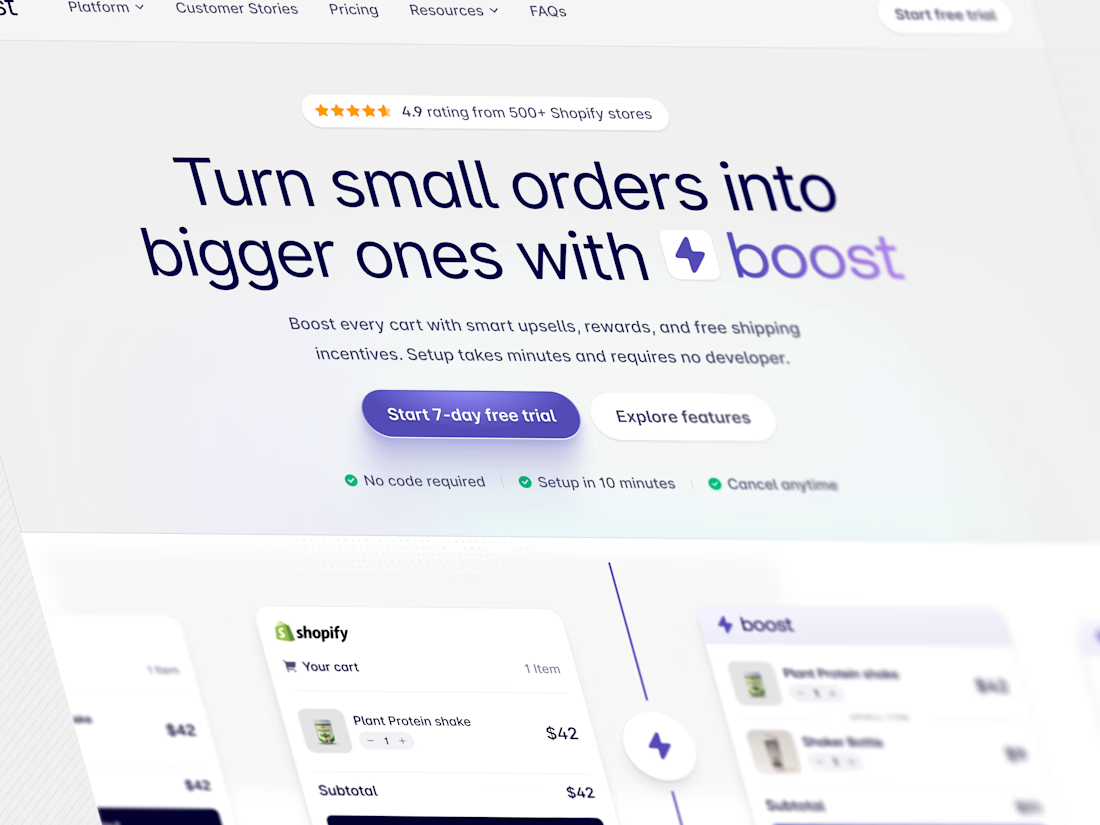
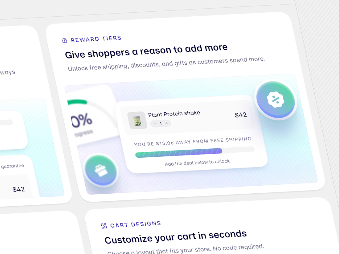
A pricing section shouldn’t overwhelm the landing page.
For this landing page, I designed the pricing section to guide visitors toward the plans that are most relevant to them.
Instead of showing every package at once, users can first choose:
Brand or Creator → One-Time Setup or Monthly Retainer
The pricing cards then adapt to that selection, keeping the section focused while still supporting multiple packages and pricing models.
The goal was simple: reduce the noise, make the options easier to scan, and help visitors understand the value without overloading the page.
Good landing page design isn’t just about making sections look polished.
It’s about making important decisions feel simple and natural.
#ProductDesign #UIDesign #UXDesign #LandingPageDesign #WebDesign #PricingUX #Figma


GOATED
The network for creativity
Join 1.25M professional creatives like you
Connect with clients, get discovered, and run your business 100% commission-free
Creatives on Contra have earned over $150M and we are just getting started











Related posts


Brilliant work

Poster Club turns a simple event template into your own print. I built two working Flutter versions and recorded the same editing flow in each.
Print Room: calm, editorial, with a mounted canvas and bottom tools.
Cutout Playground: bold, playful, with loose prints and tools at the edge.
Which one would you rather use?
What made the difference?
Grab it for free:
https://contra.com/products/cUHBysMu-poster-club-free-flutter-ab-ui-kit


37 voted
60%
25 voted
40%
62 votes
Closed

Print Room looks great!!

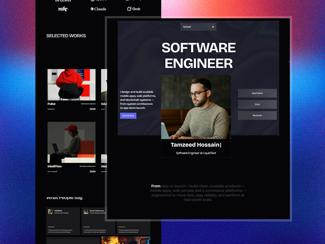
DevFolios — a developer portfolio template that helps you showcase your projects, highlight your skills, and turn your work into your next job or client.
Build it. Show it. Get noticed.
Template link: https://framer.link/BWyFxNT

The hover effect of the buttons is so cool bro