The network for creativity
Join 1.25M professional creatives like you
Connect with clients, get discovered, and run your business 100% commission-free
Creatives on Contra have earned over $150M and we are just getting started
Back to feedPost


The network for creativity
Join 1.25M professional creatives like you
Connect with clients, get discovered, and run your business 100% commission-free
Creatives on Contra have earned over $150M and we are just getting started

Challenges
View all


Related posts


Such a beautiful project!

Sometimes I paint details intentionally subtle. Because real art shouldn't be loud

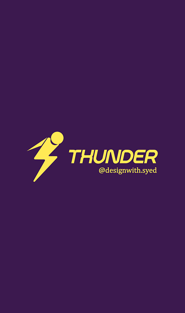
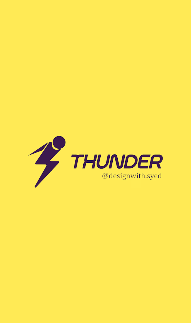
THUNDER — Logo Design
Brand: Thunder
Industry: Snowboarding fan merchandise
About the brand: Thunder is a fictional brand that creates durable, high-quality merchandise for snowboarding fans, targeting college students.
Design brief: Create an abstract logo mark that conveys a sense of victory, energy, and professionalism. The logo should use yellow as the primary color and work effectively on the brand’s website.
Design direction: A bold lightning-inspired symbol combined with strong, modern typography to represent power, motion, and an energetic brand personality.
Project type: Self-initiated concept project
Tools: Inkscape

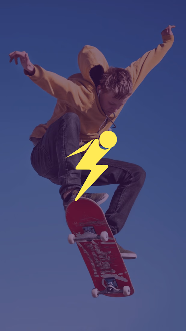

The lightning mark carries a lot of momentum without losing the clean, collegiate feel the brief calls for. I especially like how the yellow stays confident across both the flat mark and the lifestyle mockup.