The network for creativity
Join 1.25M professional creatives like you
Connect with clients, get discovered, and run your business 100% commission-free
Creatives on Contra have earned over $150M and we are just getting started
Back to feedPost
Back with another QueueLess snippet
Low-key obsessed with how these onboarding screens are coming together. The illustrations are doing their thing!
Small details, big difference. More soon 🤭.


The copy carries these screens: Your place in line, without the line, then Know where you stand, then Your turn is getting closer tell the whole product story in three taps, and the purple and green illustration matches the blue buttons well. My challenge: three onboarding...

Thank you, Aditya, for the feedback, and that's a fair question. These screens were to communicate the core values and expectations in stages: joining a queue remotely, tracking your position, and knowing when your turn is approaching.
I also agree that users wanting to get to...
The network for creativity
Join 1.25M professional creatives like you
Connect with clients, get discovered, and run your business 100% commission-free
Creatives on Contra have earned over $150M and we are just getting started



Related posts

This case study was featured on Behance last year. We’d love to hear your thoughts on the design!

This case study was featured on Behance last year.
We’d love to hear your thoughts on the design!

Just launched Nexara on my profile—a dark-mode AI SaaS landing page and design system built with custom 3D visuals, glassmorphism UI, and responsive components. Check out the full case study on my Work tab!
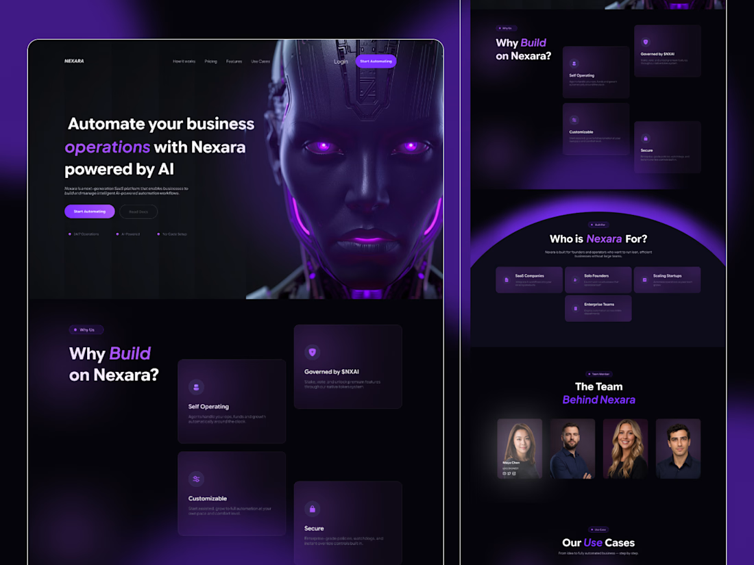

The “Who is Nexara for?” section is useful for narrowing a broad AI promise. I’d connect each audience card to one concrete workflow example, so a solo founder and a scaling team can see different reasons to try it. That would make the visual system support a more specific decision.

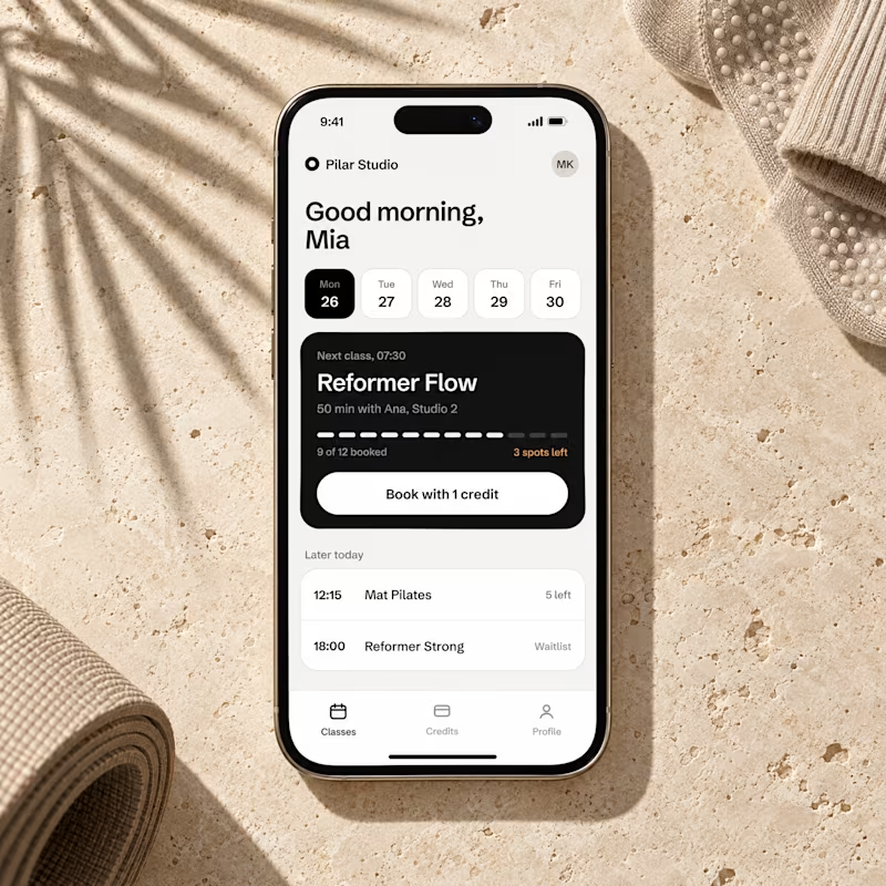
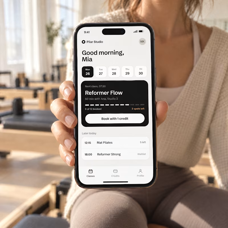
Designed a booking screen for a concept pilates studio app, then gave GPT Image 2.5 just that one screenshot.
Two launch shots came back. Which one makes you want to book a class, A or B?

3 voted
20%
12 voted
80%
15 votes
Closed


