The network for creativity
Join 1.25M professional creatives like you
Connect with clients, get discovered, and run your business 100% commission-free
Creatives on Contra have earned over $150M and we are just getting started
Back to feedPost
Taste Test

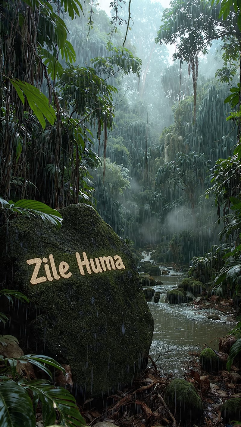
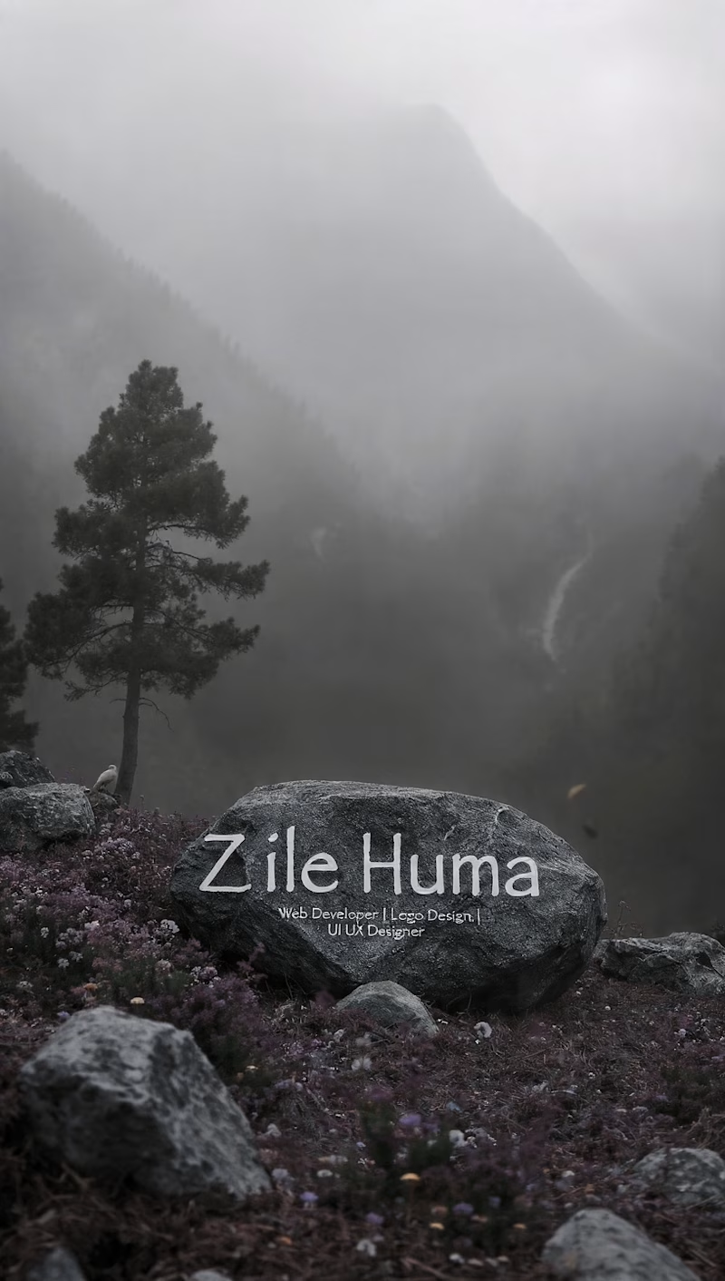

I’d go with A. it feels warmer and more approachable to me 😊 That said, I’d probably use something like this more to get a sense of your personality and style. If I were actually choosing a web designer, I’d still want to see the work and get to know how you communicate before making that decision.
The network for creativity
Join 1.25M professional creatives like you
Connect with clients, get discovered, and run your business 100% commission-free
Creatives on Contra have earned over $150M and we are just getting started







Related posts

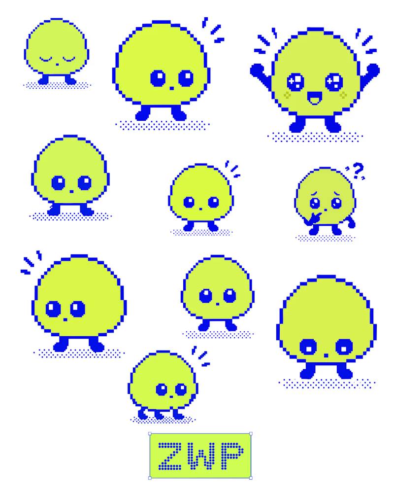
Been experimenting with pixel art and character design in Figma.
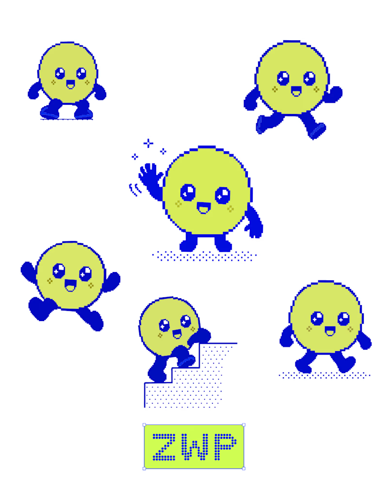
I explored different expressions, poses, and small details to give Zippy its own personality. Keeping the blue and neon-lime palette consistent helped bring the character set together.
Still experimenting, still refining. ⚡
What’s your favourite expression?
5 voted
42%
7 voted
58%
12 votes
Closed

Great character movement is better it feels alive ❤️


Yo Designers!
We're looking for a skilled product designer with an exceptional sense of visual design to create 5 high-end UI showcase visuals.

Sounds like a fun one! Looking forward to seeing the visuals that come out of this

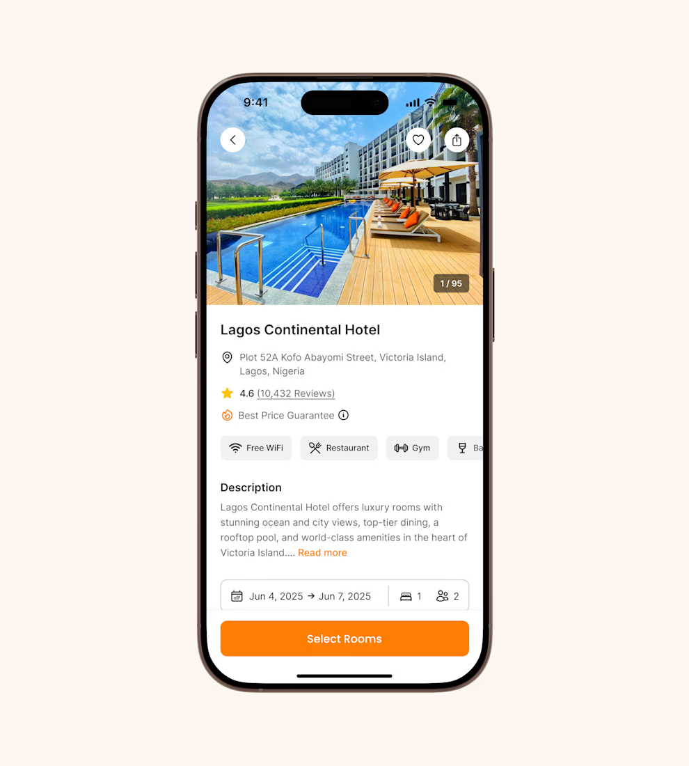
Hotel details screen for a booking app I’ve been designing.
Focused on clear information hierarchy, visual comfort, and helping users make quick booking decisions.
Excited to start sharing my work here 🚀

It's basic design but it's great❤️

