The network for creativity
Join 1.25M professional creatives like you
Connect with clients, get discovered, and run your business 100% commission-free
Creatives on Contra have earned over $150M and we are just getting started
Back to feedPost
Did you know a tornado formed the year you were born?
Not a real one. A data one.
Type your birth year. Watch the storm react - the speed, the color, the rage of it - all driven by the exact CO₂ levels recorded that year.
🌪️Live Site - https://thedatatornado.figma.site
💻GitHub Repo - https://github.com/isumenuka/Thedatatornado
🔬 The Problem
Climate change is the most documented crisis in human history. Scientists have been collecting data for over 65 years. But most people feel nothing when they see the numbers - because a wall of data doesn't make you care. That is a design problem. The Data Tornado is my answer.
⚙️ How It Was Built
I started in FigJam - mapping the full app structure, severity color system (Stable → Elevated → Critical → Extreme), and the 65-year climate timeline before touching any build tool.
In Figma Make, I loaded my complete design guidelines first - colors, fonts, spacing rules - so every generated output matched my vision from the first prompt. That one step eliminated hours of corrections.
The MCP connector was the most critical technical piece: a custom live pipeline to NOAA's servers, pulling real CO₂ and temperature readings automatically every time someone opens the app. No downloading. No pasting. Always live.
The hero background video was generated entirely in Figma Weave - I set a start frame and end frame, and Weave generated the full atmospheric storm footage between them. The Figma Agent handled precision edits throughout -clicking directly on individual elements, repositioning buttons, aligning sections, without touching anything else.
Supabase powers the share cards, news gallery, and live data caching. GitHub handles deployment.
🛠️ Tools Used
→ FigJam: full app structure, severity system & data flow diagrams
→ Figma Make: prompt-to-code app with custom NOAA MCP connector
→ Figma MCP: live pipeline direct to NOAA's climate API
→ Figma Weave: AI video generation for the hero storm background
→ Figma Agent: precision element-level UI edits throughout the build
→ Supabase: backend for share cards, news & data caching
→ GitHub: deployment and version control
✨ Key Feature - Birth Year Telemetry
Enter your birth year. The app instantly generates your personal climate log -the exact CO₂ concentration the year you arrived in the world, your temperature anomaly then vs. now, your severity level at birth vs. today. It stops being a global statistic. It becomes yours.
Most people go quiet when they see their own number.
Nice work ❤️
thank you!! ❤️
What happened on the day you were born? Share your link in the comments!
THIS IS MINE - https://thedatatornado.figma.site/?share=d9844bb7-12d7-4c5a-94e8-ebd84ade9f8b
bro ngl it's so cool, i like the design and 3d element of tornado in below section, and you did such a great job with this, good smooth animation and the hero-section is the best spotlight
Whoa
😭😭 thank you!!
This is wild!
haha thank you!! 🙏
This is next level
means a lot!! thank you 🙏
I want learn from you... @Isum Enuka
Nice work👏🔥🔥
appreciate it!! 🙏🔥
thank youuu!! 🙏🙏
Nice Work
thank you!! 🙏
OMG OMG OMG! Loooks sooo good and the atmosphere!🔥
haha thank youuu!! the atmosphere took so long to get right 🔥😭
it looks legit cool man
haha legit appreciate that!! 🙏🔥
The visuals look amazing! Unique take on the problem as well. Good work 👏
thank you so much!! wanted it to actually feel like the data not just show it 🙏
the effects on the tornado is stunning!
appreciate it!! that part took way too long ngl 😭🔥
wow this is so cool, mine almost blew up my screen 😂
HAHA 💀🌪️
Looks cool!
thank you!! 🙏✨
Impressive work
means a lot!! 🔥
wow this is creativity
haha thank youuu 😭🙏
Amazing!
ahhh thank you!! ❤️
You're welcome👍
this is soooooo coooooool 👏🙌
HAHA thank youuu 😭🔥🙏
That's impressive! Great work
appreciate it!! 🙏🔥
Cool concept!
thank you!! 🙏✨
This is cool!!!
haha thank youuu!! 🔥🙏
Really Great Experience!
so glad you felt it!! 🙏😭
This is such an interesting way of displaying data. 💫
that was literally the whole goal!! thank you 💫🙏
Interesting how you have mixed story telling with design to create a unique experience. Good work💯
that's exactly what i was going for!! thank you so much 💯🙏
cool
thank you!! 🙏✨
I love it!!!!!!
haha thank youuu!! ❤️🔥
at first i thought it was a movie 😂 but whoosh this is fire🔥
HAHA that's the best thing i've heard 😭🔥 thank you!!
this is absolutely GORGEOUS woahhhh
ahhhh thank youuu!! 🙏😭✨
The birth year hook is genius. Making it personal is the unlock most data viz projects miss.
yes exactly!! data hits different when it's yours 🙏 thank you for getting it!!
The network for creativity
Join 1.25M professional creatives like you
Connect with clients, get discovered, and run your business 100% commission-free
Creatives on Contra have earned over $150M and we are just getting started
Trending
Claude
Claude has entered the design space. How are you using Claude Design?
Contra University
Learn from expert creatives how to earn more using next-gen AI tools.
creativeaiflow
Creative AI workflows are evolving. What tools do you use, and what are their strengths and weaknesses?
freelancerlife
Freelancer life is wins, pivots, and everything in between. What’s yours right now?
Related posts
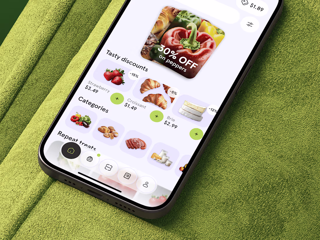
Just shared food delivery app concept 🥐 What do you think?
This looks fantastic. Which stage of the process was the most challenging?
Nice design
This logo mark began with research into South African heritage. I kept returning to the country’s flag, especially the green Y-shaped form at its center. I isolated that shape, refined it, and rotated it around a central axis until each piece aligned into one balanced symbol.
The result feels warm, natural, and rooted in heritage, while still giving the skincare brand a modern and distinctive identity.


Pulling the mark from the flag's Y-shape instead of designing a generic botanical icon is what gives this an actual story. It reads like a flower at first glance but has real meaning behind it once you know where it came from.