
Ravnish Vaghasiya
Lead Product Designer
New to Contra
Ravnish is ready for their next project!
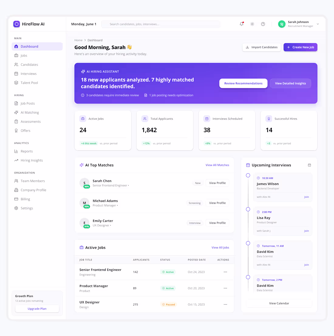
Recruitment SaaS — Dashboard Screen Design
Designed a modern AI-powered Job Publishing flow for HireFlow AI, focused on helping recruiters create, review, and publish jobs faster with a clean and intuitive experience.
💡 Helping Startups Build Better SaaS Products
✨ Available for SaaS, Dashboard, Web App & Mobile App Design Projects.
0
20
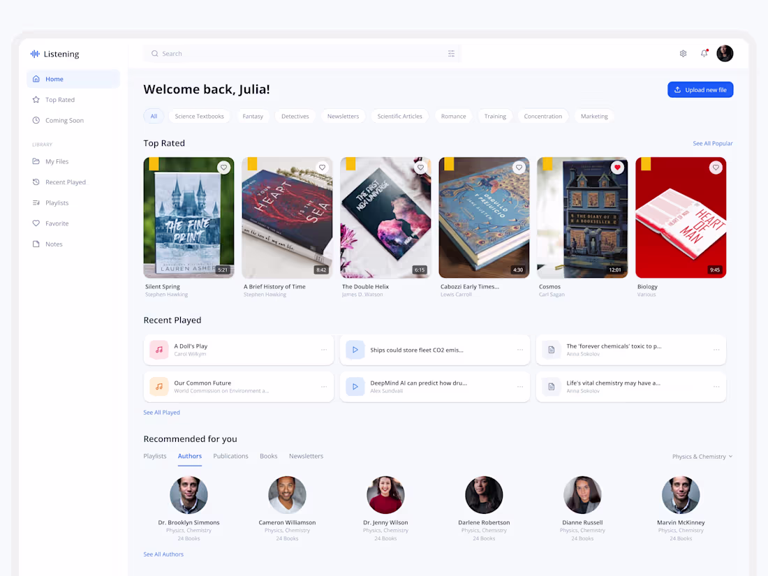
🚀 Modern Learning Platform Dashboard Design
Exploring a clean and modern dashboard experience designed for digital learning, audiobooks, content management, and personalized recommendations.
The goal was to create an intuitive user experience with seamless navigation, content discovery, uploads, playlists, listening history, and media controls—all within a scalable SaaS dashboard ecosystem.
Every section is designed to improve usability, increase engagement, and create a smooth content consumption experience.
💡 Turning Business Ideas Into Scalable Digital Products
✨ Available for SaaS, Dashboard, Web App & Mobile App Design Projects.
1
51
I designed a Founder CRM web application called FounderFlow AI. The product helps founders manage relationships with investors, mentors, customers, partners, and advisors. It includes a relationship intelligence dashboard, network visualization, contact profiles, opportunity discovery, and AI-powered relationship nurturing features.
I used Stitch to generate the UI designs for multiple dashboard screens of the FounderFlow AI web application. I created detailed prompts for each screen and used Stitch to quickly explore layouts, components, data visualizations, and overall product design concepts while maintaining a modern
SaaS experience.
Stitch helped me generate dashboard designs quickly and explore ideas faster than designing from scratch. The overall visual quality was impressive. However, I found it challenging to maintain consistency across multiple screens. Navigation menus, text styles, and color palettes often changed between screens even when the screens belonged to the same product. Improving design consistency across generated screens would make the experience even better. Compared to tools like Figma AI, Lovable, and Google Antigravity, I expected more consistency throughout the design flow.
Link: https://stitch.withgoogle.com/projects/16141423346836115982
2
2
191
🚨 Users don't leave because your product is bad.
They leave because they don't know what to do next.
After signing up, users were taken directly to the dashboard.
The problem?
No guidance.
No context.
No clear next step.
For a new user, landing on a feature-heavy
dashboard can feel overwhelming.
Instead of helping users discover value, the experience creates confusion from the very first interaction.
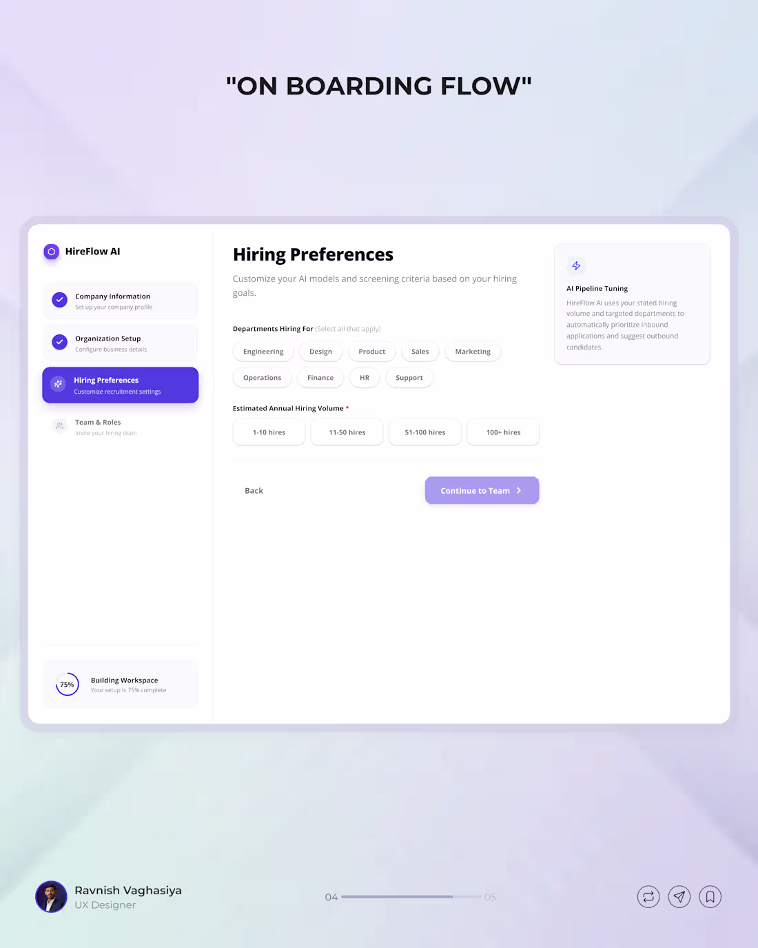
So I redesigned the flow by introducing a guided onboarding experience before users reach the dashboard.
✅ Clear starting point
✅ Step-by-step guidance
✅ Reduced cognitive load
✅ Faster path to value
Good onboarding isn't about explaining features.
It's about helping users achieve their first win as quickly as possible.
That's often the difference between an active user and a lost user.
What's your take?
Would you prefer users land directly on the dashboard, or go through a short onboarding flow first?
Save this post for your next UX project and share your thoughts below 👇
onboarding flow design, user onboarding experience, SaaS onboarding flow, dashboard UX design, first time user experience, product onboarding best practices, user activation strategy, UX case study, onboarding UX design, signup to dashboard flow, reducing user confusion in UX, SaaS user activation, product experience design, UX redesign case study, guided onboarding flow
0
83