The network for creativity
Join 1.25M professional creatives like you
Connect with clients, get discovered, and run your business 100% commission-free
Creatives on Contra have earned over $150M and we are just getting started
Back to feedPost



Tamer amazing work 👏🏻

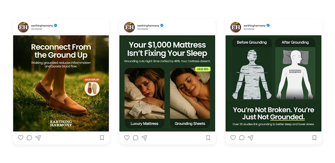
The before and after grounding pairing is such a clean way to make an abstract benefit visible. Did the client give you creative freedom on the concept or were they set on the ground up angle from the start?

Quite nice..

Fantastic!

The direct comparison against a $1,000 mattress in the second ad is a bold move, positions grounding sheets as the smarter buy instead of just another wellness product. That before/after grounded framing is doing a lot of work too.


This looks clean and well thought out. How long did it take you to bring everything together?


Nice design

Looks great

looks nice i like it

Nice!!!
The network for creativity
Join 1.25M professional creatives like you
Connect with clients, get discovered, and run your business 100% commission-free
Creatives on Contra have earned over $150M and we are just getting started





Related posts

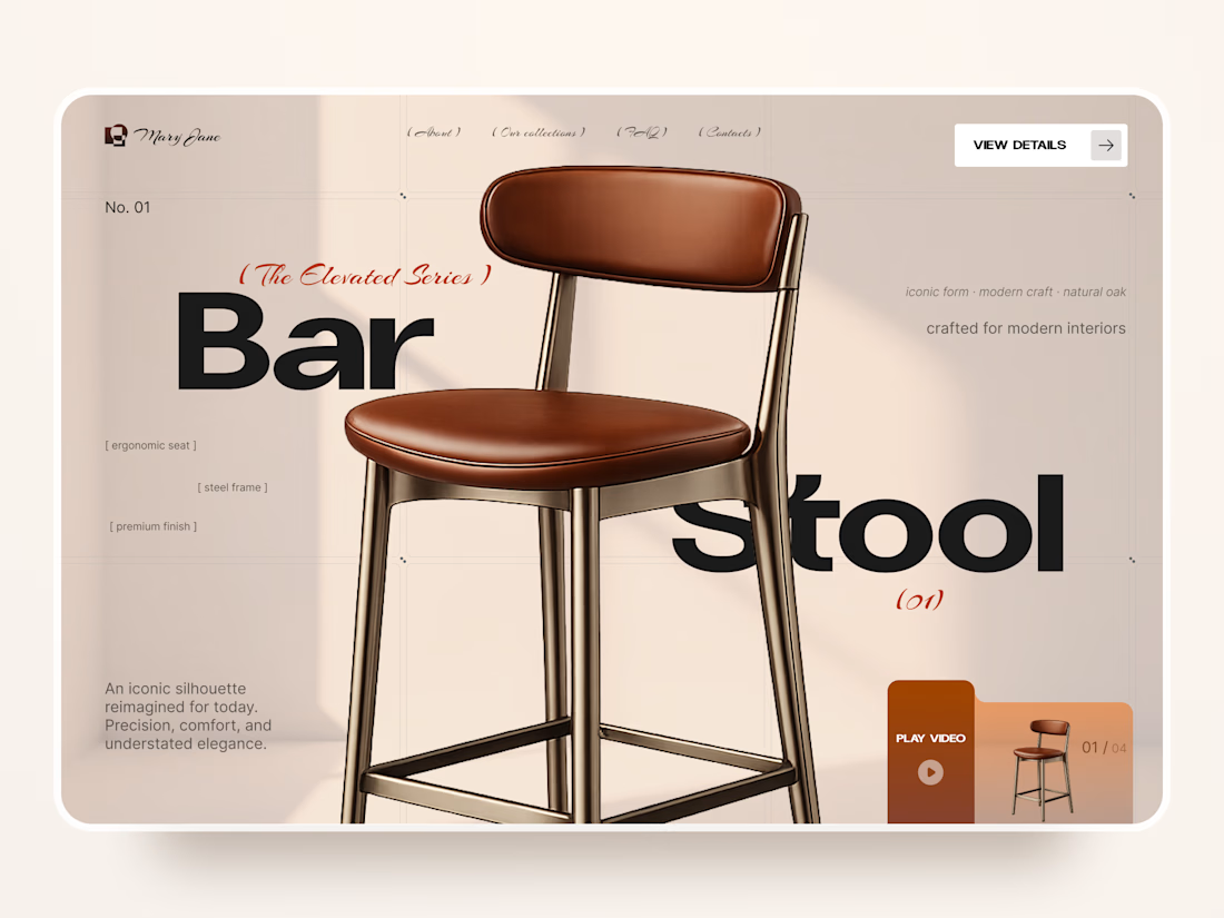
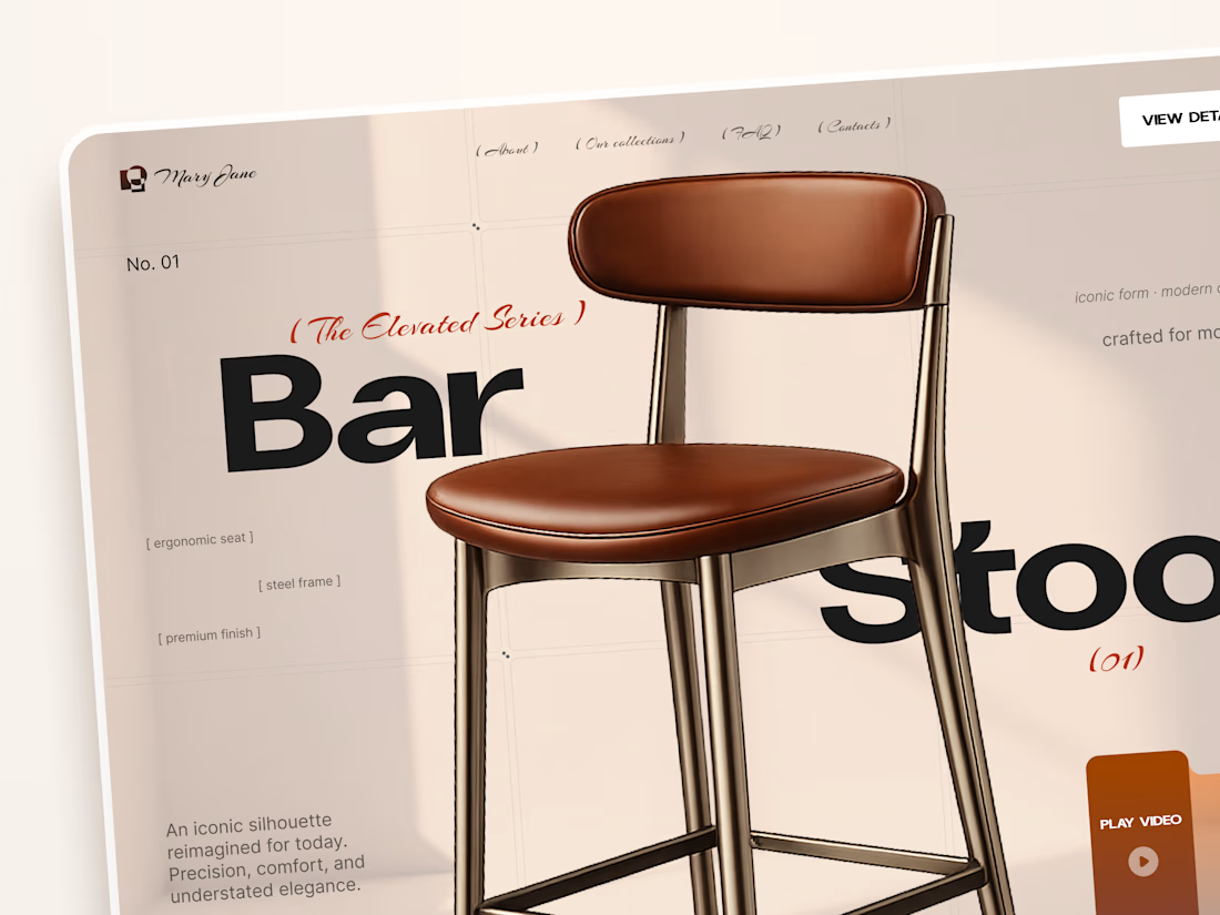
Mary Jane — Bar Stool Product Landing Page 🪑✨
A refined product landing page concept for a modern furniture brand, built around one statement piece
The design combines warm neutral tones, oversized typography, and editorial layouts to give the bar stool a premium, design-focused feel
Special attention was given to:
• Product-first composition
• Clean editorial typography
• Warm premium aesthetic
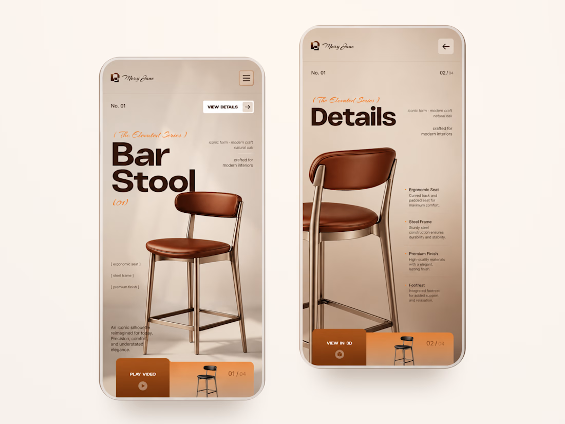
• Product details and features
• Video and 3D presentation
• Responsive mobile layout
The result is a simple, elegant experience that keeps the product at the center while giving the brand a distinctive visual character 🤎


Nice work


Hi, I'm Victoria, and this is Hardy, my golden retriever.
We spend a lot of time in New York. Hardy goes with me almost everywhere.
Then I got an idea.
What if brands could actually book advertising space on Hardy's harness?
For the Lovable challenge, I built Hardy Ad.
Brands pick a spot on a 3D Hardy, upload their sticker, choose their weeks and pay in one go. The booking confirms itself. No DMs, no invoices, no chasing.
Hardy Ad. New York's fluffiest billboard. Your brand can go places. Literally.

Such a fun and creative concept! 🐶 Love the idea of turning Hardy into NYC’s fluffiest billboard. Great execution! 🔥


