The network for creativity
Join 1.25M professional creatives like you
Connect with clients, get discovered, and run your business 100% commission-free
Creatives on Contra have earned over $150M and we are just getting started
Back to feedPost

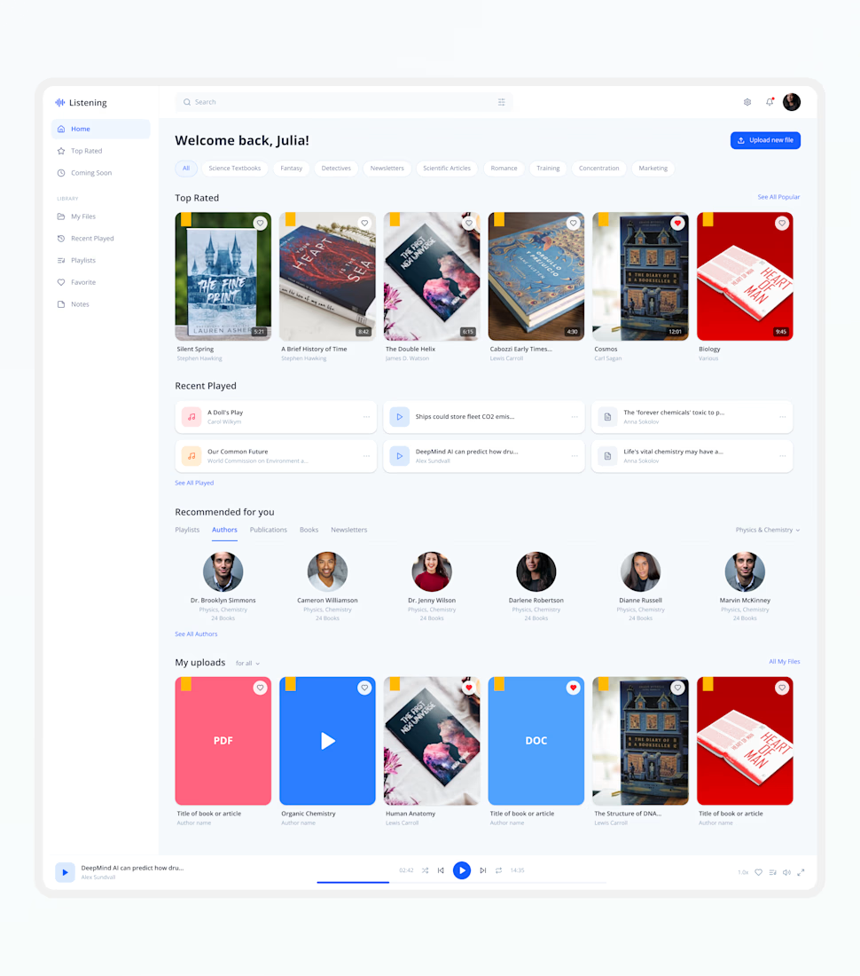
🚀 Modern Learning Platform Dashboard Design
Exploring a clean and modern dashboard experience designed for digital learning, audiobooks, content management, and personalized recommendations.
The goal was to create an intuitive user experience with seamless navigation, content discovery, uploads, playlists, listening history, and media controls—all within a scalable SaaS dashboard ecosystem.
Every section is designed to improve usability, increase engagement, and create a smooth content consumption experience.
💡 Turning Business Ideas Into Scalable Digital Products
✨ Available for SaaS, Dashboard, Web App & Mobile App Design Projects.

The network for creativity
Join 1.25M professional creatives like you
Connect with clients, get discovered, and run your business 100% commission-free
Creatives on Contra have earned over $150M and we are just getting started











Related posts

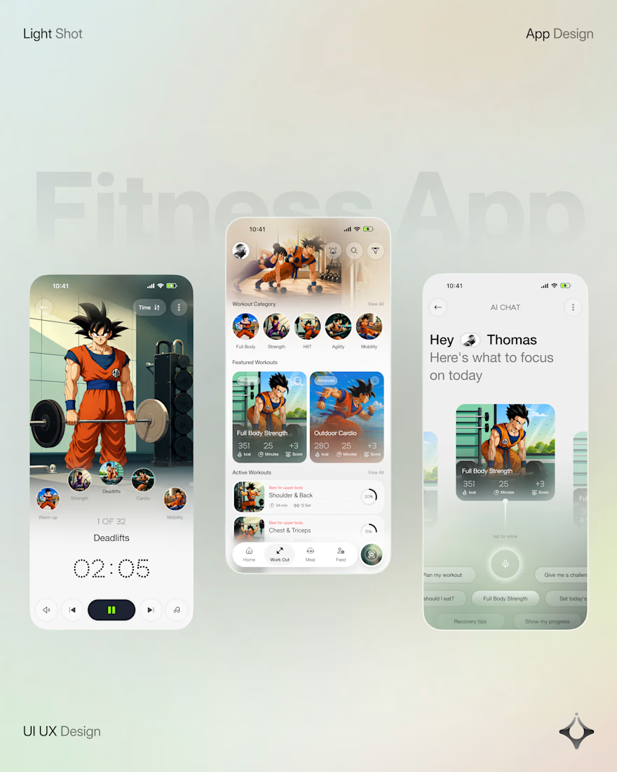
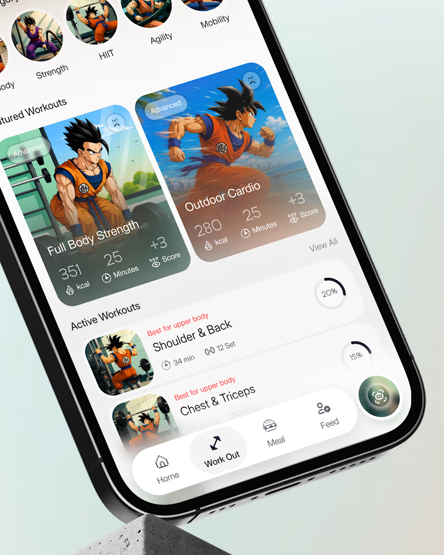
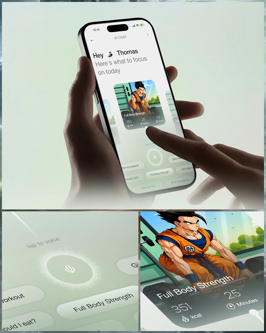
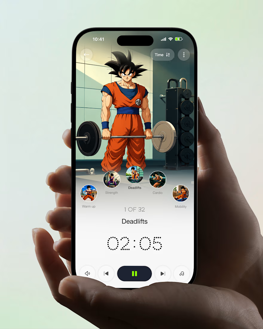
What if your fitness app felt like having a personal trainer in your pocket?
Meet your new workout companion. A bold fitness app concept combining personalized workouts, AI coaching, and a seamless mobile experience to make every session count.
Would you use this to level up your fitness journey?



Ye le Jani Juice Lab wali post ke liye copy-ready:
Love this concept Juice Lab! A fitness app that feels like a personal trainer in your pocket is exactly what's needed — combining personalized workouts with AI coaching and a seamless mobile experience is a great approach. The...

Shipped my first feature on Delphi last week!
We touched on profiles to add more entry points to a conversation, based off the users life experiences.
Already working on v1.2, stay tuned!


Solid work here can't wait for v1.2


