The network for creativity
Join 1.25M professional creatives like you
Connect with clients, get discovered, and run your business 100% commission-free
Creatives on Contra have earned over $150M and we are just getting started
Back to feedPost
Taste Test
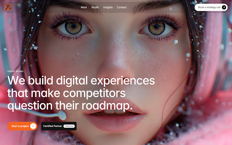
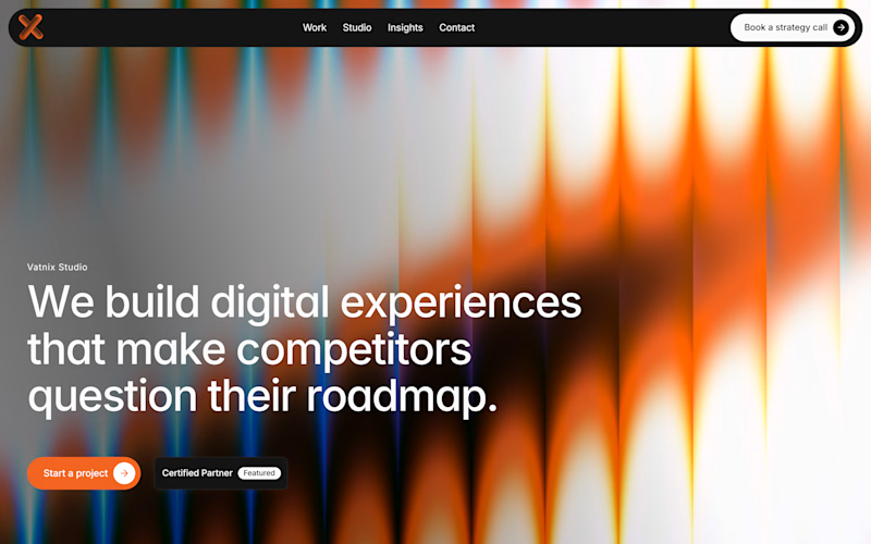
Design Agency Hero
Which is better?
4 voted
40%
6 voted
60%
10 votes
Closed

Amazing 😍

Thank you! Really appreciate it

The option on the left is more suitable for a studio, as this background fits the studio's design direction better.
But I could be wrong. I'd look at both options with animation: the first one has motion animation, the second one has background video.
Thanks for the thoughtful feedback! 🙌
Just a small note: the first uses a motion video, while the second uses a shader background. Really appreciate you sharing your thoughts!

Amazing design!
Thanks so much! Glad you liked the design
Appreciate everyone who voted! Thanks for helping me choose.

I'd vote for the right one. The abstract background makes the headline a lot easier to read at a glance. On the left one, the face competes a bit too much with the text.
Thanks! That's a great point, really appreciate your insight.
The network for creativity
Join 1.25M professional creatives like you
Connect with clients, get discovered, and run your business 100% commission-free
Creatives on Contra have earned over $150M and we are just getting started

Challenges
View all


Related posts

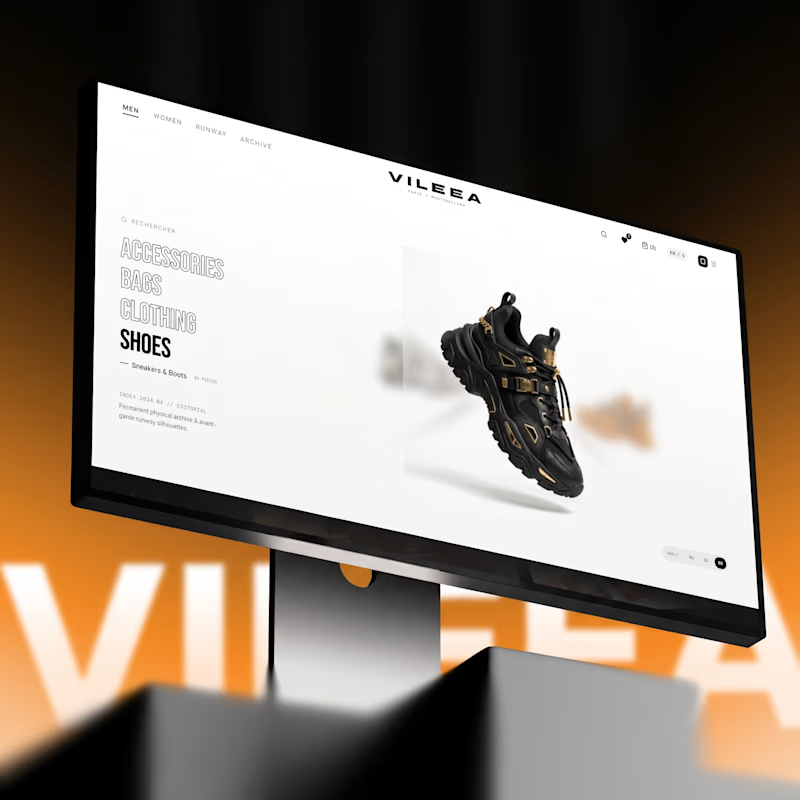
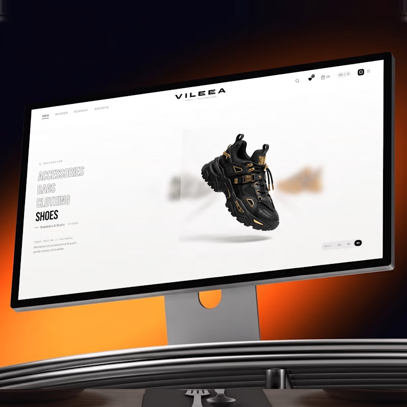
Help me decide the best visual direction for this 3D Product Hero Section:
Option A: Bold red accent with high visual impact
Option B: Subtle orange tone with smooth lighting focus
If you're building luxury e-commerce platforms, which UI aesthetic do you prefer?
Let’s hear your thoughts below! 👇


11 votes
Ends in 1d


Option A commands immediate attention for high-impact visual campaigns, but Option B feels much more aligned with luxury e commerce. A subtle, warmer tone creates a refined, high end look that keeps the product front and center without overwhelming the interface.


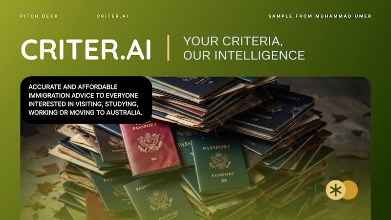
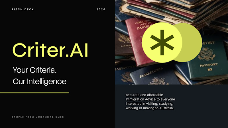
Criter.AI: Pitch Deck Cover, Two Design Directions
For an AI immigration advice platform serving Australia, I explored two cover directions to test how tone changes perception.
Direction 1, Olive gradient: warm, human and trustworthy, with a rounded image card and gold accents.
Direction 2, Dark and neon: high contrast, modern and investor-ready, with a bold split layout.
Both keep the brand mark, the tagline "Your Criteria, Our Intelligence" and the hero imagery, so the difference is purely in the design language.
Scope: pitch deck cover design and visual direction
Tools: Figma, PowerPoint, etc.
Available for pitch decks, presentations and brand design. Open to new projects.
Contra tags: , Presentation Design, Graphic Design, Branding, Startup Design
4 votes
Ends in 1d


