The network for creativity
Join 1.25M professional creatives like you
Connect with clients, get discovered, and run your business 100% commission-free
Creatives on Contra have earned over $150M and we are just getting started
Back to feedPost
Taste Test
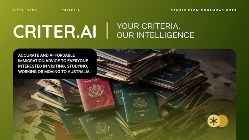
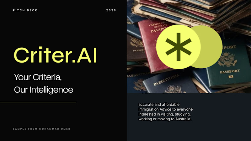
Criter.AI: Pitch Deck Cover, Two Design Directions
For an AI immigration advice platform serving Australia, I explored two cover directions to test how tone changes perception.
Direction 1, Olive gradient: warm, human and trustworthy, with a rounded image card and gold accents.
Direction 2, Dark and neon: high contrast, modern and investor-ready, with a bold split layout.
Both keep the brand mark, the tagline "Your Criteria, Our Intelligence" and the hero imagery, so the difference is purely in the design language.
Scope: pitch deck cover design and visual direction
Tools: Figma, PowerPoint, etc.
Available for pitch decks, presentations and brand design. Open to new projects.
Contra tags: , Presentation Design, Graphic Design, Branding, Startup Design
3 voted
50%
3 voted
50%
6 votes
Closed


Thanks. Please tell me one thing you would do to make it better?

Olive Gradient is Impressive.


i'd pick the olive gradient. the dark one is quieter.
Thanks Benjamin, Olive is surely attracts view

Thanks for thorough remarks. Gives it more Visual message.
The network for creativity
Join 1.25M professional creatives like you
Connect with clients, get discovered, and run your business 100% commission-free
Creatives on Contra have earned over $150M and we are just getting started

Challenges
View all


Related posts

Recent brand showreel ✨
Identity and pitch deck for Infranova AI. Dark, bold, and a lot of purple.

Great 😍


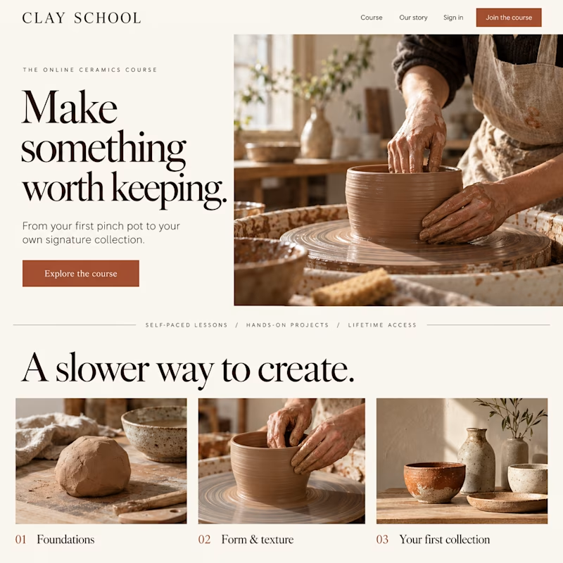
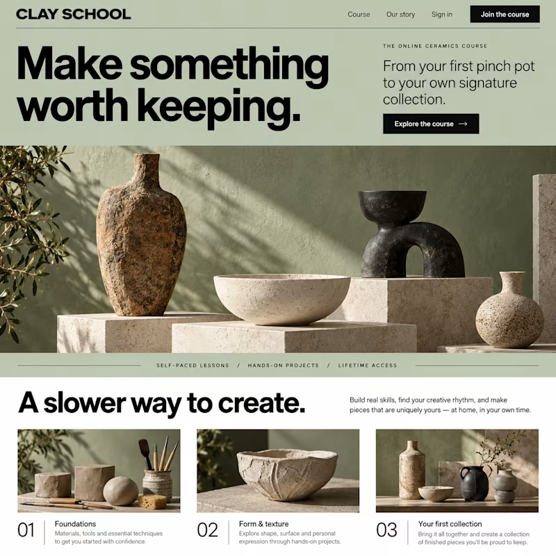
Which design would make you more likely to join this ceramics course?
Two new AI-generated Kajabi landing-page concepts for Clay School: warm editorial or modern gallery. Same course, two different directions. Pick your favorite below.

18 voted
46%
21 voted
54%
39 votes
Closed

Same collection. Two different experiences.
Would you choose the bold, playful catalogue or the calm, architectural gallery?
Both complete websites are free to download — source code, assets and animations included.
Grab the kit: https://contra.com/products/FNrYmtZe-stillform-two-animated-landing-pages
10 voted
53%
9 voted
47%
19 votes
Closed
