The network for creativity
Join 1.25M professional creatives like you
Connect with clients, get discovered, and run your business 100% commission-free
Creatives on Contra have earned over $150M and we are just getting started
Back to feedPost

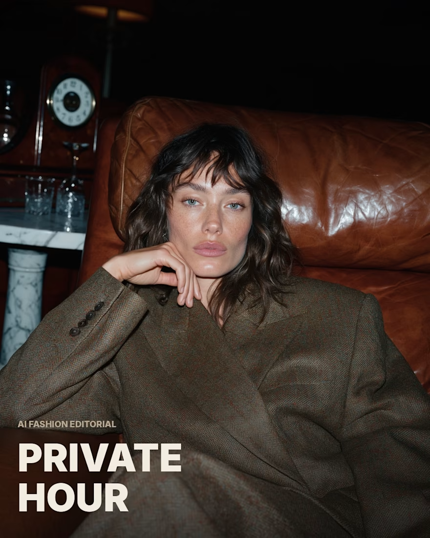
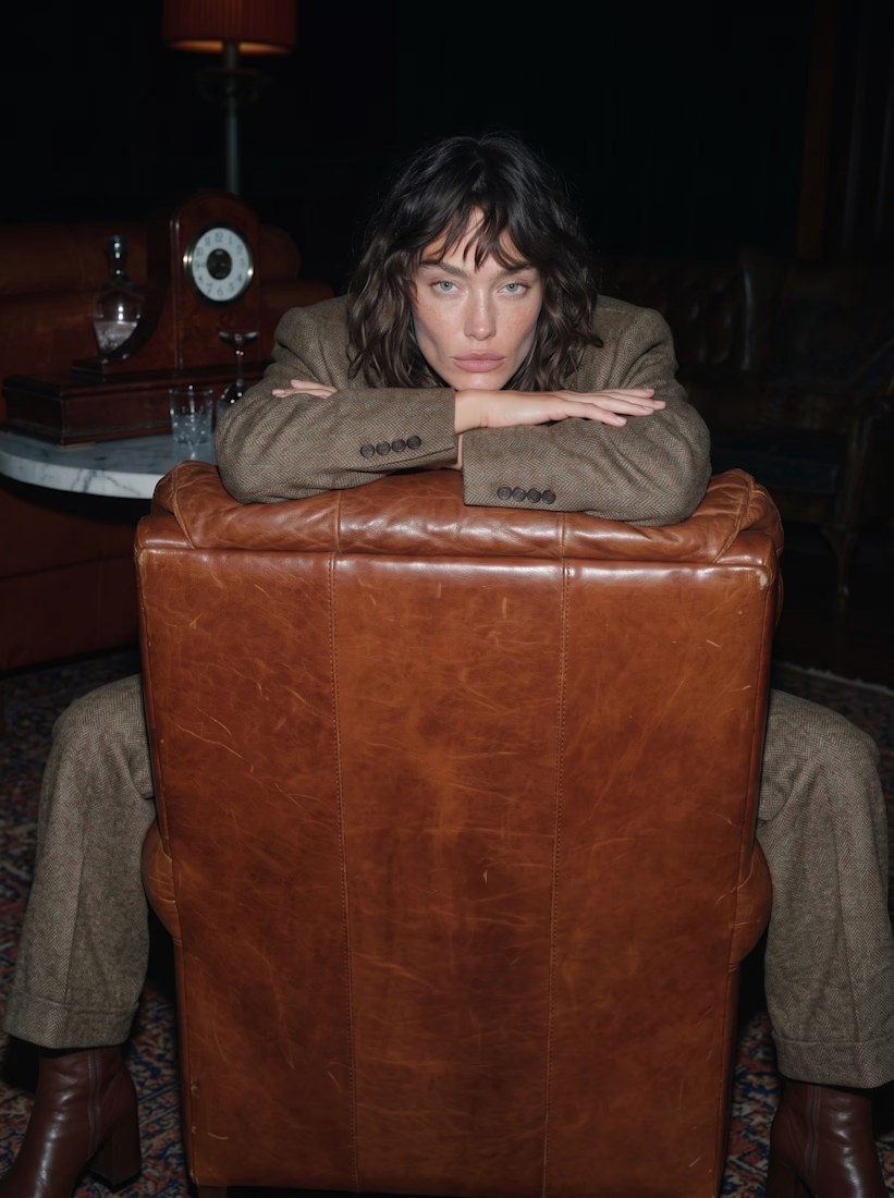
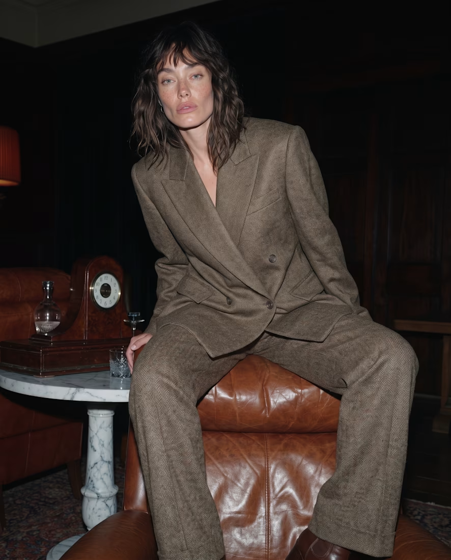
Hey all 👋 been playing with a moodier, more cinematic direction for this one — vintage room, warm leather, a single tweed look, shot like an editorial rather than a straightforward campaign.
Full series is up in my portfolio if you want to see more 🖤


The network for creativity
Join 1.25M professional creatives like you
Connect with clients, get discovered, and run your business 100% commission-free
Creatives on Contra have earned over $150M and we are just getting started










Related posts

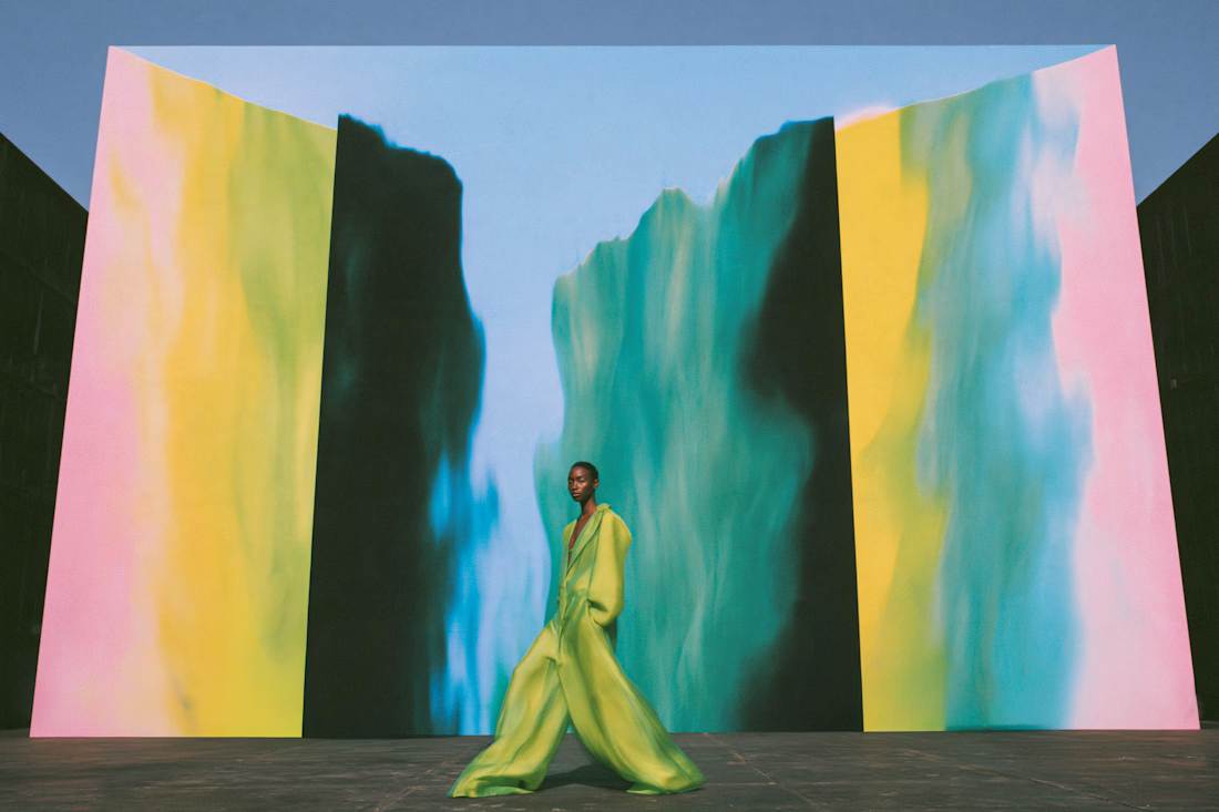
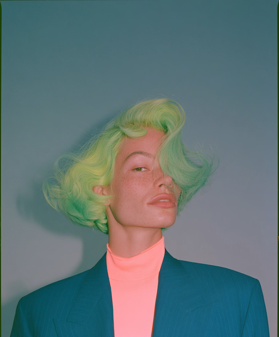
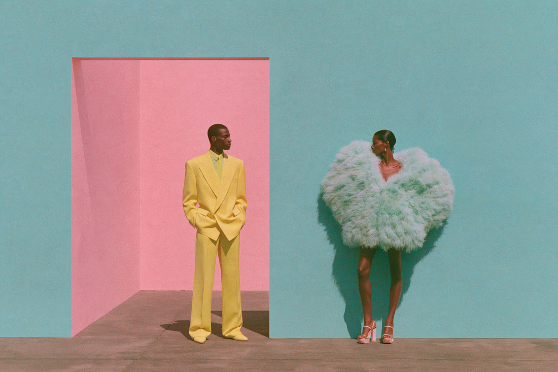
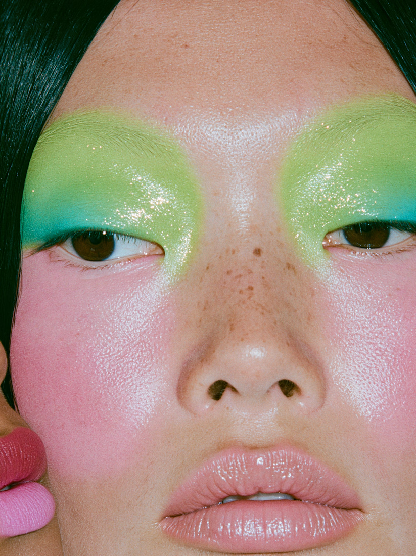
Chlorophyll: an 18-frame color story that moves from pastel to full saturation. Many models, many designers, held together by a single palette, built to read like an editorial where the images carry the story. Original artwork and visual storytelling by Kelsey Laurel Creative Studio.




One scene, from the rough visual to the final shot 👀
Made a quick breakdown of how the 3D, lighting, materials, textures, and motion came together.
This is probably my favorite kind of content to make. Just showing how the thing actually gets built.


Super sleek presentation! ✨ The phone mockup with that purple gradient is looking premium. Clean editing!