The network for creativity
Join 1.25M professional creatives like you
Connect with clients, get discovered, and run your business 100% commission-free
Creatives on Contra have earned over $150M and we are just getting started
Back to feedPost


Financial clarity, designed to convert
I just finished this high-conversion landing page concept for a financial SaaS brand. Clean layout, strong hierarchy, premium visuals, and a conversion-focused flow from hero to pricing.
Built with:
• Minimalist SaaS structure
• Strong CTA placement
• Trust-building sections
• Clear pricing cards
• Modern dark/light contrast
If you’re building a SaaS, fintech, or B2B product and want a website that feels premium and drives action, this is the kind of direction I love designing.


The network for creativity
Join 1.25M professional creatives like you
Connect with clients, get discovered, and run your business 100% commission-free
Creatives on Contra have earned over $150M and we are just getting started
Related posts

Proper Form — Social Media Branding System
A flexible social media system created for Proper Form as part of the wider brand identity.
The template system was designed to adapt across different post formats, banners and platforms while maintaining a consistent visual language.
Rather than repeating one rigid layout, the system gives the brand room to vary composition, imagery and content while remaining clearly recognizable.
Created by Lepisov Branding in collaboration with Creative Mints.
Logo design: Ilya Gorchanyuk
Creative direction: Dmitry Lepisov
Brand identity + social system: Lepisov Branding × Creative Mints


This is how a social system should work: strong enough rules that the brand reads at thumbnail size, loose enough that the feed never looks copy-pasted. Do you hand clients a Figma kit for this, or build it in something their team edits themselves?

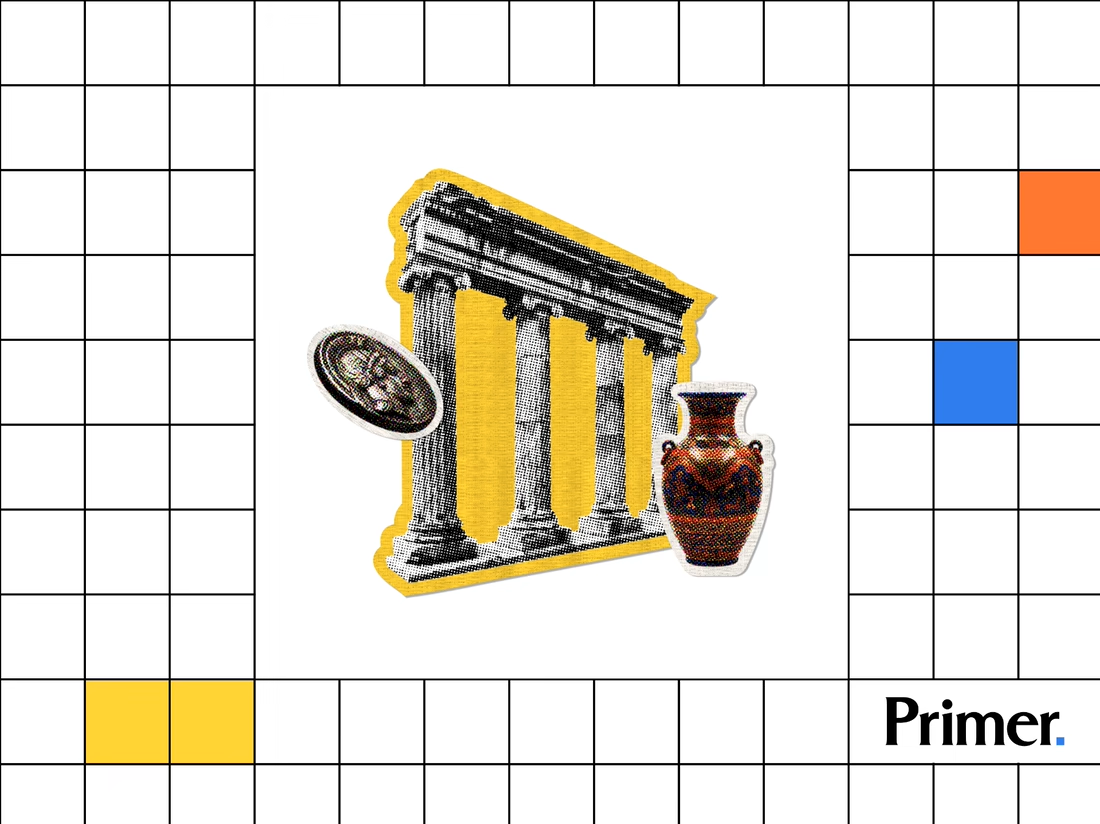
Just posted a new case study featuring the thumbnail artwork I designed for Primer.com. Check it out! 📚

Nice! Thumbnail artwork can make such a difference in how content catches attention. Looking forward to seeing how you approached this project!

🚀 The Keel website is now live!
I designed Keel as a fintech website concept focused on presenting financial products through a clean layout, clear messaging, and a simple user experience.
I’ve also built the website in Framer. Check it out below!
🎨 Built with Framer: https://thekeel.site/
Always happy to hear your feedback!

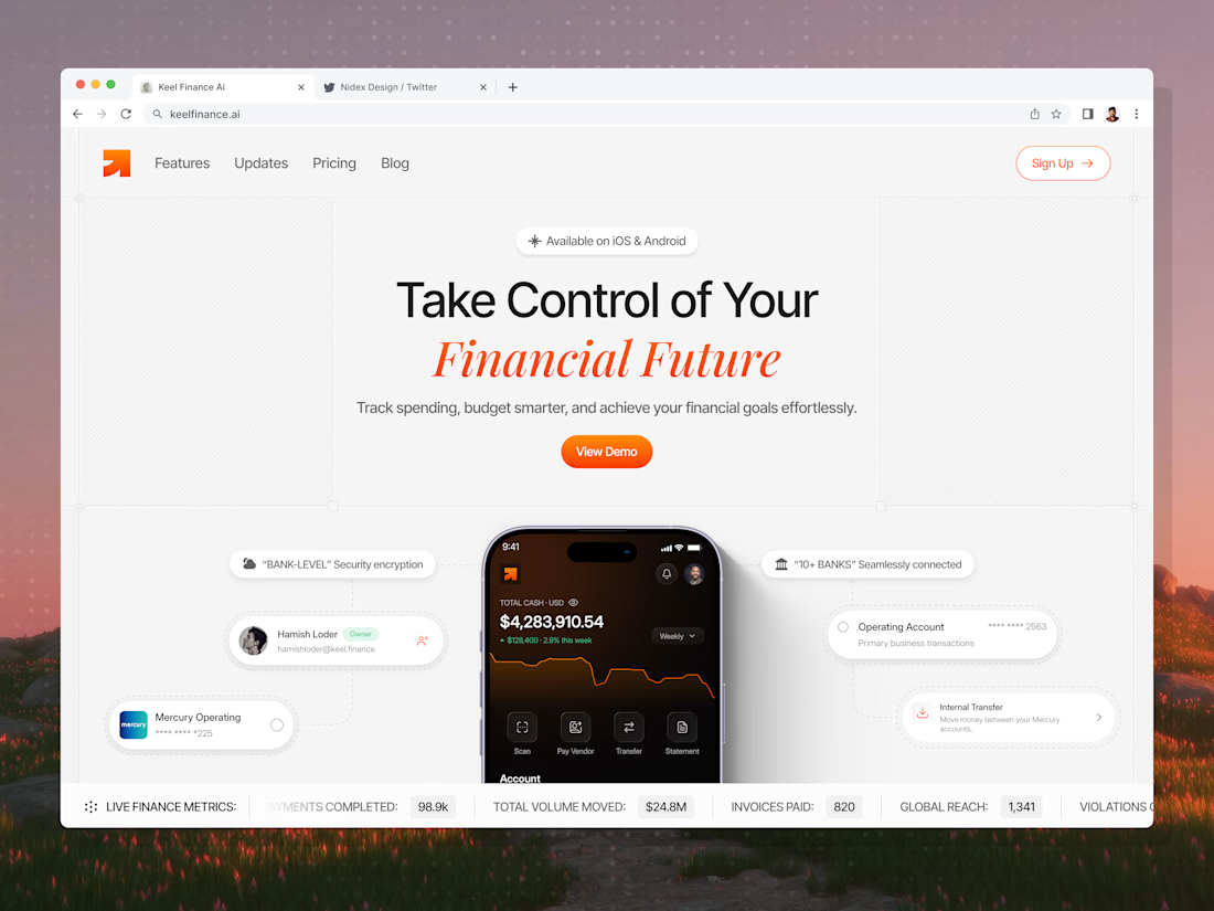

Congrats on the launch Nilkanth! Keel looks super clean — love how you kept the fintech messaging simple and focused. The "Take Control of Your Financial Future" hero with the app preview balances trust and clarity perfectly. Great job building it in Framer too!