The network for creativity
Join 1.25M professional creatives like you
Connect with clients, get discovered, and run your business 100% commission-free
Creatives on Contra have earned over $150M and we are just getting started
Back to feedPost
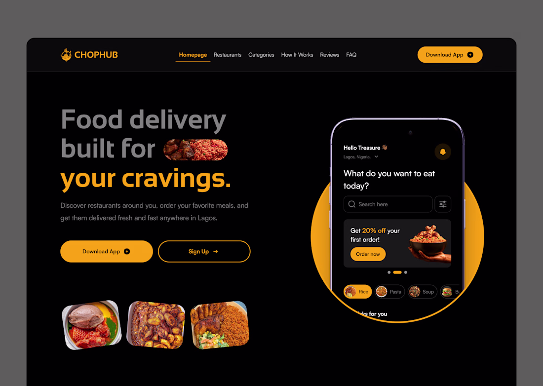
One color. That's all it took. 🟡
I designed this food delivery landing page for ChopHub and the entire visual language runs on a single primary color: amber.
No complex gradients. No trendy glassmorphism. Just disciplined use of one warm, high-energy hue against a deep black surface.
Here's the color strategy behind it:
✦ Amber = action. Every interactive element, buttons, active states, highlights, promo tags, lives in amber. Your eye always knows where to go next.
✦ Black = amplifier. Dark backgrounds don't just look premium, they make warm colors louder. The amber hits different on black than it ever would on white.
✦ Gray = support. Supporting text, inactive nav links, subtle UI elements, all in muted tones. They carry information without competing for attention.
The result? A UI that feels energetic, focused, and on-brand without visual noise.
This is color hierarchy in action. Not color variety. Not color trends. Just knowing where your primary color should live and protecting that space.
If you're building a brand-forward product, try this: strip your design down to ONE primary color + neutrals. You'll be surprised how much cleaner and stronger it gets.
🛠 Tools: Figma
🎨 Palette: Amber #F5A623 + Near-black #0E0E0E
📱 Type: Food delivery app landing page
Open to new projects. Hit Hire Me if you want a UI that works as hard as it looks. 🚀
Absolutely Amazing!
The network for creativity
Join 1.25M professional creatives like you
Connect with clients, get discovered, and run your business 100% commission-free
Creatives on Contra have earned over $150M and we are just getting started
Related posts
Love how far you've experimented with the ghost! Keep it going! : )
Love this!
How are you with understanding your blood test results?
Aura is a personal health dashboard 📊 that organises your medical test results into a plain-language insights. You can also chat with Aura to go deeper on anything that concerns you.
Built on Bubble AI generated foundation and taken the rest of the way by hand:
→ Started with a single prompt to Bubble AI, shaped by Claude;
→ Bubble AI generated the foundation: pages, data structure, and UI;
→ Cleaned up the structure into a working app;
→ Redesigned every screen into a soft, light experience.
🎬 See full process walkthrough and comparison between Bubble's initial output and my design in the comments.
🔗 Try Aura
Process walkthrough:
Trending
Claude
Claude has entered the design space. How are you using Claude Design?
Contra University
Learn from expert creatives how to earn more using next-gen AI tools.
MagicPath
The canvas is infinite, and exploration is becoming the workflow. How are you using MagicPath?
creativeaiflow
Creative AI workflows are evolving. What tools do you use, and what are their strengths and weaknesses?
freelancerlife
Freelancer life is wins, pivots, and everything in between. What’s yours right now?