The network for creativity
Join 1.25M professional creatives like you
Connect with clients, get discovered, and run your business 100% commission-free
Creatives on Contra have earned over $150M and we are just getting started
Back to feedPost
Simple circular grid😍
I had been seeing this effect since on so many social media posts and i thought "I can do that" but after fiddling I couldn't quite get it right until I found a plugin that helps me create and adjust grid expressions in after effects. Now I think I'm gonna use this effect more often.

Love it 🤩

thank you very much.
The network for creativity
Join 1.25M professional creatives like you
Connect with clients, get discovered, and run your business 100% commission-free
Creatives on Contra have earned over $150M and we are just getting started



Related posts

Design Agency Website
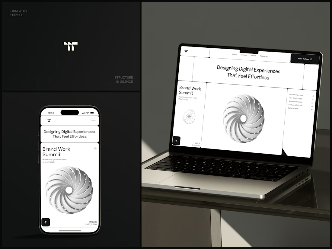
Only one cell on this homepage is black.
The rest of the page is a grid of rounded white cells: the headline, an event card, a white 3D spiral and a list of services. The black one, top right, holds the "Follow the future" button and stands out against all that white.
On the phone, the cells stack into a single column. The navigation folds into a menu icon, and the event card and spiral merge into one cell.
The headline reads "Designing Digital Experiences That Feel Effortless", so the grid has to look organized before anyone reads a word.
Designed by the Hue & Machine team.
#DesignAgency #WebDesign #AgencyWebsite #LandingPage #BentoGrid #MinimalDesign #UIDesign #ResponsiveDesign #MobileDesign #FigmaDesign



Looks cool

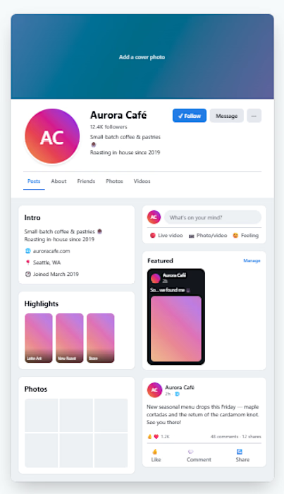
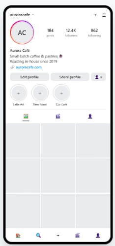
A little tool I built for my social media management workflow.
A Fb and Ig page mockup tool to bring page concepts and visual directions to life.
Built by me, for the work I do.🚀

Figma's auto layout now has a Grid flow, and it changes how I build feature sections.
• Grid is a third auto layout flow next to horizontal and vertical.
• Set the columns, the rows and the gap on the frame.
• A child can span more than one cell, like a wide feature card across two columns.
• It's close to how CSS grid works, so the handoff is easier.
Do you build card sections with Grid yet, or nested stacks?
Follow for more videos: instagram.com/sellwrightstudio · youtube.com/@sellwrightstudio