The network for creativity
Join 1.25M professional creatives like you
Connect with clients, get discovered, and run your business 100% commission-free
Creatives on Contra have earned over $150M and we are just getting started

The network for creativity
Join 1.25M professional creatives like you
Connect with clients, get discovered, and run your business 100% commission-free
Creatives on Contra have earned over $150M and we are just getting started

Challenges
View all


Related posts

Modern Hero Section Design 🚀
A sleek and modern hero section concept designed to create a strong first impression through clean layouts, bold typography, and a visually engaging interface.
Focused on balancing aesthetics, usability, and clear communication — helping brands present their value with confidence.
Designed in Figma.

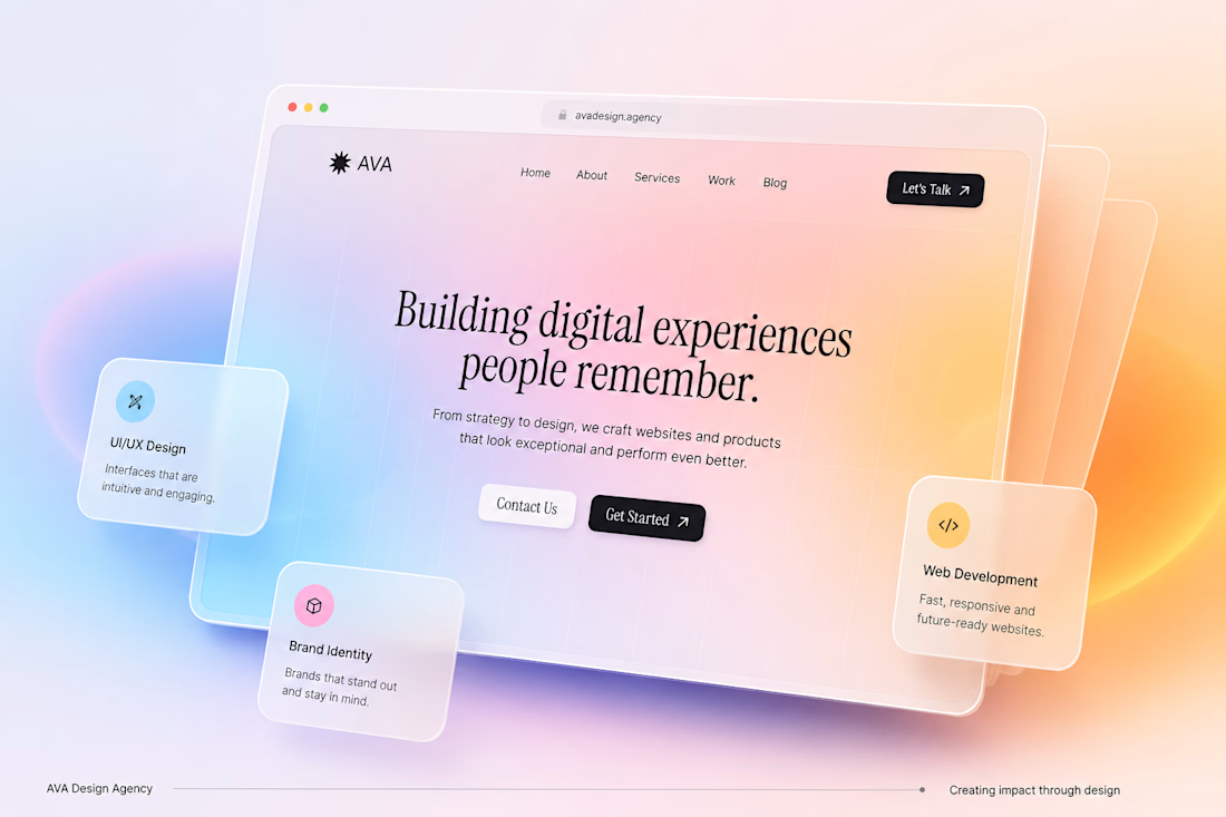

The floating service cards sit off the mock frame, so the hero reads as a product instead of a flat poster. The serif line stays readable against that peach gradient.

Join for event friends


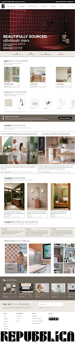
Made this high-conversion editorial desktop homepage concept design for Repubblica in Figma.
What do you guys think?