The network for creativity
Join 1.25M professional creatives like you
Connect with clients, get discovered, and run your business 100% commission-free
Creatives on Contra have earned over $150M and we are just getting started
Back to feedPost
Modern Hero Section Design 🚀
A sleek and modern hero section concept designed to create a strong first impression through clean layouts, bold typography, and a visually engaging interface.
Focused on balancing aesthetics, usability, and clear communication — helping brands present their value with confidence.
Designed in Figma.

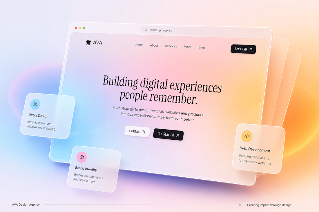

The floating service cards sit off the mock frame, so the hero reads as a product instead of a flat poster. The serif line stays readable against that peach gradient.

Thank you! I really appreciate it.
The network for creativity
Join 1.25M professional creatives like you
Connect with clients, get discovered, and run your business 100% commission-free
Creatives on Contra have earned over $150M and we are just getting started

Challenges
View all


Related posts


“Or similar” leaves a lot to the imagination.
A few billboard designs I made for Sync as part of the rebrand. The campaign centres on a simple promise: the car you see is the car you drive.
I kept that message big and direct, with the cars up close and enough pink to make you look twice.
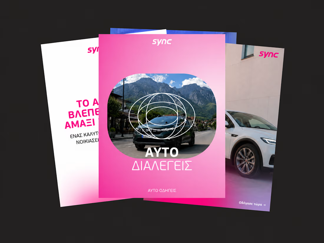
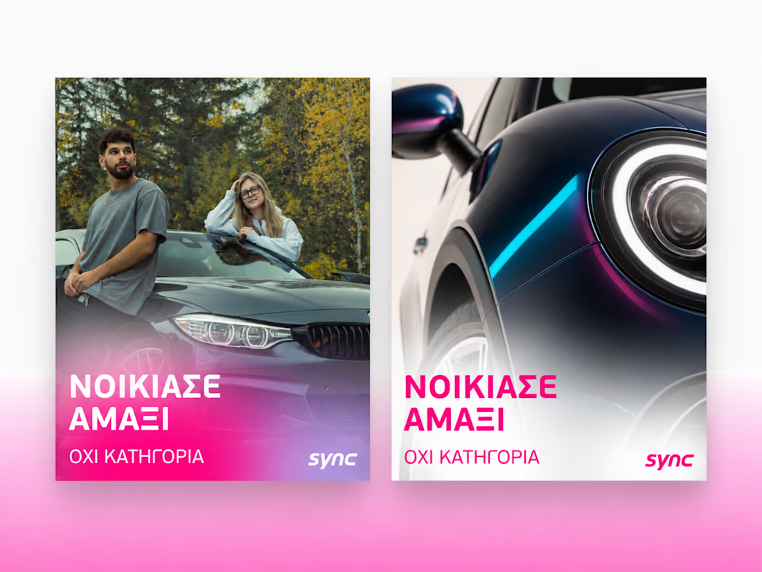
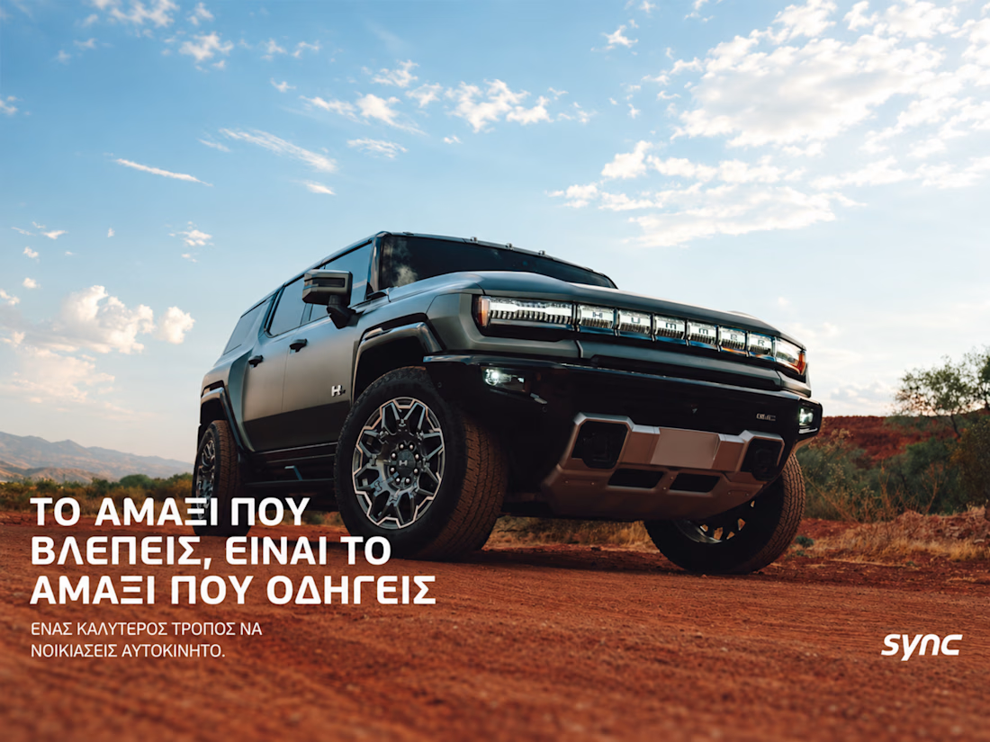
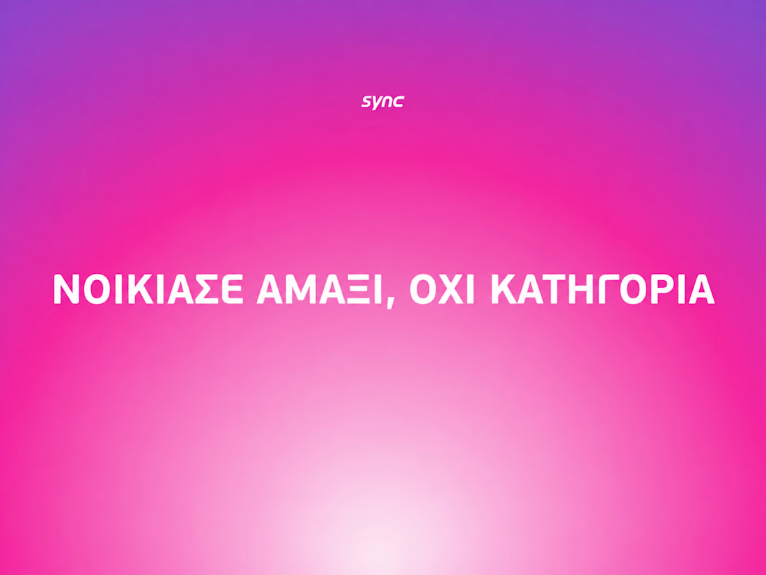
The way the oversized promise carries through the pink palette is really effective—the close-up crops make the car feel immediate without losing the campaign idea.


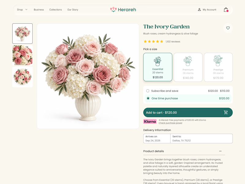
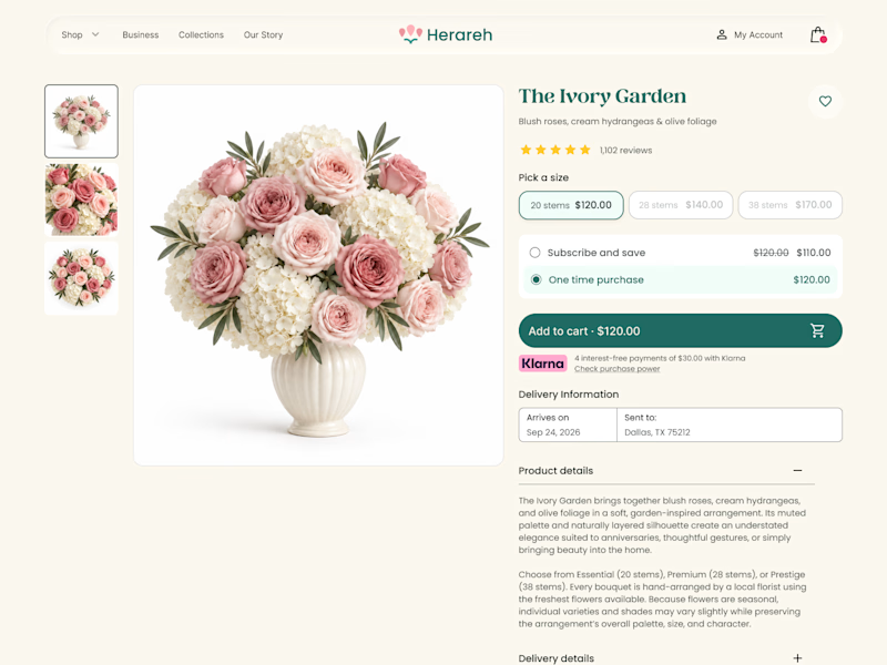

Icon cards for me, bouquets are such a visual purchase that a scannable icon beats reading "small/medium/large" every time. Did the compact chips version convert worse in testing, or are you still gathering data on that?


The search field keeps a spinner even while the Recent/Navigation groups stay visible underneath - you don't lose your place waiting for results, the palette just adds to what's already there.