The network for creativity
Join 1.25M professional creatives like you
Connect with clients, get discovered, and run your business 100% commission-free
Creatives on Contra have earned over $150M and we are just getting started
Back to feedPost
Made this high-conversion editorial desktop homepage concept design for Repubblica in Figma.
What do you guys think?

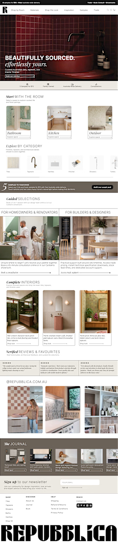

The split between homeowners and builders makes this editorial grid feel considered, not just a pretty collage. Quiet serif headlines over those kitchen photos keep the page magazine-calm while the columns do the navigation.

Thanks a lot!
The network for creativity
Join 1.25M professional creatives like you
Connect with clients, get discovered, and run your business 100% commission-free
Creatives on Contra have earned over $150M and we are just getting started








Related posts

Exploring hero sections for Nation e-commerce
Loving the direction

Solid layout, Miguel! The contrast between the clean typography and those interactive bento-style cards is crisp. Building this layout with smooth CSS grid transitions or GSAP pin scrolling would make the UX feel incredibly interactive.

The Good Times website is live 👀
Most app sites start with a phone mockup and a list of features. This one starts with the problem, so you can see yourself in it first. The app shows up after that, as the answer.
https://goodtimestimer.com/
Built with Astro.


Great concept

Same SAE-REN project. A new way to explore it.
I’ve reworked the case study to make the connections between the identity, packaging, and physical applications clearer.
I think this version finally strikes the balance I was looking for: explaining the design decisions and logic behind the system while making the full page a pleasure to explore.
Old or new, which version would make you keep exploring?
2 voted
15%
11 voted
85%
13 votes
Closed

New♥️