The network for creativity
Join 1.25M professional creatives like you
Connect with clients, get discovered, and run your business 100% commission-free
Creatives on Contra have earned over $150M and we are just getting started
Back to feedPost

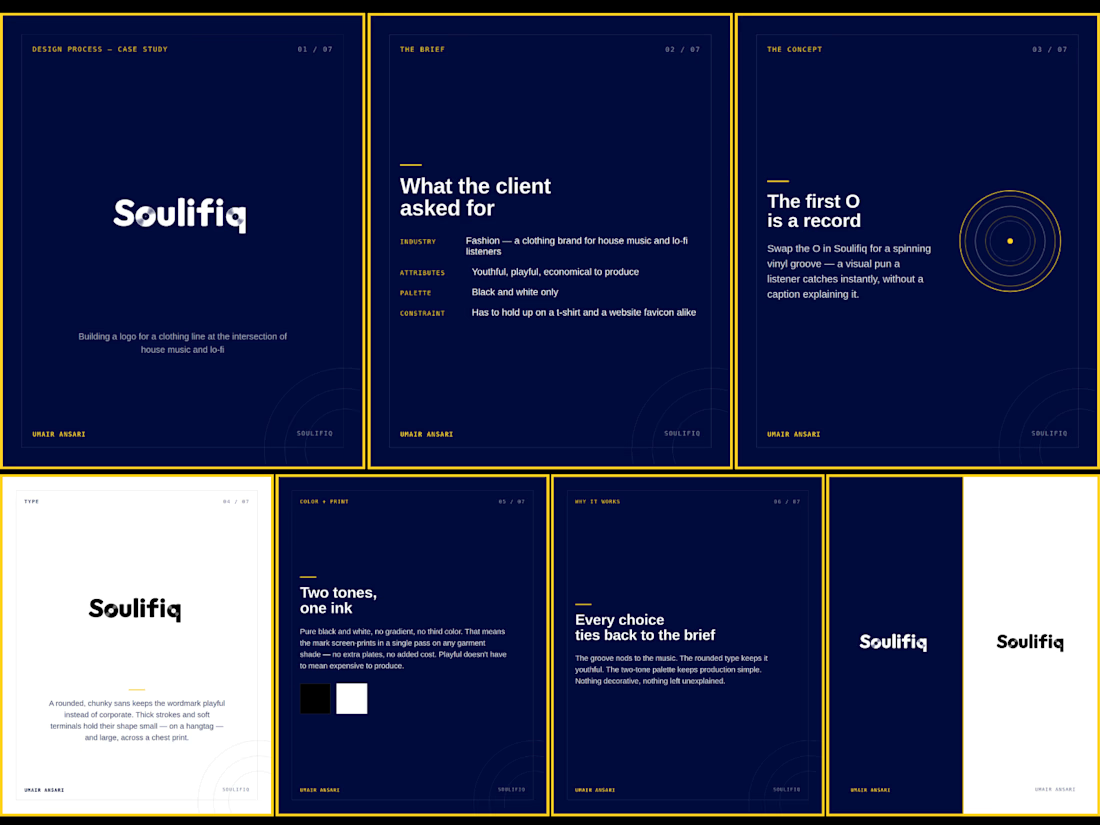
A brief said "youthful, playful, economical". Here's how those three words became a spinning record inside a letter O.
Soulifiq is a clothing line for house music and lo-fi listeners. Black and white only, and it had to work equally well on a hangtag and a t-shirt. That last constraint shapes more of a logo than people expect it rules out anything that only works at one size.
The idea came from the brief itself, The first O becomes a vinyl groove, a nod any listener catches without needing it explained. The type is a rounded, chunky sans so it reads as playful instead of corporate. And because it's pure black and white, it screen prints in a single pass on any garment color no extra plates, no added production cost.
That last point is the one I keep coming back to. "Playful" and "cheap to produce" usually get treated like opposite goals in fashion branding. They don't have to be. The constraint can be the idea.
What's a production constraint that's actually improved one of your designs, instead of limiting it?
#LogoDesign #BrandIdentity #GraphicDesign #FashionBranding #DesignProcess


The network for creativity
Join 1.25M professional creatives like you
Connect with clients, get discovered, and run your business 100% commission-free
Creatives on Contra have earned over $150M and we are just getting started













Related posts


A Recent Framer-Based Brand Experience for a Real Estate Company


Super clean brand system! 🤌 Love the mint on dark contrast and how the mark works across touchpoints - that ID card mockup is chef's kiss. Great Framer execution for real estate!

Not every client comes to me for a brand identity and not all my clients are skincare or cosmetic brands.
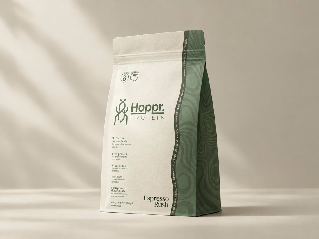
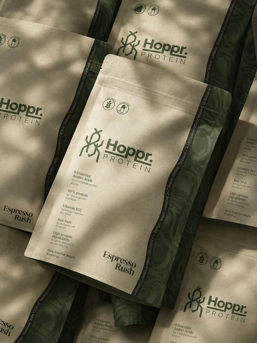
That was the case with Hoppr, a protein powder brand made from crickets. 🦗 YES, CRICKETS!
Sometimes the logo, colors, and visual system are already there and my job is to bring them to life on packaging and see how far I can push them.
I love projects like this because I get to play with typography, layout, and materials while working within an existing identity.
How much freedom do you think a designer should have when working with an established brand?


Great packaging work, nice job

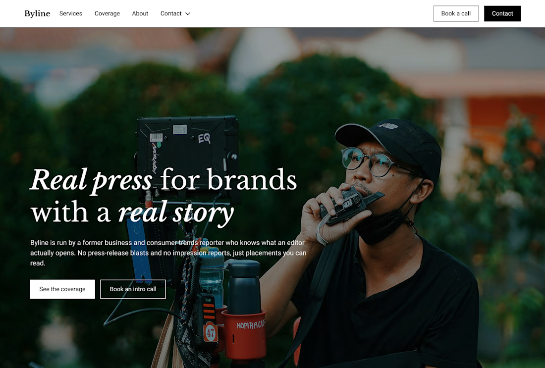
Built this in Framer as a concept project. Goal was to make it feel run by ex-journalists. Choices: editorial serif (Libre Baskerville), a dark photo with one color accent, and copy that positions against blast-style PR.
Where I’m unsure: text legibility over the photo and whether the two CTAs compete. What would you change?

That's great design it feels professional I like how the background mixed with interface ❤️❤️
Great job Cheree🎉🎉


