The network for creativity
Join 1.25M professional creatives like you
Connect with clients, get discovered, and run your business 100% commission-free
Creatives on Contra have earned over $150M and we are just getting started
Back to feedPost

Desktop looks good. But how is your mobile conversion rate?
Most founders lose 70% of their ad spend simply because their mobile layout is an afterthought.
When I architected this homepage for NailHarmonie, the goal was simple: make the mobile experience just as frictionless as the desktop.
Zero dead ends for thumb-scrolling.
Instant add-to-cart access on collections.
Clear trust badges visible above the fold.
The client loved the build, and the metrics followed.
Stop forcing mobile shoppers to pinch and zoom. Build for the screen they are actually buying on.


Design is far away frim my understanding but it looks cool and the responsive side is pretty strong and appealing without any frictions as you have promised so good work!
The network for creativity
Join 1.25M professional creatives like you
Connect with clients, get discovered, and run your business 100% commission-free
Creatives on Contra have earned over $150M and we are just getting started
Related posts

Workforce Activity Overview – Mobile Dashboard Widget
This mobile activity widget was designed to help employees and managers understand yearly work patterns without opening a full dashboard. It brings together total logged hours, annual leave, sickness, training and project activity in one clear view, using strong hierarchy and restrained corporate colours to make the information easy to scan.
The simplified layout could reduce the time needed to review an employee’s activity from several minutes to under 30 seconds. Managers can identify unusual absence levels, check workload distribution and prepare performance reviews faster, while employees gain a clearer understanding of how their recorded time has been allocated.



That yearly summary view is such a smart addition, most time trackers stop at weekly reports and leave you to do the math yourself. Did the Jitter integration require much custom mapping or was it fairly plug and play?

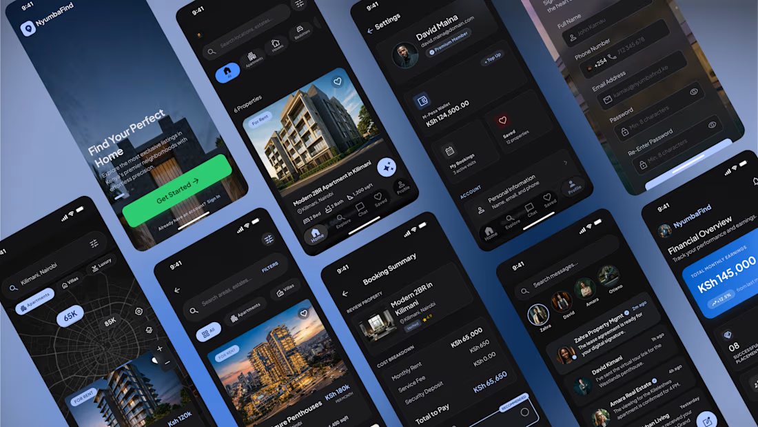
Real Estate Mobile App — UX/UI Design
Designed a modern real estate mobile experience that simplifies the journey of finding, exploring, and purchasing property.
This concept focuses on creating an intuitive, premium experience through clean navigation, personalized recommendations, and a visually immersive interface. Every screen was designed to reduce friction and help users make confident decisions.
What I worked on
• UX Research & User Flows
• Information Architecture
• Wireframing
• High-Fidelity UI Design
• Design System
• Interactive Prototyping
• Mobile App Design
Key Features
🏠 Property discovery with advanced search & filters
📍 Interactive map exploration
❤️ Save and compare favorite listings
💬 Agent messaging & communication
📅 Property viewing scheduler
📊 Mortgage & affordability calculator
🔔 Personalized recommendations
👤 User profile and saved searches
Design Approach
The interface embraces a modern dark theme with carefully balanced typography, generous spacing, and vibrant accent colors to create a premium yet accessible experience. The goal was to make browsing properties feel effortless while maintaining trust and clarity throughout the user journey.
Tools
• Figma
• FigJam
I'm always excited to design products that solve real user problems while delivering polished, business-focused experiences.



I love this premium work 🔥😍


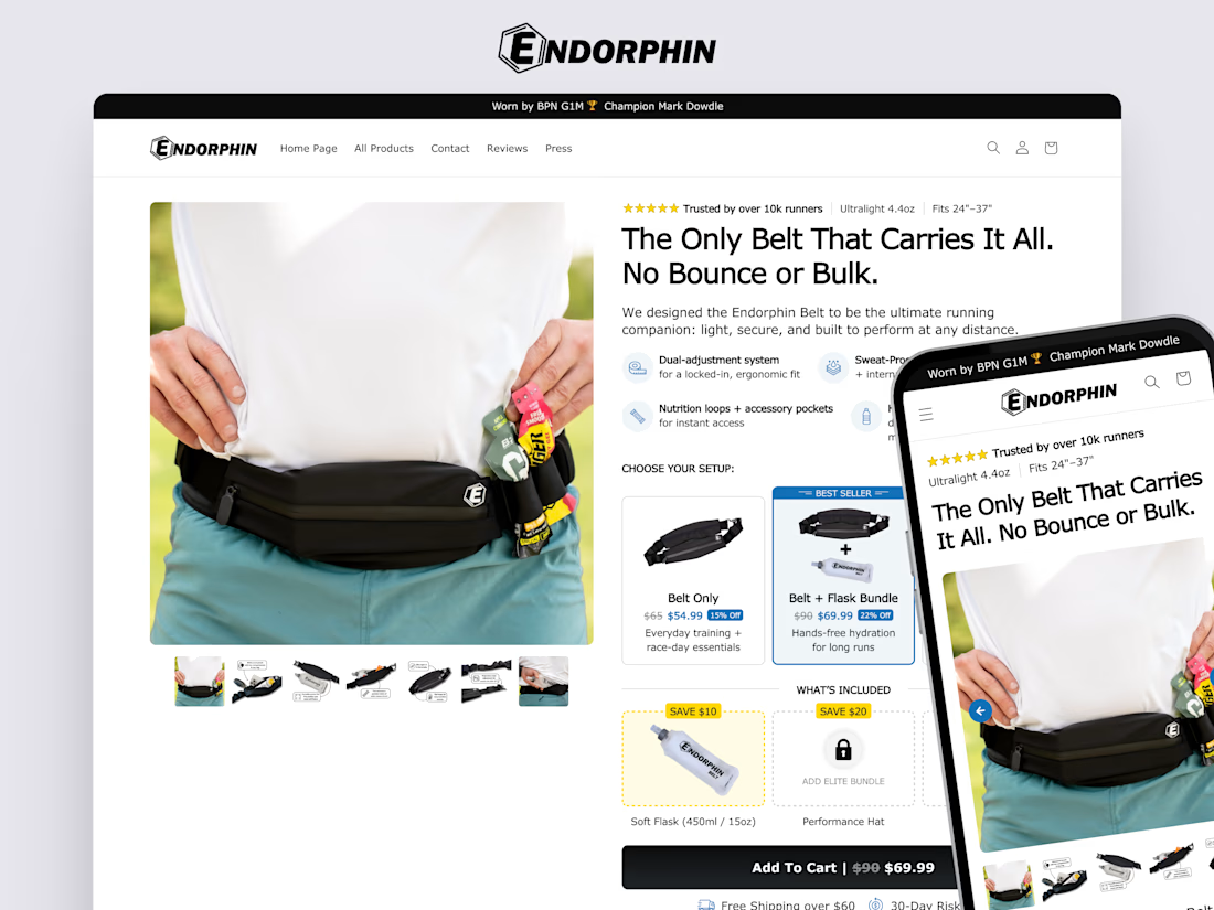
Conversion-focused product page (PDP) I designed for Endorphin Belt.
The goal was to create a premium buying experience beyond Shopify’s default theme limitations.
The redesign introduced strategic UX and CRO improvements designed to increase average order value (AOV) while strengthening buyer confidence.
Breaking out of Shopify's default theme constraints for something this detailed (bundle builder, cross-sell flasks, the whole setup flow) is a solid amount of custom work. Did you build the bundle logic natively in Replo or lean on a separate app for that?












Trending

Claude
Claude has entered the design space. How are you using Claude Design?

Contra University
Learn from expert creatives how to earn more using next-gen AI tools.
creativeaiflow
Creative AI workflows are evolving. What tools do you use, and what are their strengths and weaknesses?
freelancerlife
Freelancer life is wins, pivots, and everything in between. What’s yours right now?