The network for creativity
Join 1.25M professional creatives like you
Connect with clients, get discovered, and run your business 100% commission-free
Creatives on Contra have earned over $150M and we are just getting started
Back to feedPost

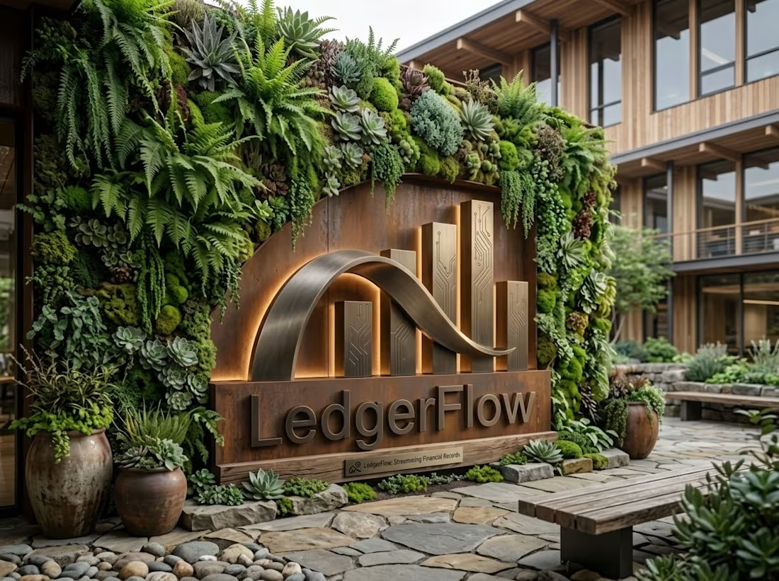
LedgerFlow is a B2B FinTech platform dedicated to automating revenue recognition and accounting reconciliation for companies with complex subscription models.
Your role: Lead Brand Designer (End-to-end visual identity creation and art direction).
Concepts explored:
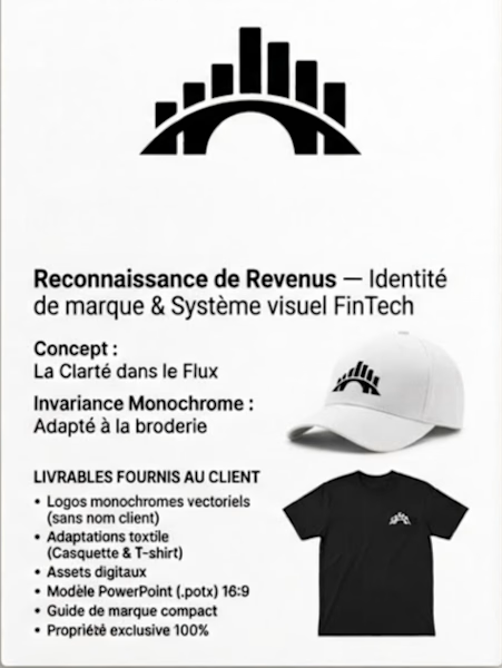
Clarity in the Flow: A visual translation of transforming raw transactional data into a clear, structured earned revenue schedule.
Rigorous Precision: Use of firm geometric lines and custom typography to express accounting compliance (ASC 606 / IFRS 15) without feeling austere.
Monochrome Invariance: Development of a strong symbol designed to work perfectly in strict black and white, ensuring maximum impact across all physical and digital mediums.
Deliverables provided to the client:
Complete logo system including the logotype, standalone symbol, and reversed versions (editable vector files: AI, SVG, PDF, transparent PNG).
Apparel adaptations: Clean monochrome pattern with no fine lines, optimized for high-density embroidery on caps and t-shirts (provided with 1:1 scale mockups and technical application sheets).
Digital assets: Responsive web banner and application icon/favicon set.
Compact brand guide detailing clear space rules, minimum sizes, primary typography, and secondary color palettes.


The network for creativity
Join 1.25M professional creatives like you
Connect with clients, get discovered, and run your business 100% commission-free
Creatives on Contra have earned over $150M and we are just getting started











Related posts


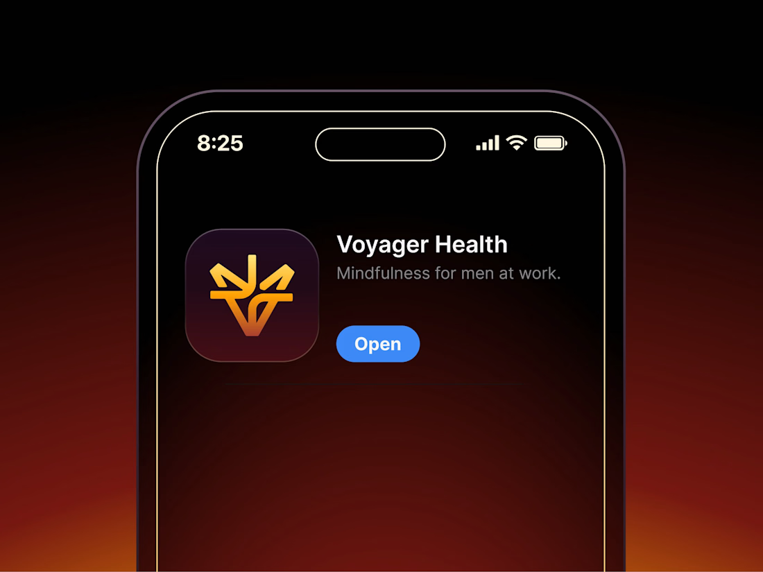

Aryna, that golden symbol pops so nicely against the plum background ✨

Behind the scenes of the Treal Studio brand film.
Built in one week, from creative direction to sound design.


Love the overall feel, looks amazing 👌🏼

It’s been a minute since my last post here on Contra.
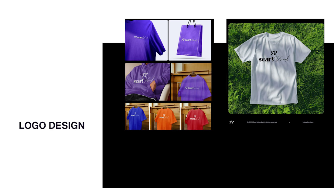
While my main focus usually lives in photo editing and digital design, I was digging through the archive recently and thought it’d be fun to share a couple of branding projects from the past:
Slide 1: Seart Visuals apparel & merchandise branding (1 year ago)
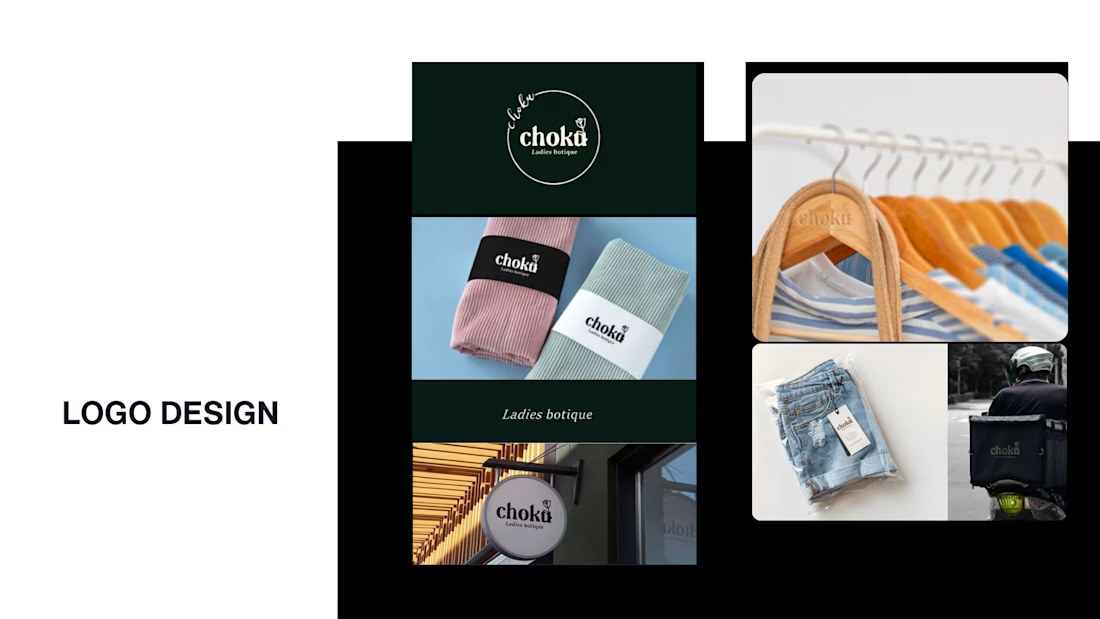
Slide 2: Choku Ladies Boutique identity and mockups (2 years ago)
Brand identity isn't my everyday lane, but tackling projects like these taught me a lot about visual consistency across different mediums. I’d love to hear your thoughts or see any feedback from fellow designers. Great to connect with the community again.



That's really great typography logo design❤️❤️