The network for creativity
Join 1.25M professional creatives like you
Connect with clients, get discovered, and run your business 100% commission-free
Creatives on Contra have earned over $150M and we are just getting started
Back to feedPost

A great visual identity isn’t just about what to build—it’s about knowing what not to touch.
When creating brand guidelines, the "What to Avoid" section is just as vital as the core identity rules. Custom typography, unique ligatures, and distinctive retro wordmarks easily lose their impact the moment consistency breaks.
Key principles to keep a visual identity sharp across all touchpoints:
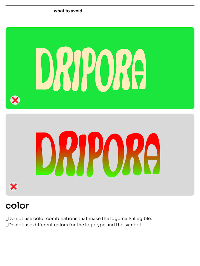
Maintain strict contrast: Avoid color combinations that compromise legibility or distort the primary visual hierarchy.
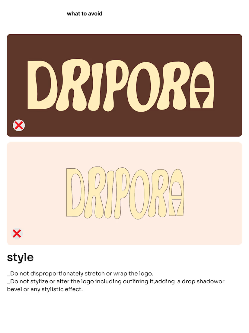
Protect the proportions: Never stretch, skew, or alter custom letterforms. Stylistic modifications weaken brand recognition.
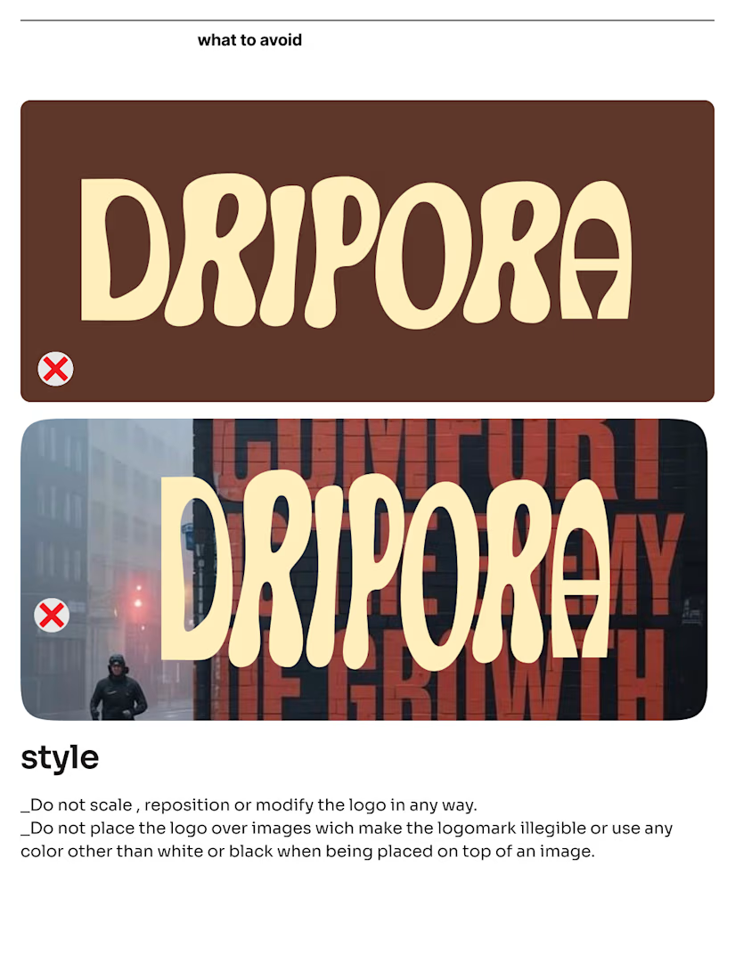
Keep backgrounds clean: Avoid placing wordmarks directly over busy images or low-contrast textures without proper treatment.
Eliminate unnecessary effects: Skip outlines, dropshadows, bevels, or unapproved gradients that aren't defined in the visual system.
Brand equity is built through repetition and clarity. Setting firm boundaries ensures the visual system stays strong across every execution.
How do you approach defining brand misuse guidelines for your identity projects? Let's connect in the comments.


Yeah thats so true.
The network for creativity
Join 1.25M professional creatives like you
Connect with clients, get discovered, and run your business 100% commission-free
Creatives on Contra have earned over $150M and we are just getting started
Trending
retrofuturism
Share your favorite designs from the past exploring the distant future. Or your own take on the aesthetic 🚀
halftone
Dots. Texture. Grain. Let's see your designs using the halftone technique.

Midjourney
Creatives are showing off what they're making with Midjourney.
colorgrade
Video editors sound off: How do you enhance the mood of your video in color grading?





Related posts

Sharing with you guys, one more logo collection! Let me know you thoughts

The way you simplify complex ideas into clean, memorable marks is always so inspiring. Love seeing the grid and the thought process behind each one!

Beetle - The Ultimate Framer Ecommerce Template : https://contra.com/products/lcNKkM93-beetle-the-ultimate-ecommerce-template


Amazing bro. Have you used Framercommerce? or any other similar tool?

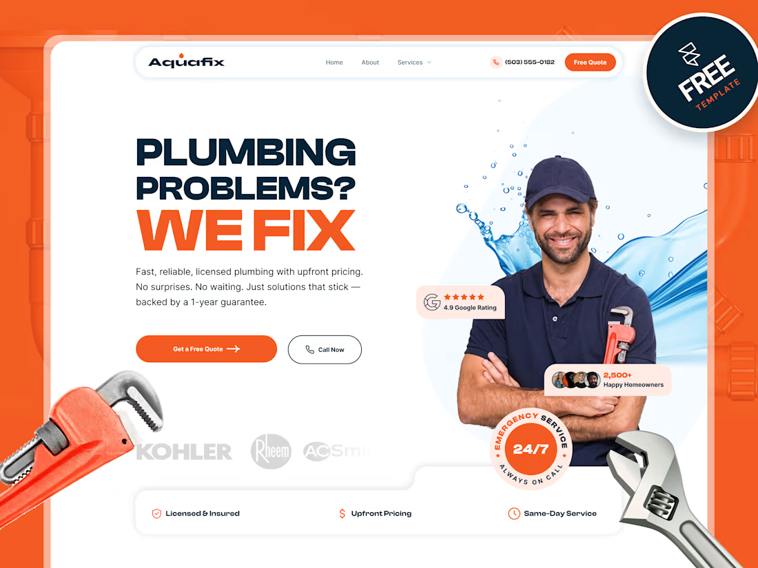
Just launched AquaFix — a modern plumbing website template built in Framer 🔧💧
Designed with service pages, pricing, testimonials, service areas, blog, contact forms, and smooth responsive interactions.
Would love your feedback on the design and overall experience.
#Framer #WebDesign #UIUX #FramerTemplate #NoCode #PlumbingWebsite

Nice work. I really like how the template feels, it's been centered around the customers journey.